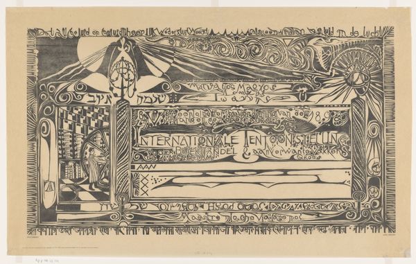
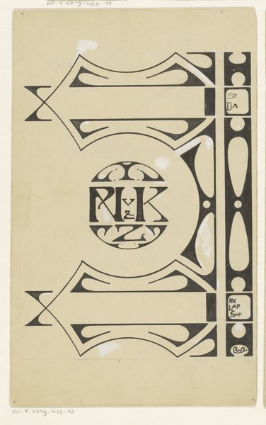
drawing, graphic-art, ink, pen, poster
#
drawing
#
graphic-art
#
art-nouveau
#
pen drawing
#
linocut
#
pen sketch
#
ink
#
linocut print
#
pen work
#
pen
#
poster
Dimensions: height 213 mm, width 345 mm
Copyright: Rijks Museum: Open Domain
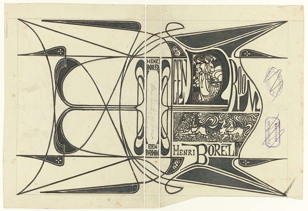
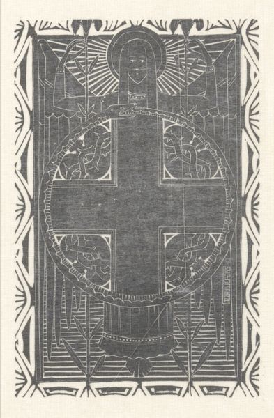
Curator: Here we have a striking pen and ink drawing by Jan Toorop, titled "Bandontwerp voor: Louis Couperus, Babel, 1901," created before the book's actual publication date. It’s currently housed in the Rijksmuseum. What’s your initial impression? Editor: Immediately, it's like a ghostly embrace of Art Nouveau. The figure emerging, almost pleading—reaching for something beyond the page. It's got this quiet, haunting aura. A certain melancholic beauty, don’t you think? Curator: Absolutely. Toorop, deeply entrenched in the artistic climate of the era, harnesses the aesthetics of Art Nouveau for a commercial purpose, yes, but the piece also resonates with symbolic meaning, from its subject, typeface, and monochrome choice of using black ink to give dimension, shadow, and depth to it. We must acknowledge, it's also the materiality of ink and pen itself giving the work its character, the physical labor behind each precisely drawn line. Editor: See, that’s fascinating to me! Labor meets dream. I'm taken by how the flowing lines of the figure contrast with the angular rigidity of the lettering announcing "Babel." It is as if order is fighting with fluidity or reason with emotion! Toorop teases this internal tension. Curator: The graphic style really stands out. This convergence reflects the broader debates concerning artistic autonomy and its role within capitalist production. Think about the availability and manufacturing processes around inks then and how that might've impacted Toorop’s technique and design choices. Editor: Material reality influencing vision – right. And those bold curves feel daring for their time; almost echoing a sense of reaching too high. It definitely captures some themes present within Babel itself! A sort of premonition embedded within the cover. Curator: Precisely. It brings up broader inquiries of how societal shifts and labor conditions shaped not just the subject matter, but every stylistic element including Art Nouveau. And the role of poster or book jacket itself: as functional item but elevated piece, as disposable print but artistic statement. Editor: Makes one appreciate what it is meant to adorn: The pages within a cover are also an exercise in that same tension. That dance is powerful! Curator: I think you are completely right, the image invites you into Babel before you even open the book and discover the world created there. Editor: It really does capture your imagination doesn’t it. A timeless invitation to lose oneself in art.
Comments
No comments
Be the first to comment and join the conversation on the ultimate creative platform.
More like this