graphic-art, print, paper, typography
#
graphic-art
#
type repetition
#
aged paper
#
reduced colour palette
#
muted colour palette
# print
#
text and photography
#
white palette
#
paper
#
block of text
#
text
#
typography
#
thick font
#
historical font
#
columned text
Copyright: Rijks Museum: Open Domain
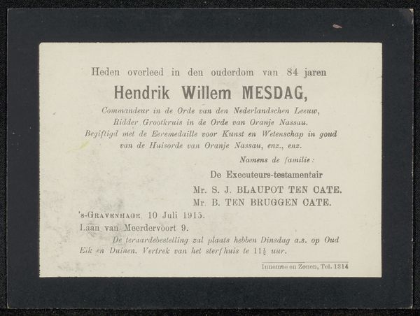
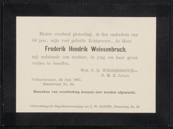
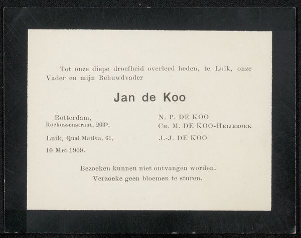
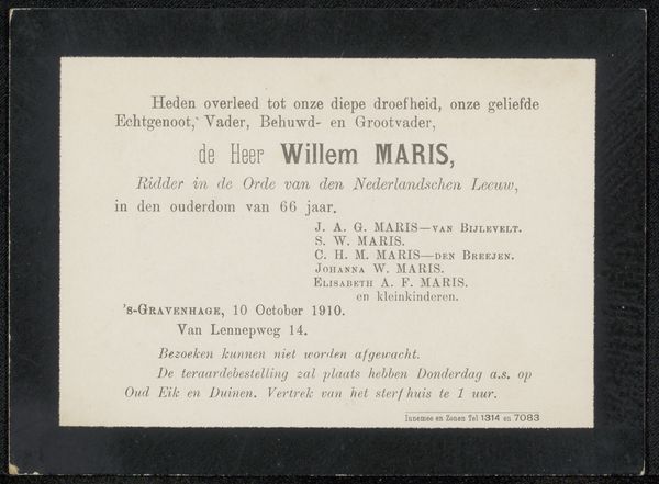
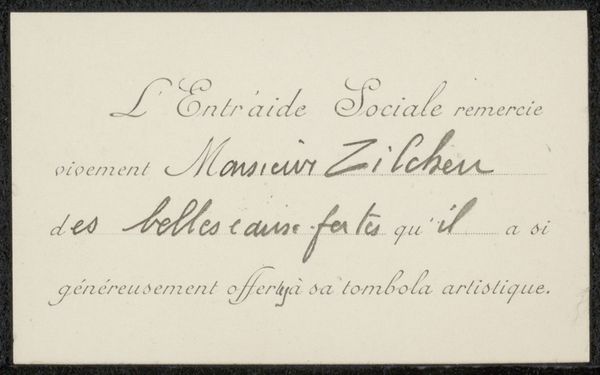
This is a notice of death made anonymously, for Philip Zilcken, printed in 1902. The layout here is so formal, so stark. The announcement is set in a crisp font, all information, no frills. I love how the rigid arrangement contrasts with the messy reality of life and death. It's like someone trying to control the narrative, to impose order on something inherently chaotic. The black frame around the text feels significant. It’s like a border, marking the edge of something, holding it in place, a visual reminder of the finality. It evokes a sense of containment, of trying to hold grief within certain boundaries, as if to say, "This is where it ends." It reminds me of some of the work of On Kawara, another artist who was obsessed with time, with dates. Both artists, in their own way, are grappling with the passage of time, with the ephemeral nature of existence, reminding us of the fleeting nature of life.
Comments
No comments
Be the first to comment and join the conversation on the ultimate creative platform.
More like this