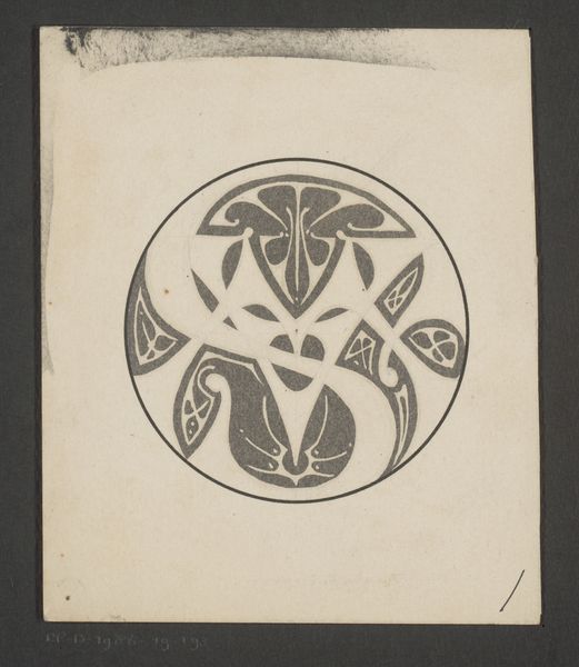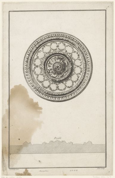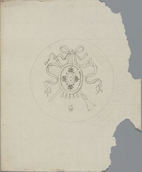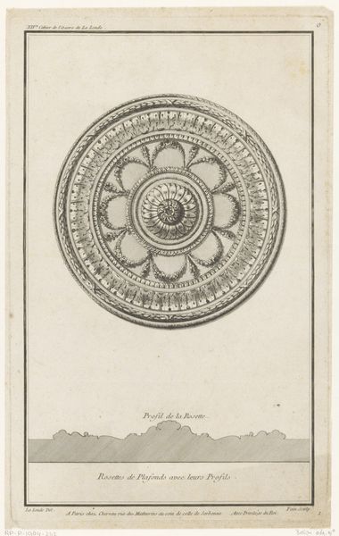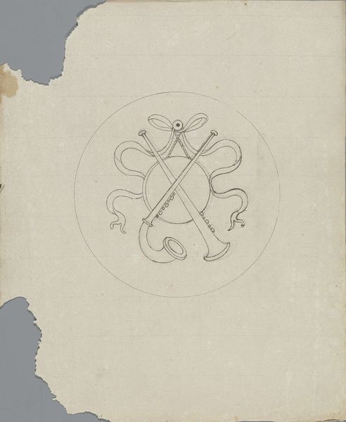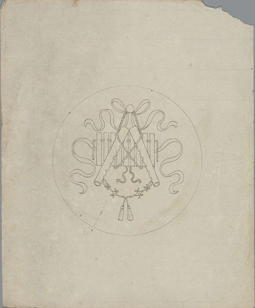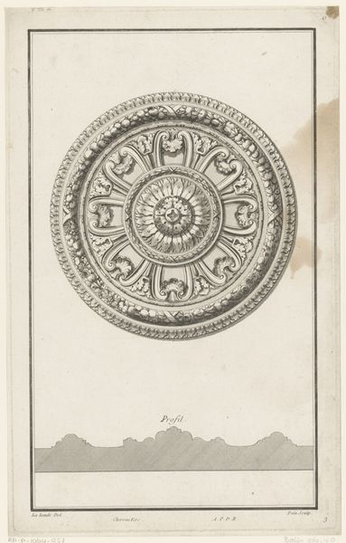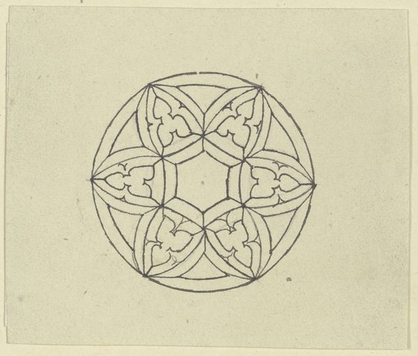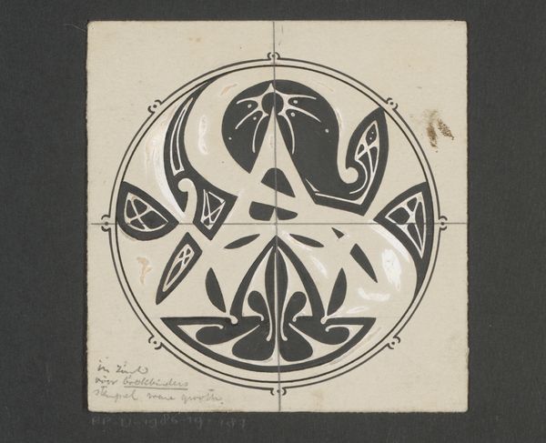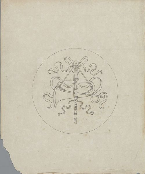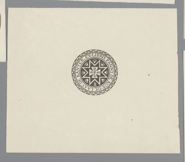
Ontwerp voor een bord ter gelegenheid van het zilveren jubileum van koningin Wilhelmina 1874 - 1945
0:00
0:00
careladolphlioncachet
Rijksmuseum
drawing, graphic-art, print, paper, ink
#
drawing
#
graphic-art
#
art-nouveau
# print
#
paper
#
ink
#
linocut print
#
geometric
#
ink colored
#
decorative-art
Dimensions: height 388 mm, width 300 mm
Copyright: Rijks Museum: Open Domain
Carel Adolph Lion Cachet made this plate design for Queen Wilhelmina's jubilee, and it looks like it was made with ink. I love the radiating pattern, like a sun or a flower, and how it plays with symmetry and asymmetry. See how the outer ring of the design seems to almost vibrate with the rhythm of thick and thin marks? The ink work has an illustrative quality, but there’s also an immediacy to it, like a sketch. The surface has this beautiful, almost rough quality to it, with visible imperfections and slight variations in the thickness of the ink. Look closely at the center of the design and you'll see the date, 1898-1923. It seems the artist was interested in playing with the boundaries between precision and spontaneity. I’m reminded of Hilma af Klint’s early, abstract works which were similarly concerned with geometric forms and radiating patterns. Art's always been this long, ongoing conversation, right? Always borrowing, always building. There's never just one way to look at a piece, and that's the beauty of it.
Comments
No comments
Be the first to comment and join the conversation on the ultimate creative platform.
