drawing, ink, pen
#
drawing
#
pen drawing
#
pen sketch
#
ink
#
ink drawing experimentation
#
pen-ink sketch
#
pen work
#
pen
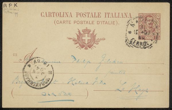
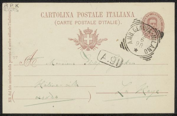
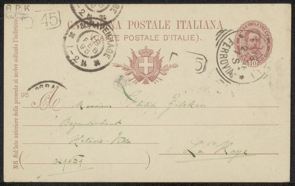
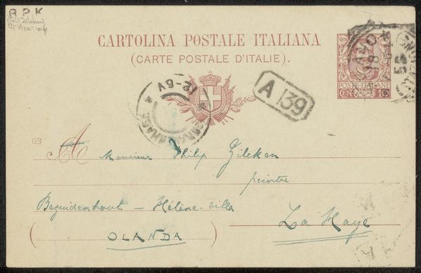
Copyright: Rijks Museum: Open Domain
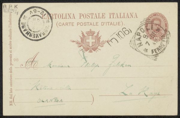
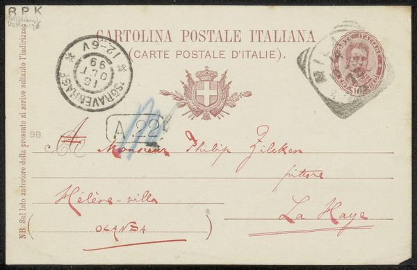
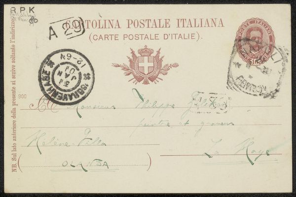
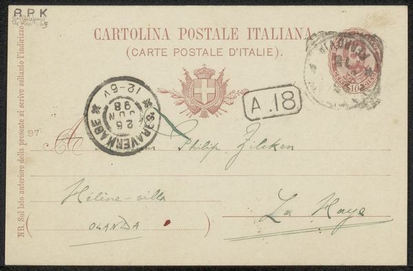
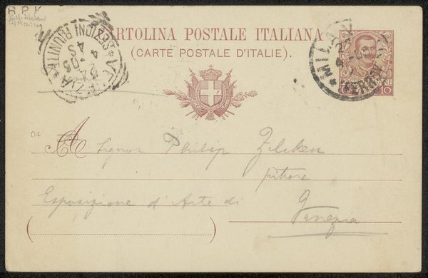
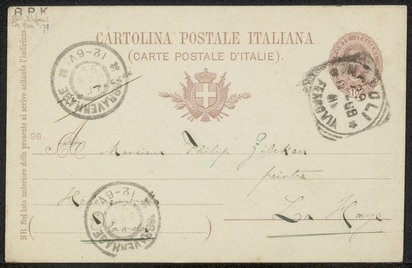
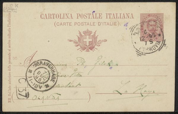
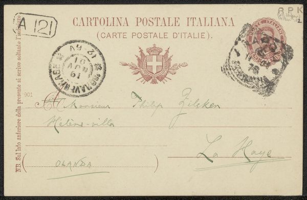
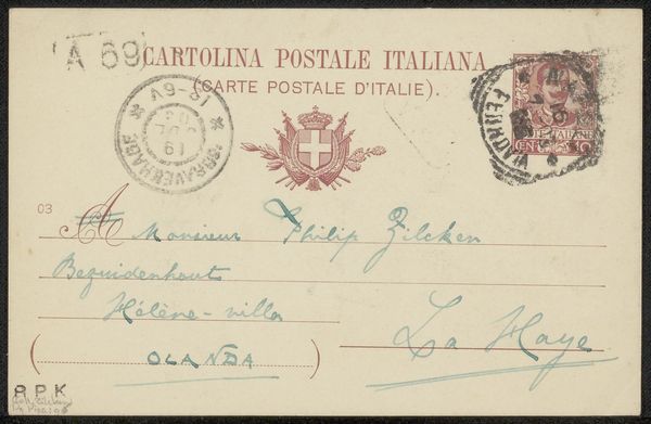
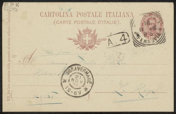
Editor: Here we have "Briefkaart aan Philip Zilcken," thought to be created sometime between 1904 and 1911, comprised of pen and ink drawings. What stands out to me is the composition—the neat lines and various stamps create a textured surface. What formal elements do you find most compelling? Curator: The interplay between the graphic elements – the precise lines of the printed postal markings and the flowing script of the handwritten address – presents a fascinating study in contrasts. Note the use of differing weights of ink; observe how this variation articulates different planes within the pictorial space. Editor: So it's the tension between the rigid and the organic that's key here? Curator: Precisely. The systematic arrangement of textual elements versus the personal, gestural quality of the handwriting. It forces the viewer to confront the object as both a functional artifact and an aesthetic composition. Consider, too, the semiotic weight of the Italian postal markings contrasted with the Dutch addressee. How does that juxtaposition complicate our understanding of its form? Editor: That international aspect adds another layer, complicating what seemed simple at first glance. Curator: Indeed. The form itself, a postcard, implies dissemination, communication – but the visual elements foreground the medium as much as the message. Do you find that this emphasis shifts your perception? Editor: Absolutely. It makes me reconsider how much meaning can be found even in functional art when analyzed for its inherent qualities. Curator: A fruitful exercise, then, in understanding how art, even in its most utilitarian form, can offer profound formal insights.
Comments
No comments
Be the first to comment and join the conversation on the ultimate creative platform.
More like this