drawing, paper, photography, ink, pen
#
portrait
#
drawing
#
hand-lettering
#
hand drawn type
#
hand lettering
#
paper
#
photography
#
personal sketchbook
#
ink
#
hand-drawn typeface
#
ink drawing experimentation
#
pen-ink sketch
#
pen work
#
sketchbook drawing
#
pen
#
sketchbook art
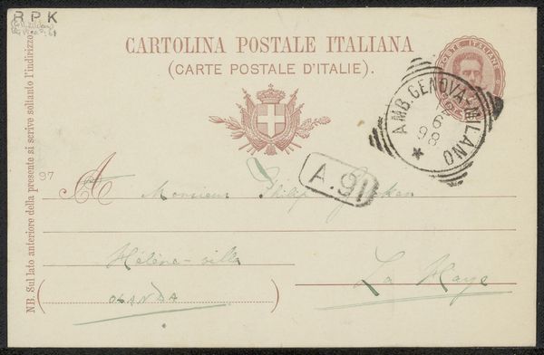
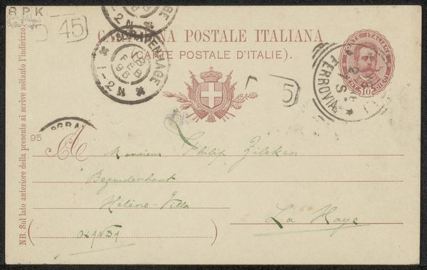
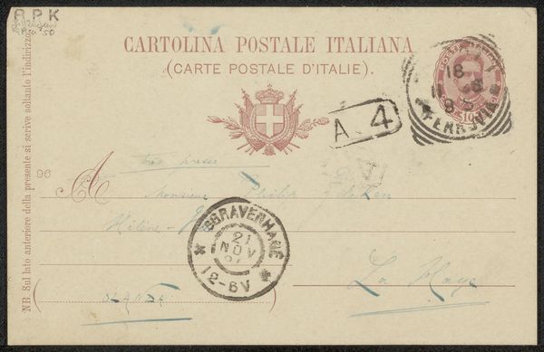
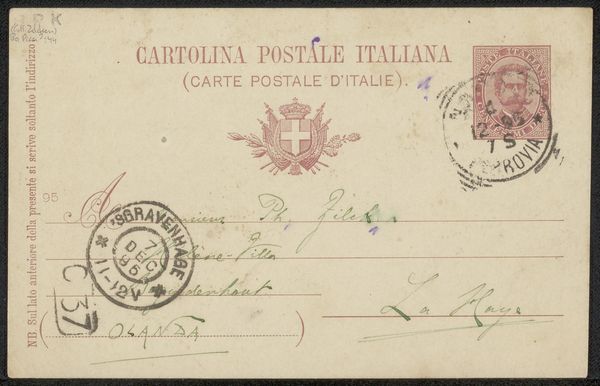
Copyright: Rijks Museum: Open Domain
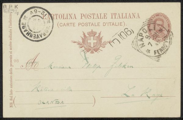
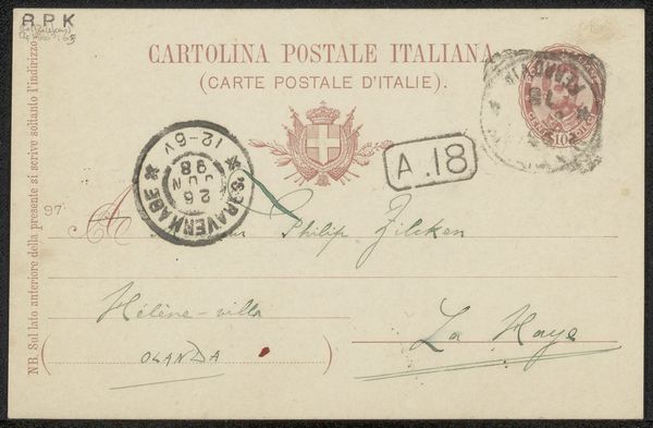
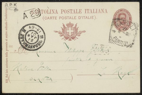
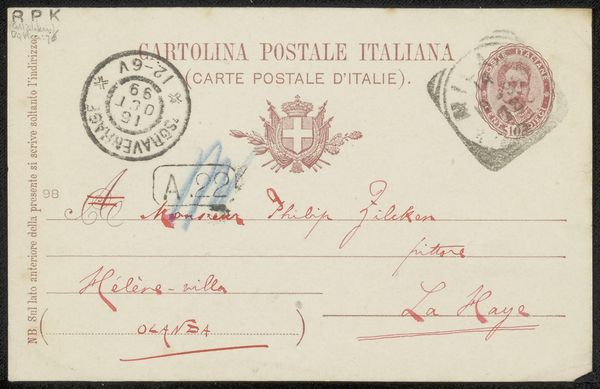
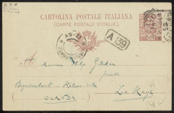
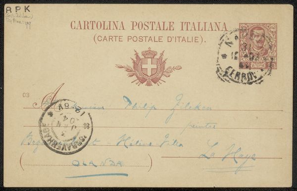
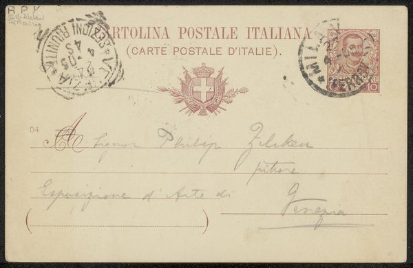
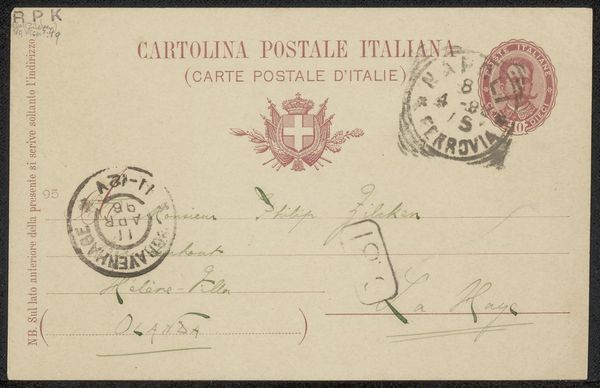
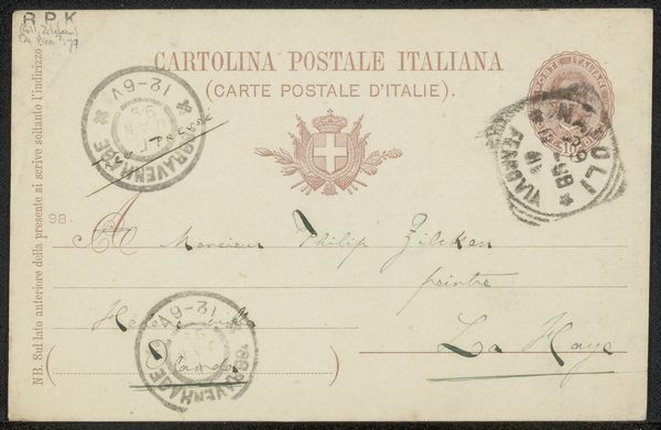
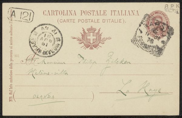
Curator: The artwork before us, dating possibly from 1903 to 1914, is entitled 'Briefkaart aan Philip Zilcken.' Editor: Well, immediately, I'm struck by its fragility. The delicate, faded ink seems to whisper across the aged paper. It's as though I'm holding a memory, a half-forgotten correspondence from a bygone era. Curator: Indeed. Composed with pen and ink, with hints of photography used for the stamp, it exists as a postal artifact. The hand-lettering is clearly a functional element, the inscription and address are central to the pieces meaning. But the elegance suggests artistry at play. Editor: Oh, absolutely! Look at the flourishes on the "A" in "A Monsieur." The hand-lettered typeface is really a design itself. There's an intimacy that machine-printed correspondence could never achieve, wouldn’t you say? I imagine the sender carefully forming each letter. Curator: Certainly. And notice the stamp's portrait, offset by the crisp architectural lines and typographic information surrounding it. This combination generates formal tensions. Editor: Do you think Vittorio Pica intentionally selected this imagery to communicate aspects of their personality or intentions toward the recipient, Mr. Zilcken? Was the "Très-pressé" a genuine urgency, or part of the performative act of letter-writing? Curator: Hard to say. But such intentionality is definitely one interpretive possibility within our reach. The semiotic interplay here between the sender, the text, and the recipient creates layers of potential interpretation that may prove fruitful avenues of analysis. Editor: I agree. I’m imagining the stories this card holds, of friendships forged, thoughts exchanged, all wrapped in this single piece of paper. Makes me want to pen a letter myself! Curator: A productive response. In this simple 'Briefkaart,' we observe the convergence of practical communication and artful expression, creating an enduring testament to the personal touch.
Comments
No comments
Be the first to comment and join the conversation on the ultimate creative platform.
More like this