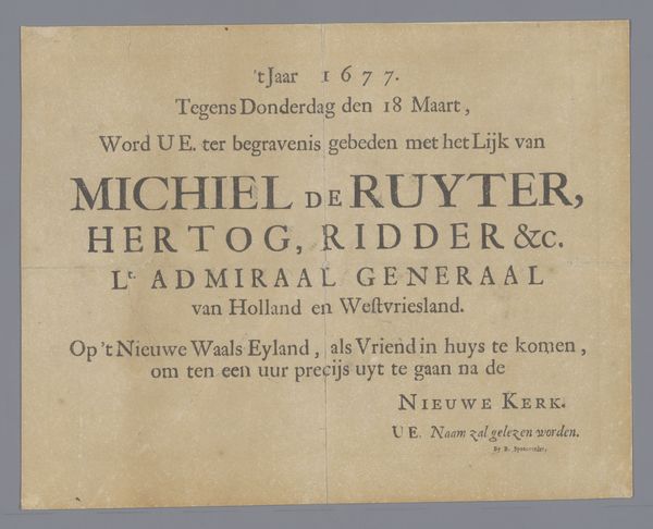
Titelblad voor de prentserie over het Huis ter Nieuburch in Rijswijk en de vredesonderhandelingen, 1697 1697
0:00
0:00
graphic-art, print, typography, engraving
#
script typeface
#
graphic-art
#
aged paper
#
dutch-golden-age
# print
#
old engraving style
#
hand drawn type
#
typography
#
hand-drawn typeface
#
thick font
#
handwritten font
#
golden font
#
word imagery
#
engraving
#
historical font
Dimensions: height 265 mm, width 333 mm
Copyright: Rijks Museum: Open Domain
Curator: Welcome. Today, we're looking at "Titelblad voor de prentserie over het Huis ter Nieuburch in Rijswijk en de vredesonderhandelingen, 1697," which translates to Title page for the series of prints about the House ter Nieuburch in Rijswijk and the peace negotiations, 1697. It's an engraving made in 1697. The printmaker was Anna Beeck. Editor: My first impression? Order! A slightly distressed order, maybe. I'm struck by the dual presentation, the careful balance of languages. And all that faded lettering…It's evocative. Curator: Indeed. The dual language—French and Dutch—points to the intended audience: diplomats and dignitaries involved in the peace negotiations held at Rijswijk. It sets a tone of accessibility to both linguistic spheres involved in the discussions. The typography itself also holds meaning. The typeface choices, alternating color, creating this…word image. Editor: Exactly. It’s almost architectural. The way "RYSWYCK" is stacked and centered… it’s solid. But there’s an ephemerality too, seeing it’s printed on paper. A paradox of permanence and passing. Curator: Symbolically, that tension speaks to the nature of peace treaties themselves, doesn't it? The desire for enduring stability juxtaposed against the fragile realities of international politics. The thick lettering used could indicate steadfastness and stability which is very interesting to consider. Editor: That contrast is definitely there. The slightly distressed look—the aged paper, the ink bleed—adds another layer. These are *negotiations*, messy, complicated things. And that's what comes to the forefront, even with the artist’s intentional order. Curator: The imagery then functions almost as a cultural shorthand, reminding viewers of the stakes involved, visually referencing history, memory, and the desire for a better future. Editor: For me, it's a meditation on the weight of words themselves. Here's a tangible expression of the hopes, the anxieties, literally printed in this title page. Curator: A poignant reminder of the complex layers present in seemingly simple designs. Editor: Absolutely, a conversation starter. It’s making me question the assumptions of those times!
Comments
No comments
Be the first to comment and join the conversation on the ultimate creative platform.
More like this