Lincoln Center for the Performing Arts- Opera c. 20th century
0:00
0:00
screenprint, color-lithograph, print, poster
#
popart
#
screenprint
#
color-lithograph
# print
#
pop art
#
geometric
#
pop-art
#
cityscape
#
poster
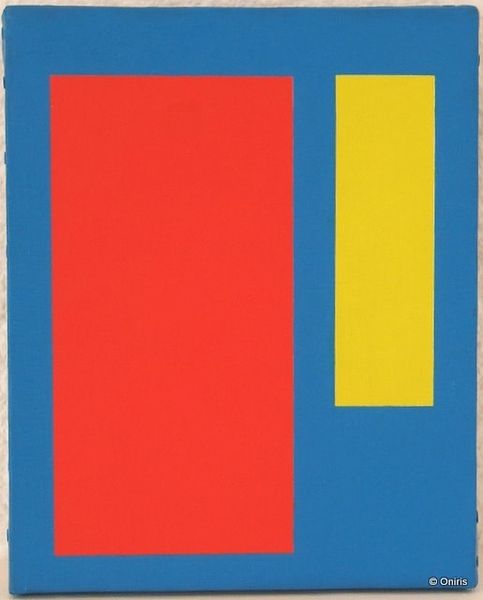
Dimensions: 35 1/16 x 23 1/8 in. (89.06 x 58.74 cm) (sight)36 1/2 x 24 9/16 in. (92.71 x 62.39 cm) (outer frame)
Copyright: No Known Copyright
Curator: What strikes me immediately is the boldness of the image. The pure red ground against the blue binoculars… it’s incredibly direct. Editor: It is certainly arresting. This is "Lincoln Center for the Performing Arts- Opera," a screenprint, color lithograph and poster by Per Arnoldi dating to around the 20th century. It’s a study in pure shapes and impactful color choices. Curator: Right, its visual impact reminds me of the Pop Art movement, which often challenged the norms of traditional art by incorporating elements from popular culture and mass production. Here, the screenprint medium reinforces that notion. How do you see the composition? Editor: The starkness simplifies the opera-going experience. We see the promise of viewing, yet devoid of ornate detailing. Curator: Agreed, and thinking about this as a promotional poster changes things. Its function as advertising—communicating to an audience, enticing them to engage with the opera house—that adds another layer. Consider the consumerist context… it encourages us to consume culture. Editor: Semiotically, binoculars become the signifier for observation and heightened perspective. However, without the complexities of set design or actors. We only see potential. Curator: Looking closer, one could also note the industrial production involved in creating such an image, using geometric shapes in print. What sort of labor was used to produce copies of this advertisement for a broader audience? These questions push us beyond mere aesthetics. Editor: Fascinating points. In terms of pure formalism though, the contrast and lack of shading flattens everything, distilling it into shapes and pure visual stimulation. I’m struck by the overall graphic quality, it practically vibrates. Curator: Well, regardless of our different interpretations, it’s a work that continues to engage with questions concerning production, reception, and aesthetic appreciation. Editor: Yes, a work which embodies, perhaps, that liminal space between accessibility and conceptualism.
Comments
No comments
Be the first to comment and join the conversation on the ultimate creative platform.
More like this