Copyright: Kiyoshi Saito,Fair Use
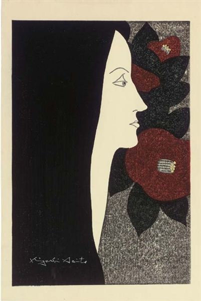
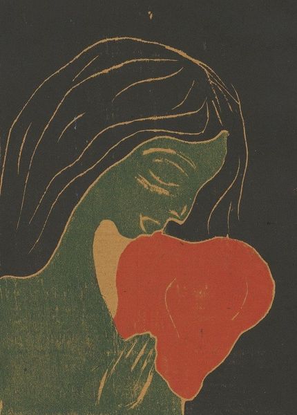
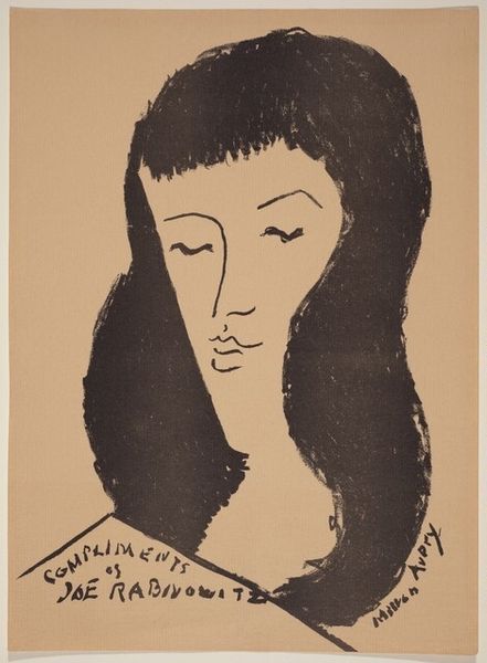
Editor: This woodcut print, "Camellia (Tsubaki)" by Kiyoshi Saito, made in 1948, strikes me with its almost graphic quality. The stark contrast and flat planes of color give it a bold presence. What stands out to you, and how do you interpret the formal relationships at play? Curator: Observe the planar organization of the composition; note how the subject is bisected between floral space and field of dark pigment, ostensibly representing the subject’s hair. The graphic flatness suppresses a deeper reading of pictorial space. Saito exploits the inherent qualities of the woodcut technique. Editor: Yes, that dark mass is particularly striking, almost ominous in contrast to the flowers and the subject's profile. What do you make of the artist’s limited palette? Curator: The strategic implementation of a restrained color system—here we see the stark whites, blues, and blacks against warmer hues in the background—draws attention to shape and the interplay of positive and negative space. It creates a visual tension, preventing the eye from settling on any single point. Editor: Do you see the slight awkwardness in the figure's neck as a purposeful element or a limitation of the artist's skill? Curator: The supposed “awkwardness” adds a unique stylistic trait, perhaps a conscious move away from strict realism toward a more stylized or idealized representation, typical of Naïve art, which you mentioned. I suggest looking past superficial representational accuracy for more significant semiotic expressions. Editor: That’s fascinating, I hadn't considered that deliberate distortion. Thanks for clarifying Saito's intent. Curator: The act of closely observing how the parts relate within an artwork is more rewarding than applying conventional meaning. These intrinsic features of an artwork give shape to deeper ideas about the formal language of art.
Comments
No comments
Be the first to comment and join the conversation on the ultimate creative platform.
More like this