drawing, coloured-pencil, print
#
portrait
#
drawing
#
coloured-pencil
# print
#
coloured pencil
#
romanticism
#
watercolour illustration
#
genre-painting
#
academic-art
Copyright: Public Domain
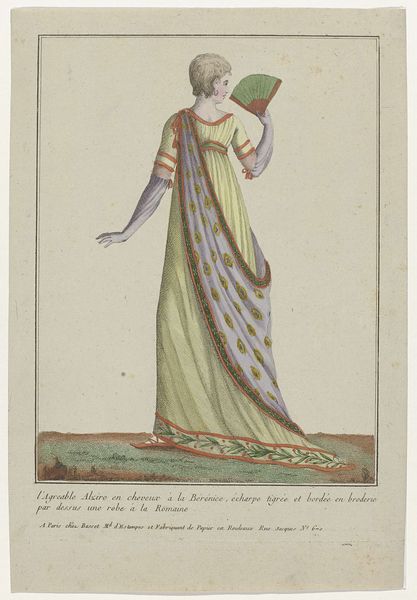
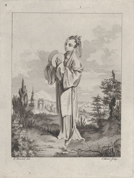
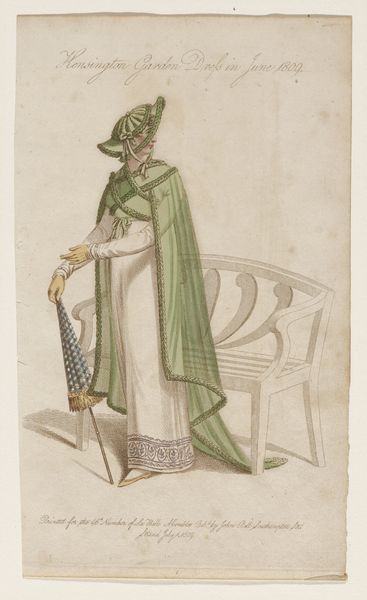
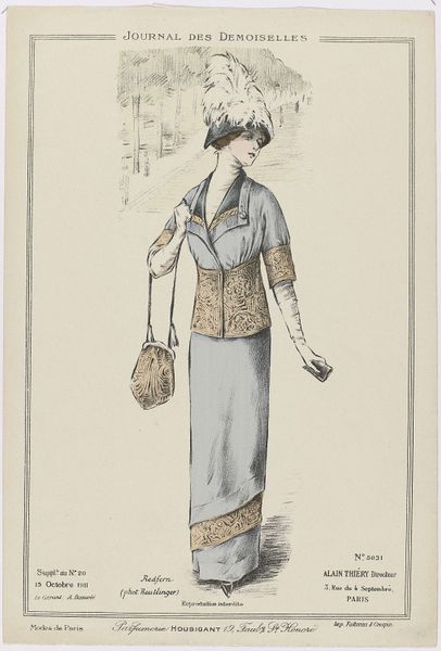
Editor: So, here we have "Fashion Plate," a print made with colored pencil from around 1809 to 1811. It's at the Minneapolis Institute of Art. I'm really struck by the delicate lines and the subtle coloring. It has such a tranquil and airy feel. What elements do you see at play in creating this effect? Curator: It is a piece that exemplifies the formal conventions of its time. Observe how the composition is structured. The figure is placed asymmetrically, yet balanced, against the backdrop. The soft colors—the blues and creams—work to create visual harmony, further enhanced by the light and shadow gradations that delineate the form. Editor: The textures seem so important, even within the print medium. The delicate fabric folds, the woven hat, the rough-hewn tree behind her... Curator: Precisely. These elements showcase a clear manipulation of the medium, directing our attention to the artistry embedded in its materiality. The textures introduce layers, and these layers in turn lead to a rich tapestry that is quite intriguing from a formalist standpoint. What is your read on the relationship between figure and setting? Editor: I see what you mean; there's almost a tension between her refined clothing and the rugged, natural world around her. It's like she's both a part of it and set apart from it. Curator: Note that the background's function isn't to imitate a natural scene but to create a balanced contrast through differing textures. Did you observe how the eye is gently guided around the plane by color and shading? Editor: Now that you mention it, I see how the blue sash draws my eye from the top down to the umbrella, and back up along the tree's shadow! Curator: And how the strategic deployment of the stippling creates gradients of shadow around the subject, and gives a strong sense of depth despite a nearly two-dimensional presentation. We may ask, then, how "deep" we may go in assigning symbolic value to these patterns? Editor: Thinking about the relationship between form and the emotional qualities we feel in response to it is really fascinating. I will certainly look for such structures now when I visit museums. Curator: And it is by learning how to ask new questions of visual and material structures that our insight becomes more robust.
Comments
No comments
Be the first to comment and join the conversation on the ultimate creative platform.
More like this