Copyright: Public Domain: Artvee
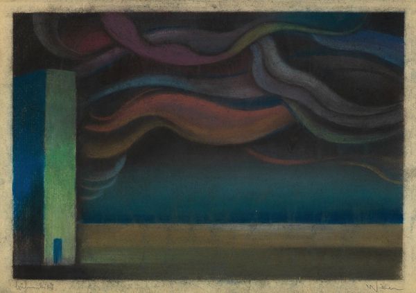
Karl Wiener made this pastel drawing called "II. Weltkrieg," or World War II, sometime during or after that conflict. There's a tension here between representation and... not-quite-representation. It's like a memory clinging to a feeling. The marks are velvety, soft, smudgy - pastel, of course. You can almost feel the give of the stick against the paper. The colours, though, are so sharp; that toxic yellow, that burning-building red. The smokey form on the left is almost anthropomorphic, you know? The face of war. Look at how Wiener uses colour to suggest both volume and flatness, like the cloud is solid yet still floating. You might compare this to some of the earlier Surrealist landscapes of Yves Tanguy. Both explore dreamscapes, but Wiener's work feels rawer, less composed. It’s like the difference between a nightmare and a carefully constructed dream. And I think that difference is what makes it so powerful. It is an open conversation about the impact of the war.
Comments
No comments
Be the first to comment and join the conversation on the ultimate creative platform.
More like this