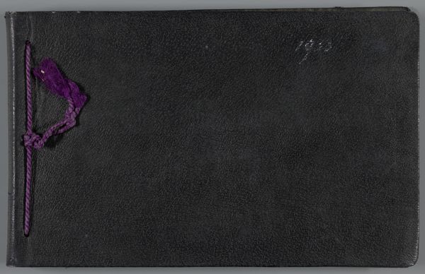
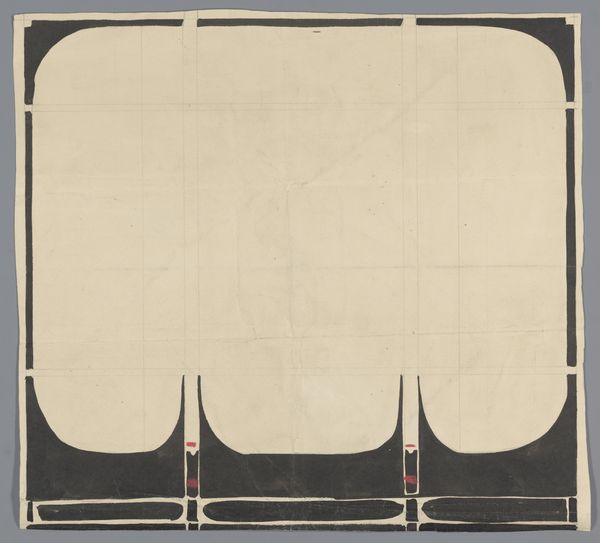
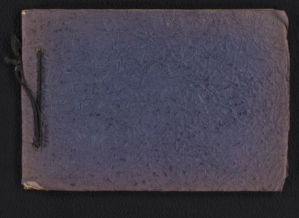
Boekband met embleem van de Algemene Nederlandse Diamantbewerkersbond c. 1920 - 1940
0:00
0:00
graphic-art, print, paper, photography
#
graphic-art
# print
#
paper
#
photography
#
geometric
Dimensions: height 235 mm, width 295 mm
Copyright: Rijks Museum: Open Domain
Curator: This photograph captures a book binding dating from sometime between 1920 and 1940. It features an emblem representing the Algemene Nederlandse Diamantbewerkersbond—that’s the General Dutch Diamond Workers' Union. Editor: Whoa, first impression? It looks like some secret society's decoder ring! Or a heavily stylized take on religious iconography... you know, if churches were into hardcore geometrics. Curator: Absolutely. The visual language speaks volumes. This wasn’t just a company logo; it’s a statement. Unions like the ANDB were pivotal in fighting for workers' rights, advocating for fair wages, and improving working conditions, especially within industries known for exploitation. Think of the cultural weight this emblem carried for diamond workers in Amsterdam! Editor: Makes me wonder about the actual book, what secrets it held, nestled beneath that intense cover. A union ledger? Radical manifestos? Maybe just grandma's famous gefilte fish recipe. Who knows! The photograph makes it so mysterious! Curator: It’s quite likely related to union activities or propaganda. Its geometric design, its bold symbolism, evokes power. It would’ve been seen at a time when geometric abstraction, through movements like De Stijl, mirrored societal desires for rationalization and progress after the horrors of World War I. Editor: I love how it all kind of locks together. That cross shape made up of what look like tools and symbols…It's visually tight and organized, hinting at strength in numbers. Like, "we fit together, we work together." Clever stuff, no? Curator: Exactly! Analyzing these types of symbols provides so much cultural insight, from gender to class—revealing complex systems of power embedded in our material culture. We can see how design serves ideological aims, shaping consciousness and legitimizing certain viewpoints. Editor: Alright, so after all our pontificating and decoding, what’s our takeaway from this snazzy book cover? Curator: For me, it's how something as seemingly simple as an emblem on a book can represent a whole social movement, encapsulating its hopes, its struggles, and its visions for a better world. Editor: Totally. I dig how it blends cold, hard geometry with, you know, a diamond-cutter's soul. A reminder that even in the tiniest details, people pour their passions. And I bet it looks absolutely stunning under a jeweller’s loupe!
Comments
No comments
Be the first to comment and join the conversation on the ultimate creative platform.
More like this