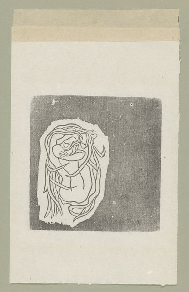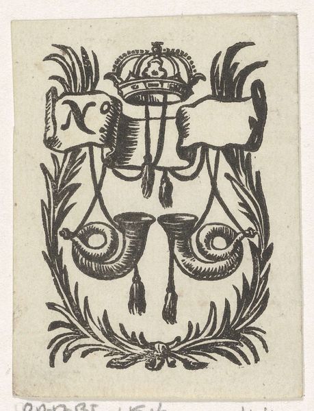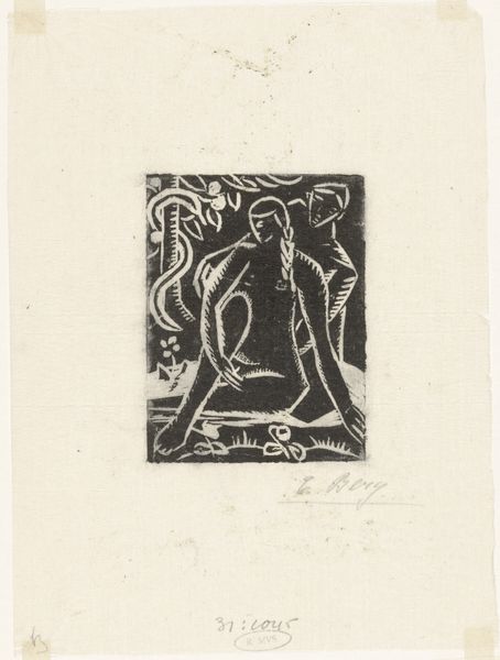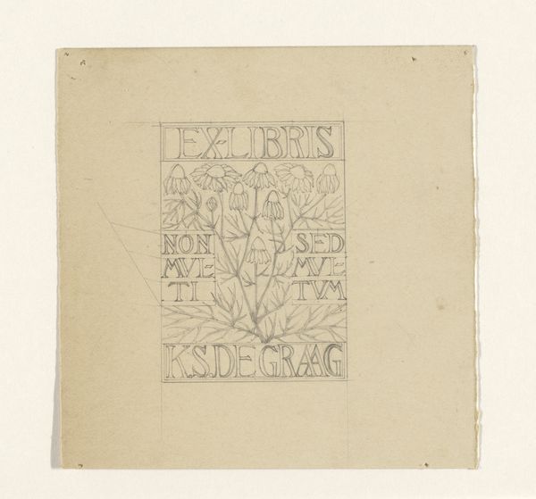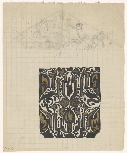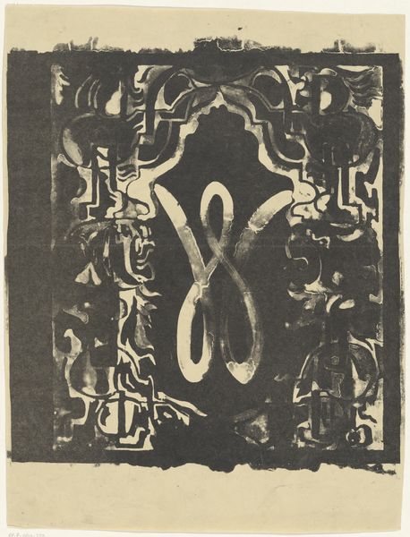
Bandontwerp voor: Louis Couperus, Extaze: een boek van geluk, 1894 before 1894
0:00
0:00
richardnicolausrolandholst
Rijksmuseum
drawing, graphic-art, ink
#
drawing
#
graphic-art
#
toned paper
#
light pencil work
#
art-nouveau
#
pen sketch
#
old engraving style
#
form
#
personal sketchbook
#
ink
#
ink drawing experimentation
#
pen-ink sketch
#
ink colored
#
line
#
sketchbook drawing
#
decorative-art
#
sketchbook art
Dimensions: height 62 mm, width 62 mm
Copyright: Rijks Museum: Open Domain
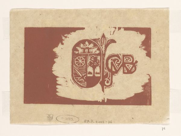
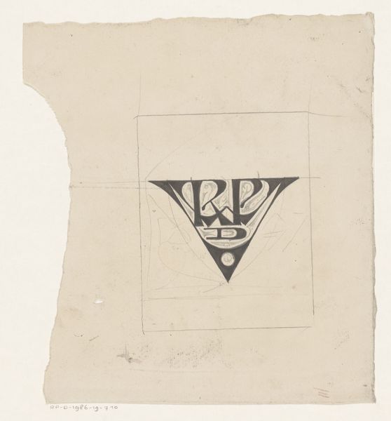
Curator: Standing here, we're looking at a preliminary cover design by Richard Nicolaüs Roland Holst, crafted before 1894. It's a pen and ink drawing intended for Louis Couperus' novel, "Extaze: een boek van geluk". Editor: It feels unfinished, yet that's part of its charm. A strong graphic sensibility—it almost looks like it could be a woodblock print, even though it’s a drawing. Raw, almost primal in its composition. Curator: Absolutely. Considering Couperus’ novel explores themes of ecstasy and profound emotional experiences, the cover design is fitting in its representation of idealized aestheticism, connecting these elements to Holst's wider output of socially conscious work in graphic design and his socialist commitments. Editor: It strikes me as the blueprint for something much larger. You see the visible pencil under-drawing; this wasn't just art for art's sake but design work—labour with a very specific purpose and likely tight deadlines. The materials are simple, yet they’re used to achieve an incredibly elegant result. Curator: Precisely. I think the lines and forms here embody a rebellion against academic styles, moving toward the Symbolist and Art Nouveau movements prevalent in Europe at that time. This cover’s organic flow could be seen as representing an unrestrained freedom associated with exploring human sensuality within this "book of happiness". Editor: The means by which art reaches a wider audience were radically shifting, facilitated through mass print culture—yet made possible by someone like Holst putting pen to paper and experimenting. We have to consider the material processes that allowed “Extaze” to reach readers in the first place. Curator: Looking at it now, knowing what we know about this specific historical moment—I wonder if the design pushes against rigid Victorian morals, embracing instead a liberated, queer sensibility expressed by both the book's narrative and cover image. Editor: Yes, there's an undeniable beauty in recognizing its functionality beyond the aesthetic. A fascinating intersection between craft and cultural consumption, particularly within a burgeoning literary scene. Curator: It offers an early, progressive viewpoint when we consider not only form and the artwork itself but the messages the author and artist convey regarding societal norms. Editor: It’s remarkable to see art entangled within this industrial production cycle, speaking volumes about the evolving nature of creativity.
Comments
No comments
Be the first to comment and join the conversation on the ultimate creative platform.
