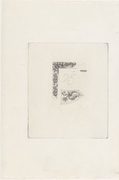
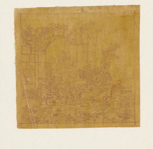
drawing, paper, pencil
#
photo of handprinted image
#
drawing
#
aged paper
#
light pencil work
#
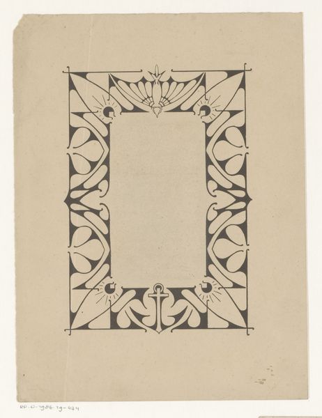
art-nouveau
#
ink paper printed
#
old engraving style
#
hand drawn type
#
flower
#
paper
#
form
#
personal sketchbook
#
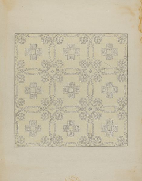
geometric
#
pencil
#
ink colored
#
line
#
sketchbook drawing
#
decorative-art
#
sketchbook art
Dimensions: height 101 mm, width 100 mm
Copyright: Rijks Museum: Open Domain
Curator: This is a design for a bookplate, or "ex libris," by Julie de Graag, created sometime between 1887 and 1924. It's rendered in pencil on paper. Editor: Hmm, the flowers are strangely droopy, almost like they're tired of holding up all that Latin! What's the vibe here, scholarly gloom? Curator: Not gloom, exactly, but an intellectual ownership, literally. Bookplates marked personal libraries, signifiers of status and taste in a rapidly expanding world of print. De Graag's design speaks to that. Editor: So, less "read me!" and more "this is MINE!" Got it. But what about the Art Nouveau flounce around those somewhat aggressive block letters? A battle between possessiveness and pretty flowers? Curator: It's more nuanced. Art Nouveau in the Netherlands was often about synthesizing nature, symbolism, and functionality. The lettering, while bold, integrates with the floral motif, a very Dutch blend of pragmatism and aestheticism, perhaps a push toward accessible ownership of beauty and knowledge. Editor: Accessible? Maybe. I mostly see this delicate flower drawing crushed by a typographic weightlifting competition. "Non mihi, sed meum," isn't it? Not for you, but mine? That’s pretty forward, and more about protecting intellectual real estate, it sounds... very 2024 of them. Curator: Indeed, these personalized bookplates functioned within a system that valued both individual ownership and a burgeoning art market. Commissioning such a design was a statement. The flowers add a layer, I believe, that reflects an appreciation for art, the decorative and intellectual value of the collection inside. Editor: I still think the flowers look like they're staging a tiny revolt against the weight of all those capital letters and the whole ownership vibe. Like a whispered reminder that even libraries eventually return to dust... or maybe, get resold to another collector, with a slightly different "ex libris." Curator: A poetic notion. It makes me consider what future scholars might read into the ownership marks that we put on our digital libraries today. Editor: Which just proves, curator, some anxieties are timeless. So, next time you see a wilting flower, remember, it might be whispering about the fleeting nature of ownership, digital or otherwise!
Comments
No comments
Be the first to comment and join the conversation on the ultimate creative platform.
More like this