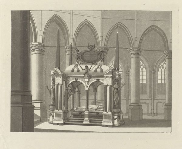
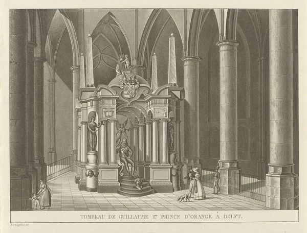
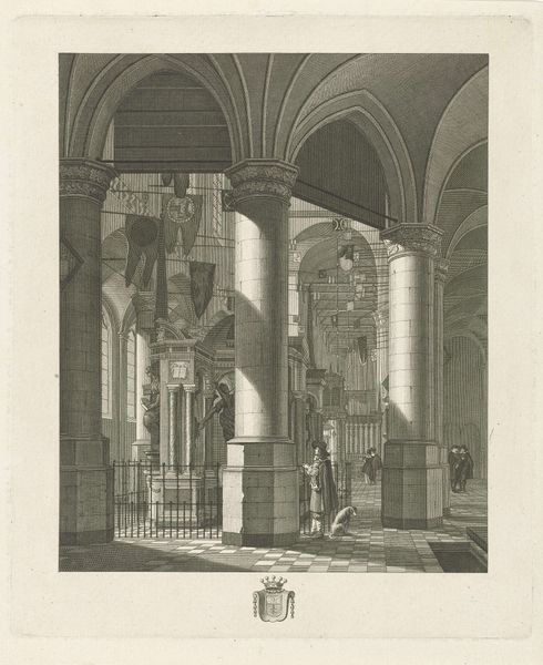
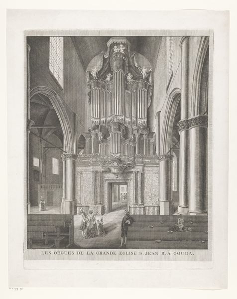
print, engraving, architecture
#
neoclacissism
# print
#
perspective
#
engraving
#
architecture
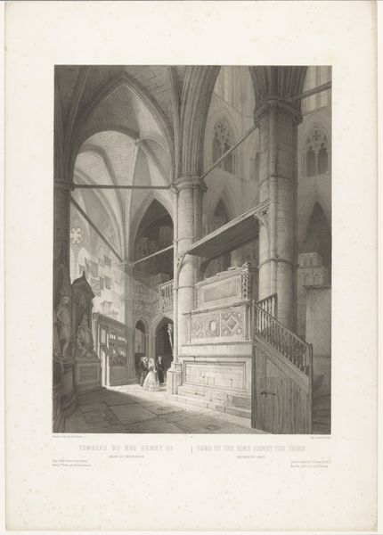
Dimensions: height 226 mm, width 284 mm
Copyright: Rijks Museum: Open Domain
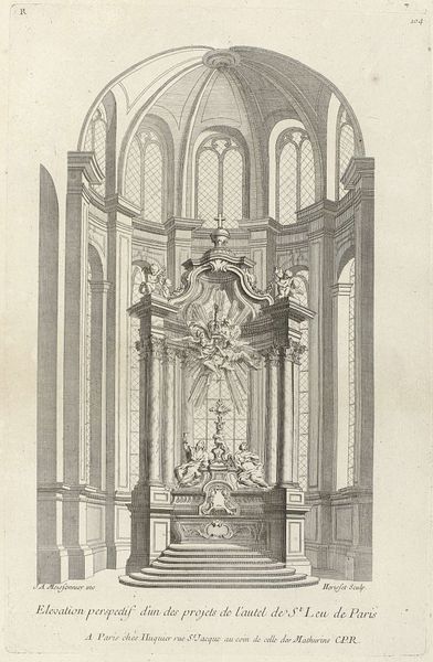
Curator: Here we have Johannes Cornelis Zürcher’s depiction of the tomb of William I of Orange. Executed sometime between 1809 and 1853, this print captures the imposing monument within its architectural setting. Editor: My first impression is how the meticulous details within a somewhat restricted monochromatic palette manage to convey a strong sense of reverence, almost austere, yet the scale makes it also strangely comforting. Curator: It's essential to contextualize William of Orange within the burgeoning nationalist movements of the 19th century. He represented resistance to oppressive rule, a beacon of hope for self-determination. Consider how that message would have resonated in Europe at the time. Editor: Indeed. I see the strategic employment of linear perspective amplifying the monument's presence within the vaulted space of the church, contributing to this feeling. Look at how those lines converge, almost pulling us toward the tomb. Curator: The use of neoclassical forms, evident in the columns and statuary, also plays into the construction of William as a civic hero, echoing the virtues of antiquity—connecting him to notions of Republicanism. Editor: The starkness, that carefully graded shading, and those receding architectural lines emphasize the geometry of the structure and lend the piece a striking level of three-dimensionality. Curator: Let's think about how Zürcher's work reinforces particular readings of Dutch history and national identity at this pivotal moment in the country's political evolution. It served to promote a very specific narrative that we must question. Editor: From a compositional viewpoint, I would suggest it’s interesting how the very absence of vivid color directs attention toward form, construction, and depth, revealing the artist's mastery of engraving techniques. Curator: Exactly, so even the choice of monochrome underscores the historical gravity of the subject, prompting contemplation on issues of legacy and nationhood that must acknowledge the colonial nature of the Netherlands and the Royal family, even centuries ago. Editor: Seeing the print through the lens of its formal qualities and its socio-political context certainly deepens our appreciation.
Comments
No comments
Be the first to comment and join the conversation on the ultimate creative platform.
More like this