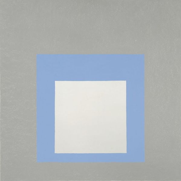
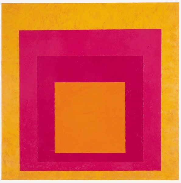
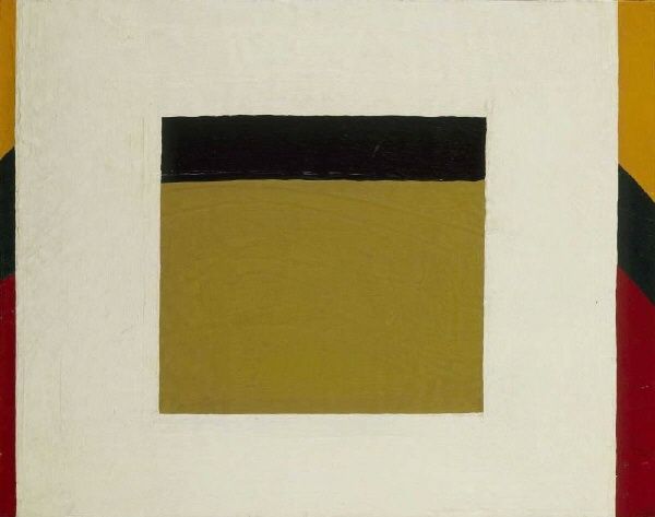
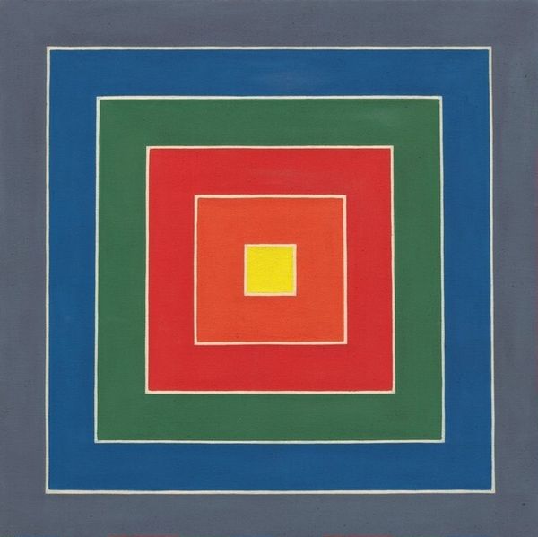
Study for Homage to the Square: Light Rising Possibly 1950 - 1959
0:00
0:00
painting, acrylic-paint
#
abstract-expressionism
#
painting
#
colour-field-painting
#
acrylic-paint
#
form
#
geometric-abstraction
#
abstraction
#
modernism
Dimensions: overall: 81.3 x 81.3 cm (32 x 32 in.) framed: 81.6 x 81.9 x 3.5 cm (32 1/8 x 32 1/4 x 1 3/8 in.)
Copyright: National Gallery of Art: CC0 1.0
Editor: Here we have Josef Albers' "Study for Homage to the Square: Light Rising," likely created sometime in the 1950s. It's an acrylic painting, and what immediately strikes me is how calm it is. Three squares nested inside each other, each a different color. What do you see in this piece, beyond the geometry? Curator: Oh, calm, you say? That's interesting. For me, it's all about controlled energy! Albers believed colors weren't static; they shift and change depending on their neighbors. Think about that vibrant yellow: does it look like the sun just before a storm, peaking out from grey clouds and blue sky? The colour combinations hum, don't they? They vibrate like musical notes in my eye, that play with spatial relationships to create a perception of depth on a flat plane. What would happen if you saw the colour fields interchanged? Editor: I suppose it would disrupt the feeling. That light, inner yellow square really does feel like it’s pushing forward, creating depth... I hadn’t thought about it like that. So, it's not just about the colours themselves, but about how they interact. Curator: Exactly! Albers dedicated his life to understanding these interactions. He was after a very personal response, an emotional reverberation through pure colour and form, beyond language or intellect. Like a sunrise that shifts and glows imperceptibly from moment to moment! He asks us to observe our experience. And if one experiences the grey field of this painting exchanged for blue, how different a picture you’d feel! Does it change your understanding of his colour selection? Editor: Yes, actually. I think it brings the "rising" part into sharper focus for me. I hadn't fully appreciated the intention there. Thanks, that gives me a whole new appreciation for Albers! Curator: And for me too, my perception shifts in understanding your point about his study's sense of “calm” by understanding the experience of observation through the feelings colours imbue as something uniquely beautiful.
Comments
No comments
Be the first to comment and join the conversation on the ultimate creative platform.
More like this