Dimensions: support: 762 x 762 mm frame: 778 x 778 x 35 mm
Copyright: © The Joseph and Annie Albers Foundation/VG Bild-Kunst, Bonn and DACS, London, 2014 | CC-BY-NC-ND 4.0 DEED, Photo: Tate
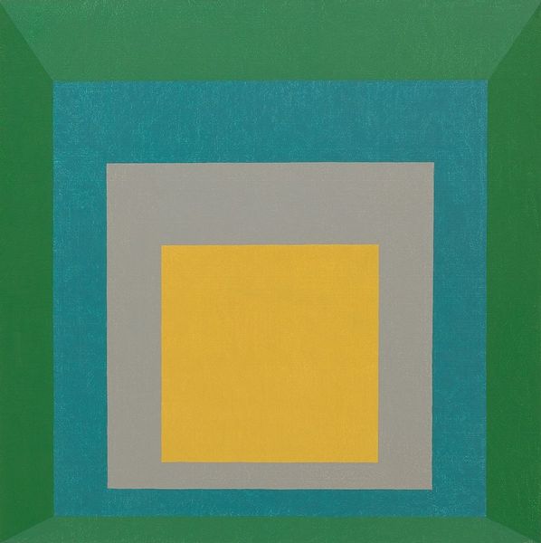
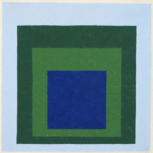
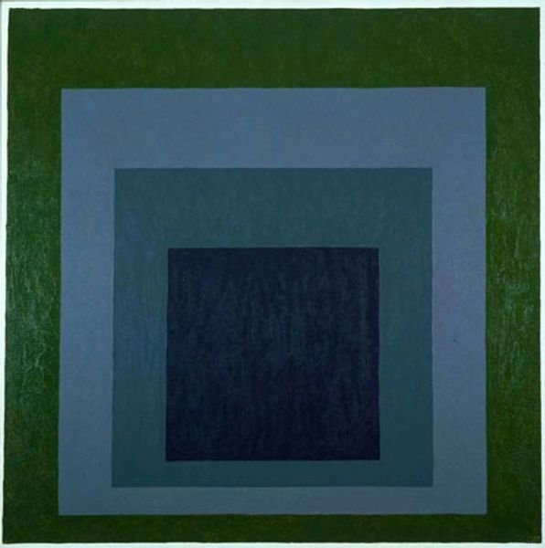
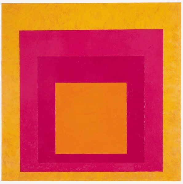
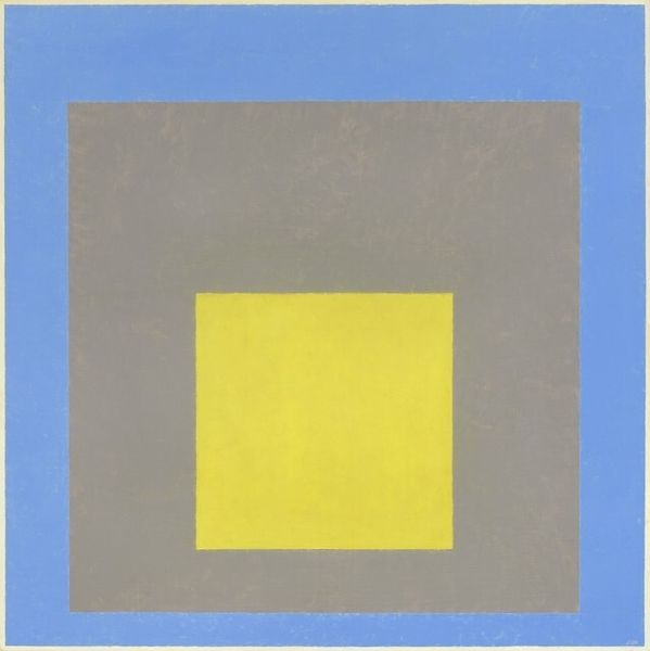
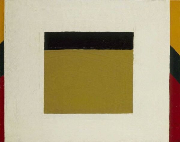
Editor: So, this is Josef Albers' "Study for Homage to the Square." It's hard to put my finger on it, but the nested squares and those colors...it's almost meditative. What do you see in this piece? Curator: Albers, through these geometric forms and carefully chosen hues, taps into a visual language. The square, an ancient symbol of stability and the earth, is repeated, creating a sense of depth, a visual mantra. Note the colours: mustard yellow, muted grey, and teal… Editor: Like building blocks? Curator: Yes, but blocks infused with cultural memory. These are not arbitrary selections. How do these color choices interact, and what emotions or associations do they evoke for you? Editor: I see warmth countered by a cool restraint. I never knew simple shapes could be so loaded with meaning! Curator: Precisely. Albers uses the simplest forms to unlock complex emotional and intellectual responses.
Comments
tate 12 months ago
⋮
http://www.tate.org.uk/art/artworks/albers-study-for-homage-to-the-square-t02311
Join the conversation
Join millions of artists and users on Artera today and experience the ultimate creative platform.
tate 12 months ago
⋮
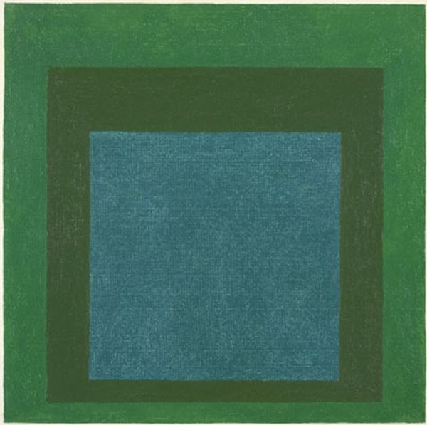
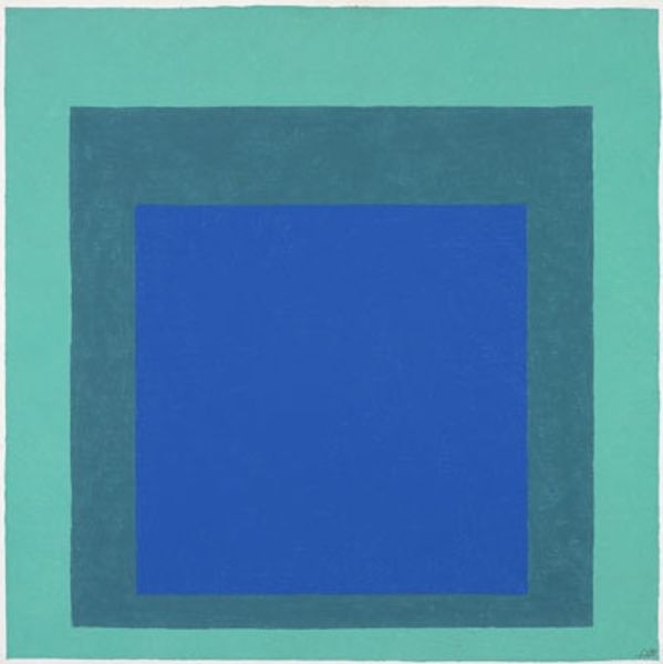
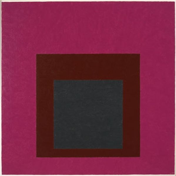
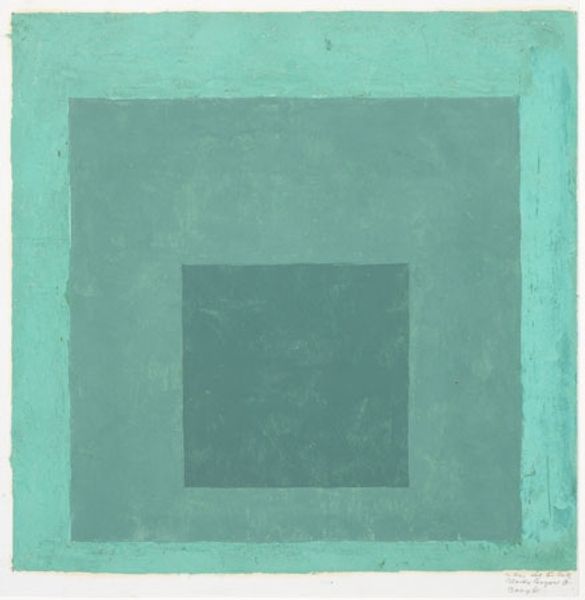
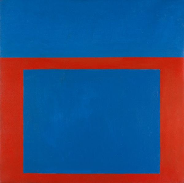
In 1950, at the age of 62, Albers began what would become his signature series, the Homage to the Square. Over the next 26 years, until his death in 1976, he produced hundreds of variations on the basic compositional scheme of three or four squares set inside each other, with the squares slightly gravitating towards the bottom edge. What may at first appear to be a very narrow conceptual framework reveals itself as one of extraordinary perceptual complexity. In 1965, he wrote of the series: ‘They all are of different palettes, and, therefore, so to speak, of different climates. Choice of the colours used, as well as their order, is aimed at an interaction - influencing and changing each other forth and back. Thus, character and feeling alter from painting to painting without any additional ‘hand writing’ or, so-called, texture. Though the underlying symmetrical and quasi-concentric order of squares remains the same in all paintings – in proportion and placement – these same squares group or single themselves, connect and separate in many different ways.’ Gallery label, December 2012
More like this