drawing, pencil
#
portrait
#
drawing
#
baroque
#
figuration
#
pencil drawing
#
pencil
#
northern-renaissance
Dimensions: 14 15/16 x 10 1/16 in. (37.94 x 25.56 cm) (approx.)20 1/2 x 24 15/16 in. (52.07 x 63.34 cm) (mat)
Copyright: Public Domain
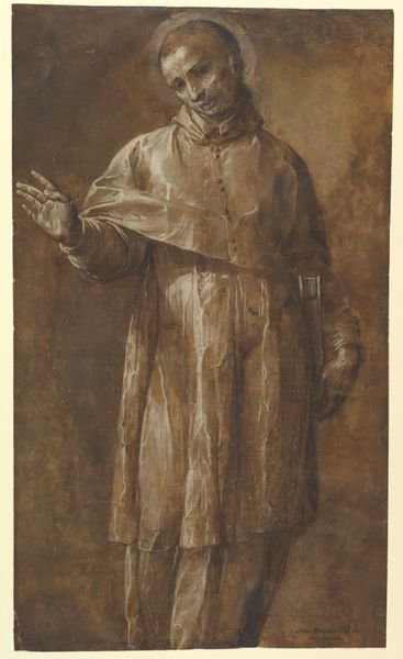
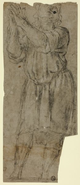
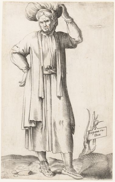
Editor: This drawing is "Study of a Figure in Priest's Robes" from around 1650, created by Jacob Jordaens, here at the Minneapolis Institute of Art. The materials are pencil, I think? I am drawn to the contrast between the soft reddish lines and the more stark black pencil marks... What stands out to you in this piece? Curator: Observe the dynamism inherent in the hatching technique. Jordaens employs this to generate not just tonal variation, but a sense of volume and movement, despite the figure's static pose. The hatching varies in direction and density to sculpt the forms of the robes and capture the fall of light. What semiotic implications do you perceive in the limited colour palette? Editor: Well, the use of red and black, sparingly, feels intentional. It focuses my attention on specific areas, especially the robes themselves, as opposed to the background. It gives the drawing an unfinished, sketch-like quality. So, does the limitation enhance the symbolic nature? Curator: Indeed, the very sketch-like nature could be construed as intentional. The focus on the *how*, rather than the *what*, privileges process over product. I invite you to consider the expressive qualities embedded within the varied textures and tonal shifts across the picture plane. Can we see something of the divine in the materiality? Editor: I see your point! I never really considered how much a focus on materiality could make something feel more expressive, like you can sense the hand of the artist. Curator: Precisely. This is Jordaens engaging with fundamental pictorial problems, not merely representing reality, but investigating its very possibility through line and form. Editor: This has provided an incredible new perspective. I see so much more in what seems like a simple drawing now. Curator: As do I; it has been very insightful exploring this remarkable study with you.
Comments
minneapolisinstituteofart over 2 years ago
⋮
Jacob Jordaens was the leading painter in Antwerp in the generation after Rubens. He was greatly influenced by the elder artist and occasionally worked for him. Though he is now best known for his droll genre pictures, he also painted religious, historical, mythological, and allegorical works. His prolific draftsmanship is represented by some 450 drawings plausibly attributed to him today. Like Rubens, he worked with a decisive hand, and scholars have had some difficulty assigning some drawing with certainty to one or the other. Jordaens' work is characterized by clear contours and insistent hatching. He often mixed media in his drawings. The use of black and red chalk, oiled charcoal, gray wash, and white heightening seen in the present drapery study is elaborate but not exceptional. The combination of red and black chalk is a hallmark of his workaday drawings. The crisp, luminous effect produced by the brush work in gray and white typifies the close attention that he gave to lighting in preparing his compositions. Though the present study has not been connected with a finshed painting, it clearly represents a priest raising his hand in a gesture of blessing.
Join the conversation
Join millions of artists and users on Artera today and experience the ultimate creative platform.
More like this