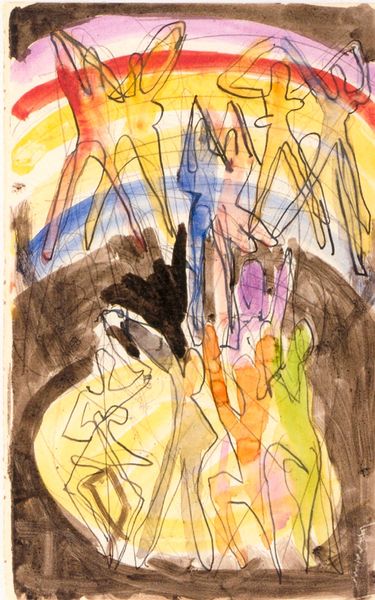
drawing, pastel
#
drawing
#
figuration
#
line
#
pastel
Dimensions: 31 x 42 cm
Copyright: Creative Commons NonCommercial
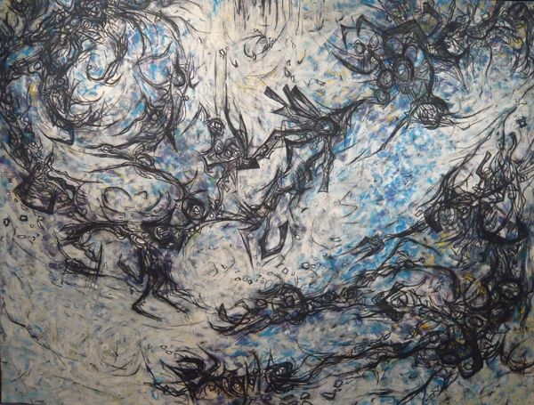
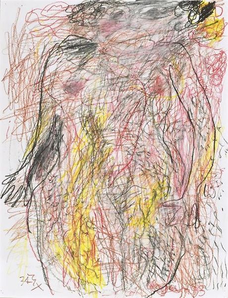
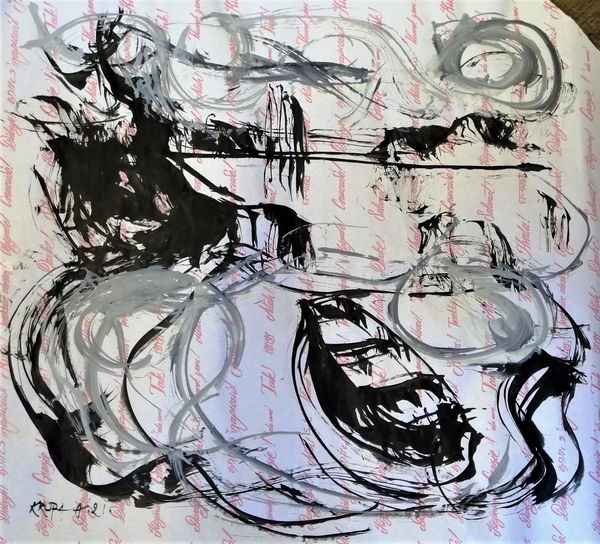
Editor: Here we have "Love," a pastel drawing created in 1993 by Alfred Freddy Krupa. The energetic strokes and vibrant colors against the neutral background give it a lively, almost frenetic feeling. There's definitely movement depicted. What do you see in this piece, taking into account the formal elements? Curator: Examining the drawing purely on its formal merits, the first thing that strikes me is the use of line. Krupa employs line not just to define form, but as form itself. Notice how the varying weights and densities of lines create a sense of depth and volume, even though it’s essentially a flat, two-dimensional plane. The high-key color selection creates chromatic tensions; these combinations could elicit psychological affect based on subjective evaluations, or may be deemed more or less successful based on contextual application. Editor: That's interesting. So you're saying that the lines are not just outlines, but are integral to the overall composition? Curator: Precisely. And consider the layering effect. The overlapping lines and colors generate a complex web that almost obscures any coherent figuration. However, that apparent chaos is deliberately orchestrated to suggest movement and dynamism. Ask yourself how the artist utilized formal organization, and you may realize this seeming randomness is skillfully crafted. Editor: So, while it’s titled “Love” and seemingly depicts figures, its essence is found in the interplay of line and color? Curator: The title "Love" acts almost as a signifier. Yet, the piece's semantic impact relies instead on formal interactions, its dynamism achieved through juxtapositions in lines and color relationships. It poses pertinent semiological and ontological arguments. Editor: I never thought about the line weights as being so important in conveying depth. Curator: It invites us to perceive abstraction, in concert with recognizable motifs. How would it have read in monochromatic scheme or static form? I contend that this pastel is less a portrait of ‘love’ and more of formal exercise. Editor: I understand better now. The emotional quality is not as straightforward. Looking closely reveals abstract tensions rather than immediately feeling affection. Curator: An excellent way to see art history as the outcome of cultural enterprise and not the exclusive creation of aesthetic demigods, that existentially are removed from the day-to-day exigencies and exigencies.
Comments
No comments
Be the first to comment and join the conversation on the ultimate creative platform.
More like this