acrylic-paint
#
non-objective-art
#
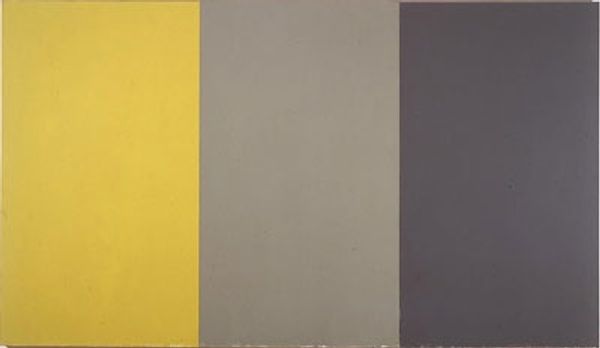
colour-field-painting
#
acrylic-paint
#
capitalist-realism
#
geometric-abstraction
#
pop-art
#
line
#
modernism
#
hard-edge-painting
Copyright: 2019 Gerhard Richter - All Rights Reserved
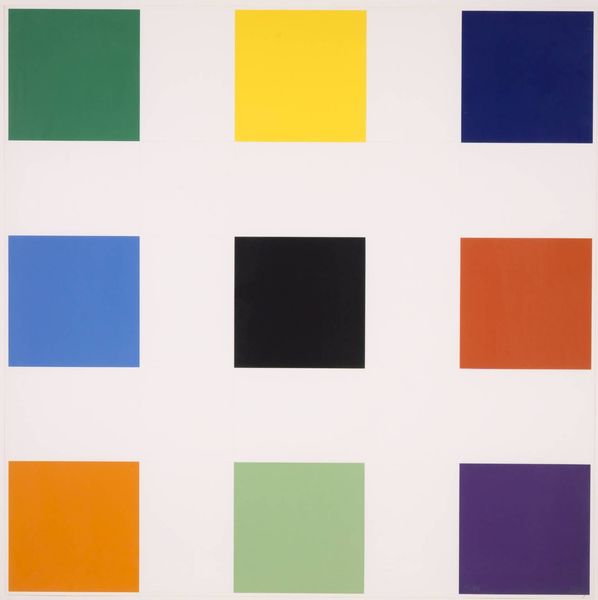
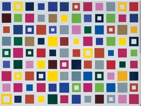
Gerhard Richter made this painting, Color Chart No. 139 1, and well, it is what it says it is. Color! Nine squares of it. I like how he’s turned something functional—like a paint sample—into something to be contemplated. It’s like he’s asking, what even *is* color? Each square is its own world, its own mood. Take the red one in the middle row. It’s not just red; it’s got depth, a kind of quiet intensity. And the way it sits next to that blue—whew! Talk about a conversation. Richter’s charts remind me a bit of Mondrian, but without the dogma. Where Mondrian was all about rules, Richter feels more open, more like he’s just playing with what color can *do.* It's like he’s saying, "Here are the tools, now go make something beautiful, or strange, or both." It's art as an invitation, not a lecture.
Comments
No comments
Be the first to comment and join the conversation on the ultimate creative platform.
More like this