About this artwork
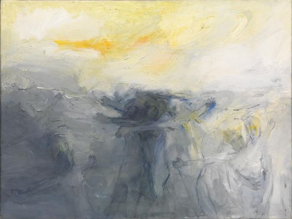
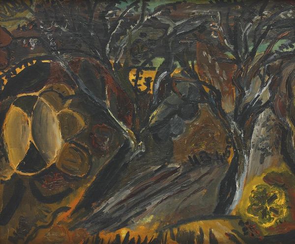
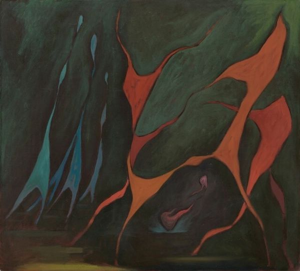
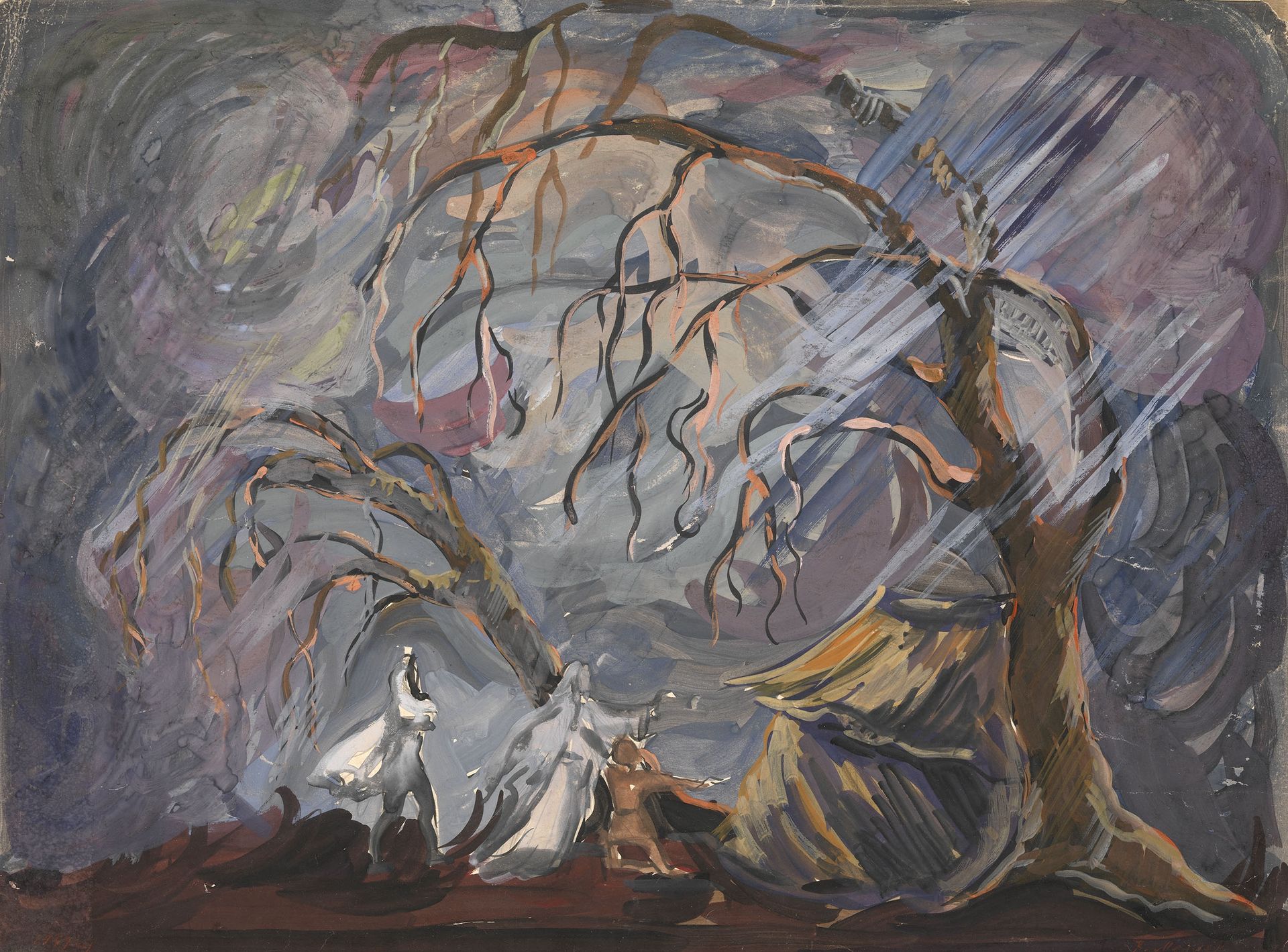
Editor: Here we have Vadym Meller’s mixed-media painting, “Set Design for ‘King Lear’,” created in 1959. It immediately strikes me as desolate. The figures seem dwarfed by the skeletal trees and turbulent sky. What do you see in this piece from a formal perspective? Curator: The effectiveness of this set design resides within its skillful manipulation of visual elements. Consider the stark contrast between the illuminated figures and the oppressive darkness of the background. Note how Meller deploys diagonal lines—in the beams of light, the tree branches—to disrupt any sense of stability. Editor: The lines definitely add a sense of unease. Is it primarily the arrangement and relationship of lines and colours that dictates the Expressionistic feel of this design? Curator: Precisely. It’s about understanding the aesthetic function and the emotive value of these formal choices. The impasto technique, where paint is applied thickly, lends a textural depth, mirroring the emotional weight of Shakespeare’s tragedy. See how the light, though bright, feels almost violent as it slices through the darkness. Editor: I hadn’t considered the application of the paint itself contributing to the overall drama, rather than simply the colours or shapes it creates. Curator: Indeed. Reflect also upon the asymmetry; the composition refuses a simple, balanced reading. What, do you think, would this visual strategy bring to the stage? Editor: It emphasizes the disruption and chaos inherent in the play; a world turned upside down. Thanks, I'm starting to appreciate the formal components of the painting and what they communicate about "King Lear". Curator: Yes, considering the artist's intentional choices in light, composition, and materiality enhances the viewing experience.
Artwork details
- Copyright
- Vadym Meller,Fair Use
Comments
Share your thoughts
About this artwork
Editor: Here we have Vadym Meller’s mixed-media painting, “Set Design for ‘King Lear’,” created in 1959. It immediately strikes me as desolate. The figures seem dwarfed by the skeletal trees and turbulent sky. What do you see in this piece from a formal perspective? Curator: The effectiveness of this set design resides within its skillful manipulation of visual elements. Consider the stark contrast between the illuminated figures and the oppressive darkness of the background. Note how Meller deploys diagonal lines—in the beams of light, the tree branches—to disrupt any sense of stability. Editor: The lines definitely add a sense of unease. Is it primarily the arrangement and relationship of lines and colours that dictates the Expressionistic feel of this design? Curator: Precisely. It’s about understanding the aesthetic function and the emotive value of these formal choices. The impasto technique, where paint is applied thickly, lends a textural depth, mirroring the emotional weight of Shakespeare’s tragedy. See how the light, though bright, feels almost violent as it slices through the darkness. Editor: I hadn’t considered the application of the paint itself contributing to the overall drama, rather than simply the colours or shapes it creates. Curator: Indeed. Reflect also upon the asymmetry; the composition refuses a simple, balanced reading. What, do you think, would this visual strategy bring to the stage? Editor: It emphasizes the disruption and chaos inherent in the play; a world turned upside down. Thanks, I'm starting to appreciate the formal components of the painting and what they communicate about "King Lear". Curator: Yes, considering the artist's intentional choices in light, composition, and materiality enhances the viewing experience.
Comments
Share your thoughts
