print, etching, typography
#
aged paper
#
hand written
#
medieval
#
hand-lettering
#
dutch-golden-age
# print
#
etching
#
hand drawn type
#
hand lettering
#
personal sketchbook
#
typography
#
hand-written
#
hand-drawn typeface
#
stylized text
#
handwritten font
Dimensions: height 140 mm, width 190 mm
Copyright: Rijks Museum: Open Domain
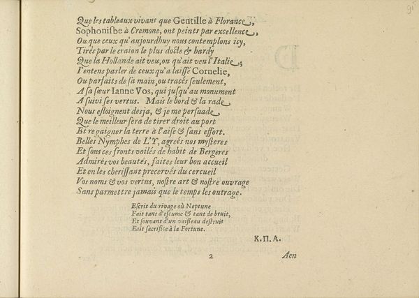
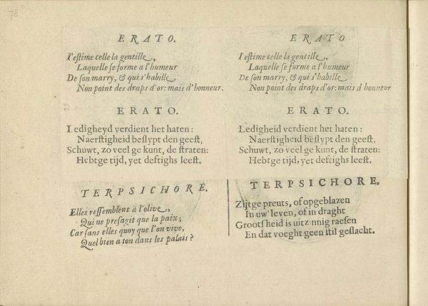
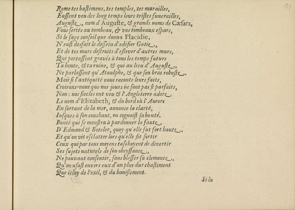
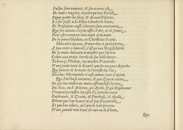
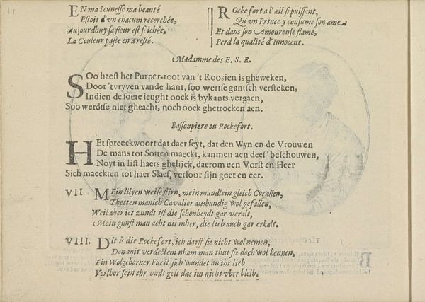
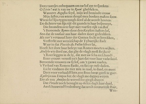
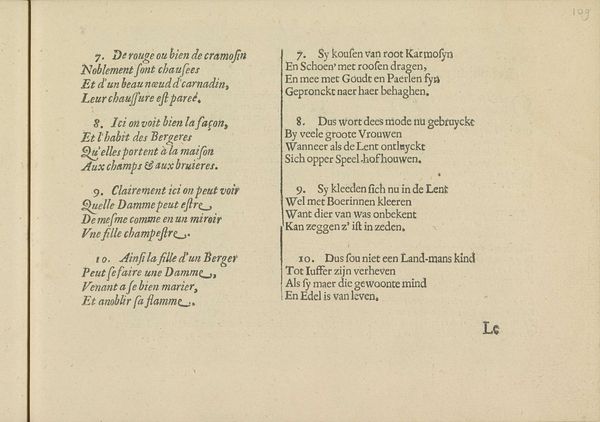
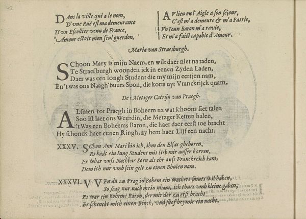
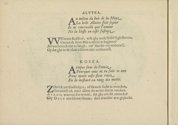
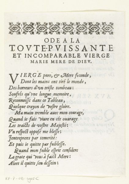
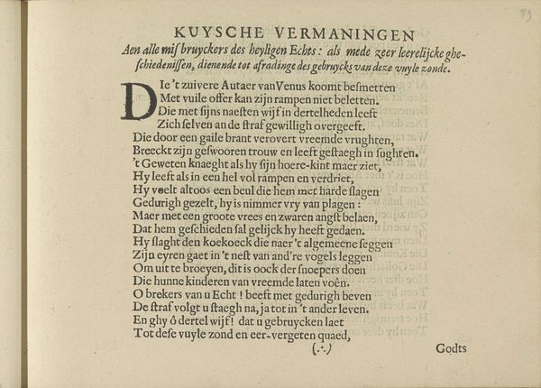
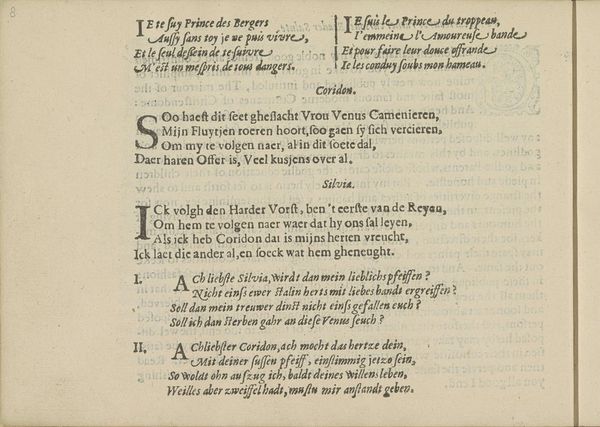
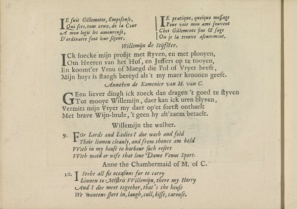
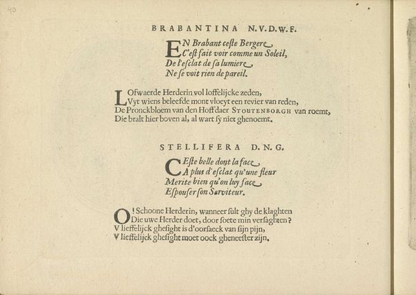
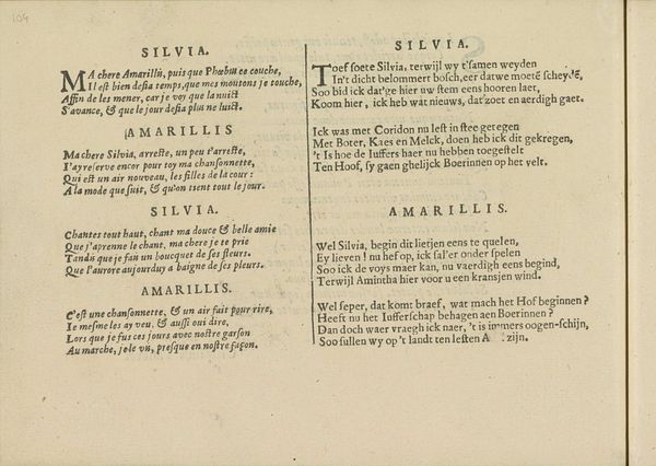
Curator: Here we have "Gezang in twee talen, pagina 1" by Crispijn van de (II) Passe, created around 1640. It's currently held in the Rijksmuseum. What are your initial thoughts? Editor: There's an immediate austerity to the piece, despite the presence of musical notation and text. The precise lettering, clearly hand-drawn, and the neat arrangement of the lines contribute to a sense of formalized restraint. It feels almost… utilitarian, but meticulously so. Curator: Indeed. It's a print, primarily etching, showcasing typography from the Dutch Golden Age. I'm drawn to the interplay of languages here – the French at the top gives way to Dutch below. It hints at a multilingual audience and perhaps even a blending of cultural influences. Editor: That's interesting because, focusing on its materiality, I’m thinking about the labor involved. Creating the plate for printing, etching each note and letter, reversing the text. It highlights printmaking as a skilled craft, pushing back against ideas of pure artistic genius. The replication factor allows wider distribution for popular songs, indicating some kind of musical commonality within its target culture. Curator: Absolutely, and consider the semiotic weight of that aged paper. Its color evokes the passage of time and reminds us of the historical context within which the piece was produced. The very texture, worn and possibly handled repeatedly, adds a layer of depth to its interpretation. Editor: And thinking about consumption – what did it mean to own a page like this? It looks like part of a songbook. Maybe amateur musicians practiced with this? It’s functional, designed to be handled, marked, and used up – that contrasts beautifully with the precision of the etched surface. Curator: A fascinating perspective! In terms of form, the contrasting blocks of script and musical notation structure the page vertically, giving it a visual rhythm not unlike the rhythm of the music itself. The large initial "M" and "Y" are stylized with foliated motifs to invite the singer. Editor: Yes, it is not only information and distribution of lyrics, but speaks to a lifestyle through the production means; each tiny stroke of the etching needle is a meditation, not unlike practicing singing itself. I had initially judged the hand lettered song page for its stiffness, but you changed my perspective by discussing cultural context. Curator: It’s the close readings, the attentive considerations of context and craftsmanship, that allow artworks like these to continue speaking across centuries. Thank you!
Comments
No comments
Be the first to comment and join the conversation on the ultimate creative platform.
