Copyright: Peter Busa,Fair Use
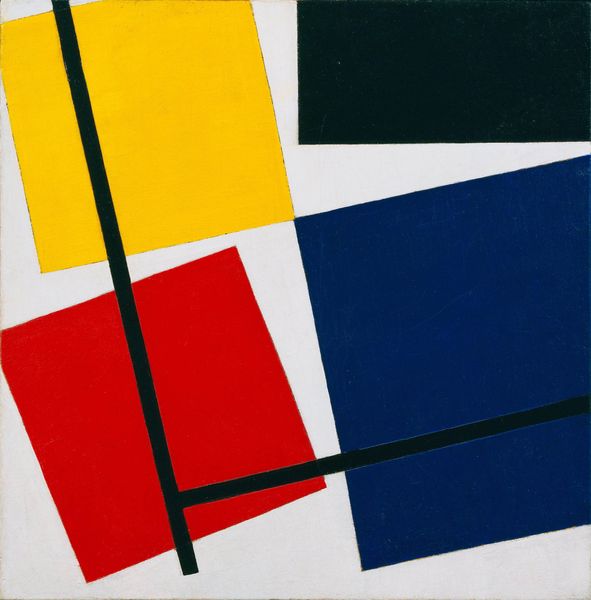
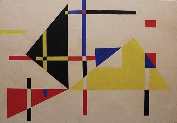
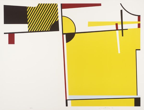
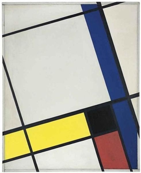
Editor: This is Peter Busa’s "Valspar" from 1977. It presents strong geometric forms rendered in bold, primary colors. There is something so direct and self-contained in its stark simplicity; how do you approach a piece like this? Curator: Precisely. Busa utilizes geometric shapes not to represent external realities but as objects in themselves. The composition emphasizes the interplay of color and form. Observe how the juxtaposition of red, yellow, blue, and black shapes creates a dynamic tension, an internal energy. Editor: So, the focus isn't on what these shapes might represent, but how they interact visually? Curator: Precisely. We are invited to contemplate the relationships between these elemental forms: the hard edges of the shapes and their placement in relation to each other within the pictorial space. Do you notice the variations in scale between each colored geometric? Editor: Yes, the blue shape feels broader, more expansive, while the red seems more contained, perhaps due to its rectangular nature? Curator: Indeed. Busa creates a sense of spatial depth through overlapping and the deliberate manipulation of color and scale. Color Field Painting pushes towards the perception of color as the primary subject. Editor: So, looking closely at the relationship between form and color allows me to grasp what Busa wanted to convey. Thank you! Curator: Absolutely. By focusing on the intrinsic qualities of form and color, we gain a deeper appreciation of its visual complexity and the dynamic interplay of elements within its composition.
Comments
No comments
Be the first to comment and join the conversation on the ultimate creative platform.
More like this