drawing, print, watercolor, ink
#
drawing
#
dutch-golden-age
#
ship
# print
#
pen sketch
#
landscape
#
watercolor
#
ink
#
line
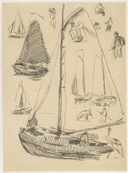
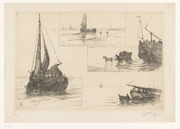
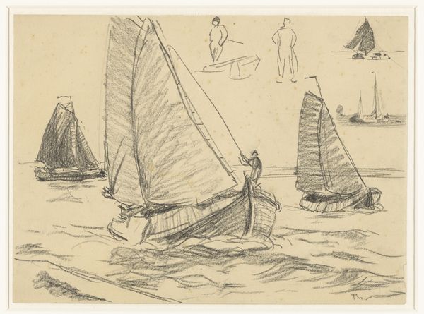
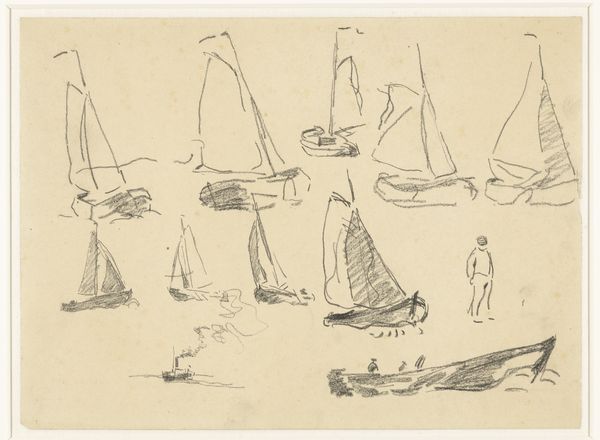
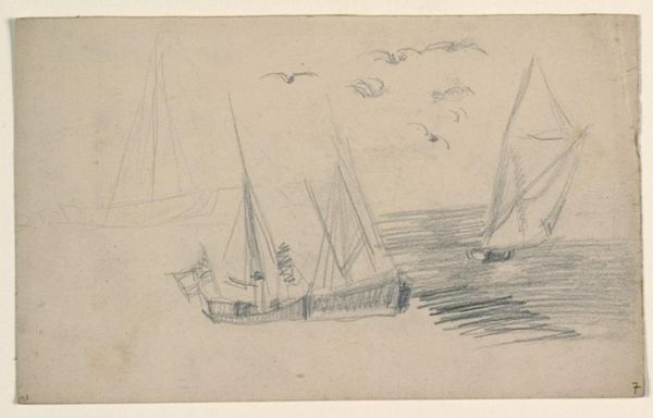
Dimensions: sheet: 11 1/4 x 6 15/16 in. (28.5 x 17.6 cm)
Copyright: Public Domain
Editor: We’re looking at Willem van de Velde the Younger’s "Studies of Ships and Boats," created sometime between 1640 and 1707. It’s currently housed at the Met. It appears to be a pen and ink drawing or perhaps a print, and what strikes me most is its incredible economy of line. What do you see in this piece from a formalist perspective? Curator: Precisely. Observe how van de Velde II masterfully utilizes line to delineate form and space. The strategic variations in line weight create depth, despite the absence of color and reliance on a minimal tonal range. Semiotically, each line functions as a signifier, collectively constructing a representation of maritime vessels. Notice how the artist doesn't rely on shading in the conventional sense, but instead employs hatching and cross-hatching. What effect do you think that has on the overall reading of the work? Editor: I think the hatching gives the sails a feeling of volume. Because of the density of the hatching, some areas feel shadowy and it does simulate light even in the absence of tone. Curator: Good observation. Think about the formal composition itself. The arrangement of the ship studies isn't random. The positioning encourages the eye to travel across the composition in a non-linear manner, almost like the unpredictable movements of vessels on water. The white space, then, operates as more than mere background. How would you argue for the importance of negative space in this work? Editor: The negative space allows the ships to breathe, to have their own identity, even as they relate to each other in the composition. Without it, it would feel crowded and illegible. Curator: Precisely. This underscores the deliberate structural choices made by the artist. Understanding the intrinsic qualities unlocks so much about the piece’s success. Editor: It is amazing how much you can appreciate by looking at the formal aspects. I would've glossed over these, otherwise. Curator: Indeed. It's a language that is so worth developing, and van de Velde II has offered us a fine composition to begin to decode this visual language.
Comments
No comments
Be the first to comment and join the conversation on the ultimate creative platform.
More like this