drawing, paper, ink
#
drawing
#
narrative-art
#
impressionism
#
paper
#
ink
Copyright: Rijks Museum: Open Domain
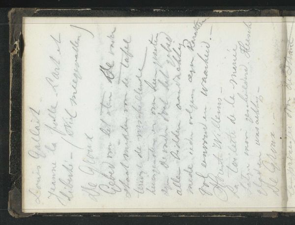
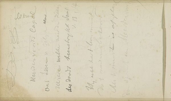
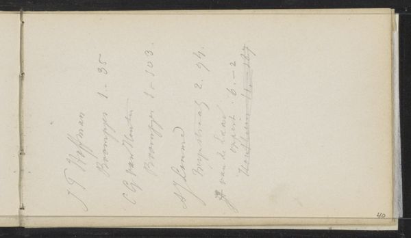
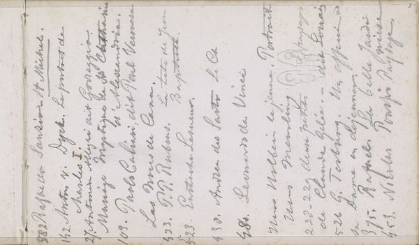
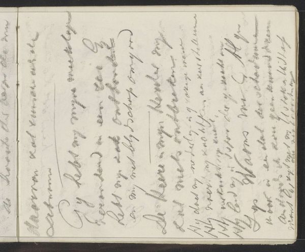
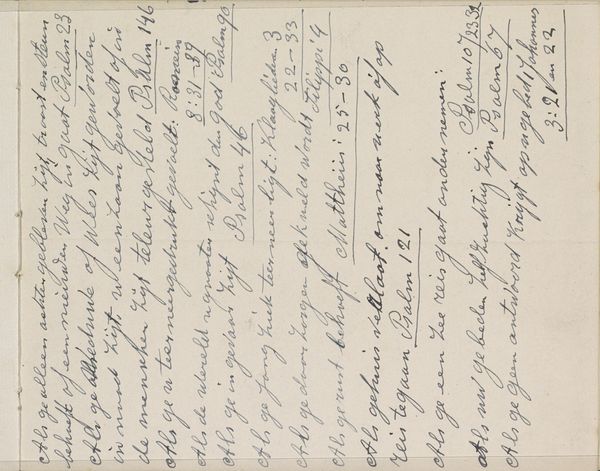
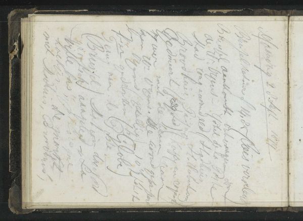
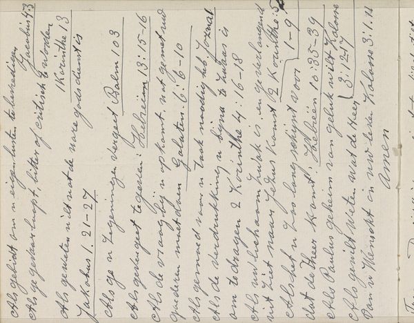
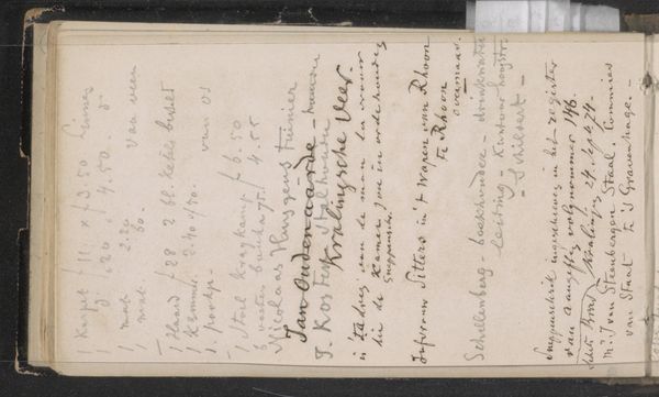
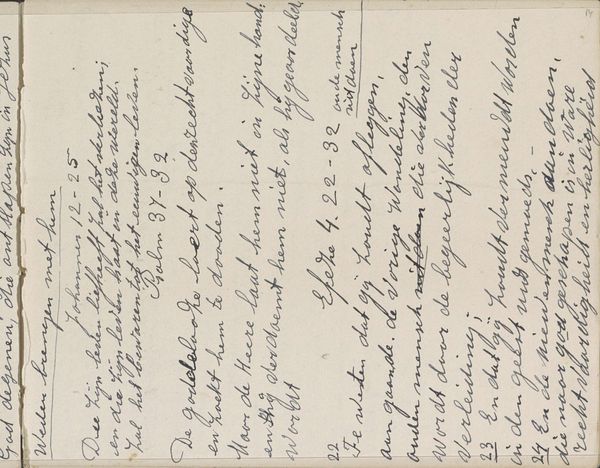
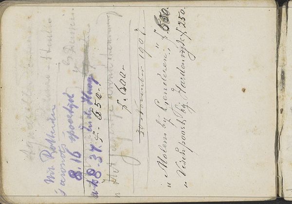
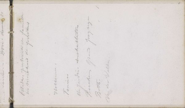
Curator: Let us observe closely the composition of “Notities,” dating back to around 1879, crafted by Theo Hanrath using ink on paper. Editor: It gives the sense of peeking into someone's private notebook. It seems quite informal. What do you see in it? Curator: It is a fascinating arrangement of textual elements upon the page. Observe the linearity – or perhaps, the intentional disruption of it – in the script’s directionality. Note how the texture of the paper interacts with the ink; where pressure is applied, the ink bleeds. Editor: I do notice the change in pressure as well as the texture of the page, so were all these lines meant to complement each other and not a separate idea? Curator: Is there actually clear intent to form a holistic composition? Or does the placement and interplay between different textual and visual motifs produce an interesting effect? We should analyze the recurring shapes within the individual letters themselves. Observe 'd', 'p' or even '&'. The forms contain slight variation but have an obvious resemblance, hinting that we may need to consider how the elements speak to one another. Editor: Interesting perspective, to delve deeply into these finer strokes, perhaps looking closer is actually the way to understand Hanrath’s notes better. Curator: By contemplating these aspects, the viewer may enter into a space of introspection with a much better chance of extracting meaning from Hanrath's notes. Editor: I find myself thinking a lot more about negative spaces. Curator: It is key.
Comments
No comments
Be the first to comment and join the conversation on the ultimate creative platform.
More like this