drawing, watercolor
#
drawing
#
water colours
#
watercolor
#
decorative-art
Dimensions: overall: 35.7 x 26.1 cm (14 1/16 x 10 1/4 in.)
Copyright: National Gallery of Art: CC0 1.0
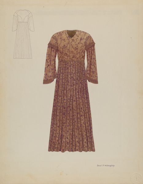
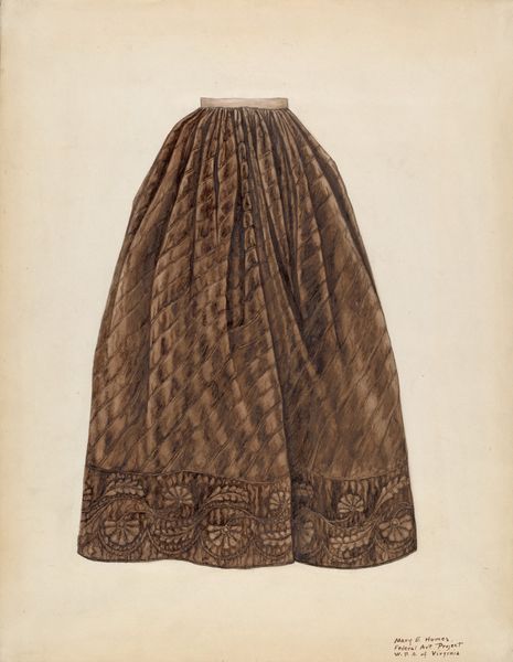
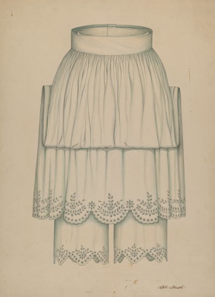
Editor: So this watercolor drawing, titled "Apron" and created around 1940 by David P. Willoughby, is striking. The almost monochromatic palette and emphasis on the embroidered floral pattern feels incredibly intentional. What jumps out at you? Curator: The strength of this work lies in its controlled palette. The artist’s dedication to shades of brown elevates a mundane domestic object to a study in tone and texture. The floral motif becomes almost abstract in its repetition and placement along the apron's edges. Do you observe the implied texture created through the watercolor technique itself? Editor: Yes, now that you mention it, the layering gives the brown areas a velvet-like depth. I see how the limited palette actually emphasizes the material qualities. But doesn't focusing solely on those qualities ignore potential readings related to the apron as a domestic symbol? Curator: It is the aesthetic organization that initially demands attention. Consider the interplay of the flat plane of the paper and the illusion of depth created through layering of pigment and detail, creating an interesting tension. Is this an image of a domestic object, or a study of lines, form and tonal relations? Editor: I see what you mean, analyzing it as a pure arrangement of form and color creates another level of understanding! Curator: Precisely! Looking closely, the negative space is just as active. Note how it highlights the artwork’s form. Editor: That is very true. Curator: The lack of background concentrates our attention on what is relevant and the artist allows us to focus on the aesthetic qualities. I think that's where its artistic value resides. Editor: I definitely appreciate the interplay between object and form in a new way. Thanks!
Comments
No comments
Be the first to comment and join the conversation on the ultimate creative platform.
More like this