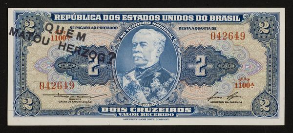
Curatorial notes
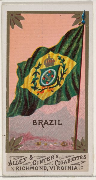
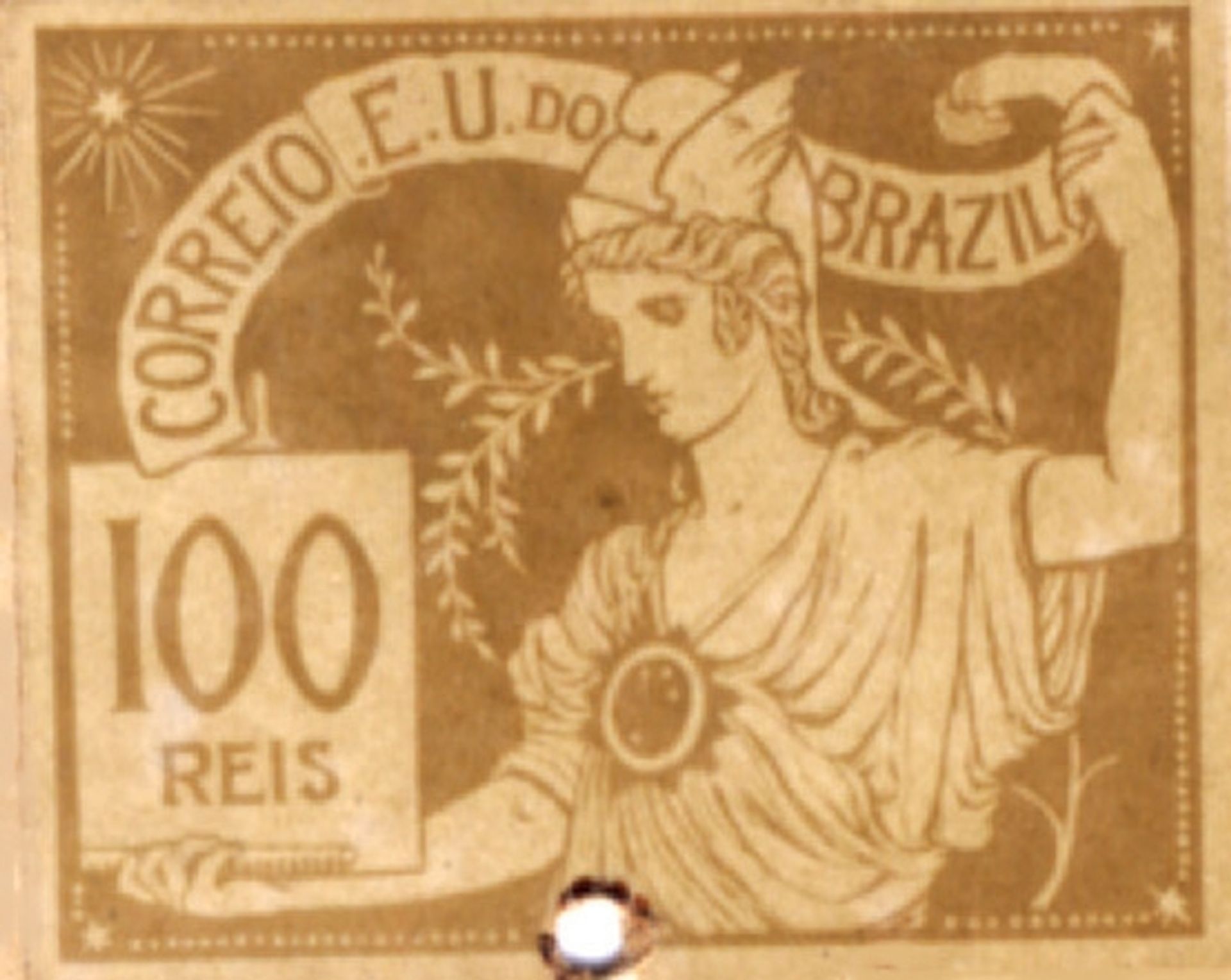
Editor: Here we have Eliseu Visconti's 1903 stamp, "The Trade," a print with drawing elements. It's… surprisingly neoclassical for a postage stamp! The figure seems inspired by Roman depictions of Mercury, the god of commerce. What cultural forces do you think prompted the adoption of this imagery for something as functional as postage? Curator: It's fascinating to see how nation-building efforts often leaned on classical imagery to project an image of order, prosperity, and connection to established power structures. Brazil, eager to assert its place on the world stage at the turn of the century, would have found resonance in these symbols. Notice how "Brazil" itself is emblazoned on a banner. How do you see the calligraphic elements fitting into that national narrative? Editor: That makes a lot of sense! I guess the stylized text and border elements, alongside the Roman figure, project a blend of tradition and modernity. So, it's like, “We're Brazil: a nation embracing progress but also rooted in… well, an imagined classical heritage.” Curator: Precisely. And what about the inscription “Correio E.U. do Brazil?” It subtly suggests a link to the more established postal systems while simultaneously stamping (no pun intended) Brazil's unique identity. Does it strike you as a particularly effective piece of propaganda, given its small scale and everyday function? Editor: It's cleverly insidious, almost! The message seeps into daily life unnoticed, legitimizing the Brazilian state with every letter sent. Curator: Indeed. This piece reminds us that even seemingly mundane objects can participate in profound social and political dialogues. I see in this small print much larger themes. Editor: I'll never look at a stamp the same way again! The deliberate choices in imagery to cultivate public perception are really eye-opening.