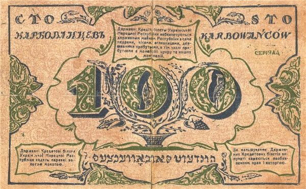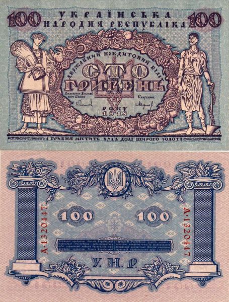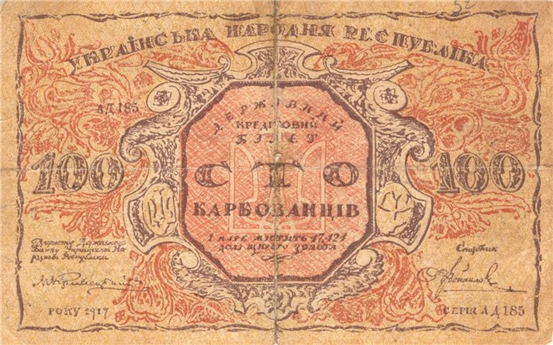
1917
100 karbovanets of the Ukrainian National Republic (avers)
Listen to curator's interpretation
Curatorial notes
Editor: We’re looking at the front of a 100 karbovanets bill from the Ukrainian National Republic, designed in 1917 by Heorhiy Narbut. It's an example of graphic art printed on paper, and it has this intricate, almost medieval feel to it. What do you see in terms of its formal elements? Curator: Initially, it is important to observe the bilateral symmetry meticulously structuring the composition. Note the centrality of the ornamental cartouche which is itself balanced. The designer contrasts the rigid, geometric shapes, such as the octagonal frame, with the flowing, organic forms of the calligraphic ornamentation. How does this tension influence your understanding? Editor: I see that it creates a really interesting visual rhythm and grounds my eyes towards the center of the composition. I also appreciate the use of line throughout the artwork. Curator: Indeed. Observe the artist’s strategic variation in line weight and density; consider how it generates both depth and visual interest. This linearity accentuates the abstract qualities of the design, transcending the mere function of currency and positioning it as an independent aesthetic object. Can you detect other structural techniques? Editor: Yes! The repeated use of numbers and text in both Ukrainian and what appears to be an older script creates this layered effect and intricate texture. It emphasizes pattern and design over pure readability, doesn't it? Curator: Precisely. The formal arrangement subverts immediate utilitarian concerns, inviting deeper contemplation on the interplay between textual elements and visual design. Consider then how Narbut uses semiotic signifiers beyond their literal monetary function. It becomes a visual language of authority and national identity. Editor: It’s amazing how much can be communicated through these formal choices! Curator: Agreed, by attending closely to these elements we can glean insight into Narbut’s skill and, ultimately, the historical currents and values that underpin its creation.