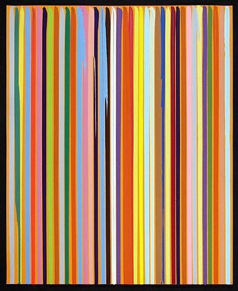
Copyright: Gene Davis,Fair Use
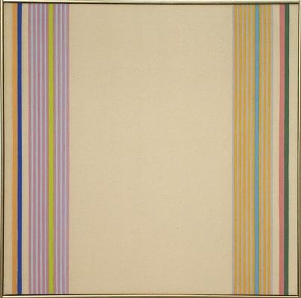
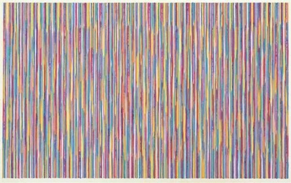
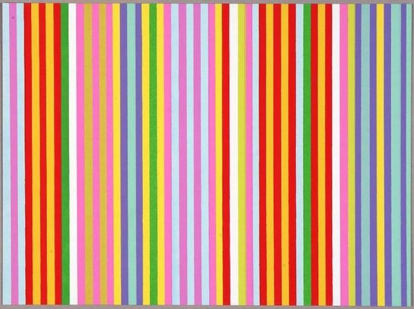
Gene Davis made this painting, Treble, with what looks like acrylic on canvas. It's a real exercise in seeing, isn't it? The way Davis lays down these vertical stripes, it's all about the rhythm of color. The paint isn’t trying to hide itself; it’s pretty flat and even, not too thick, which makes you focus on the colors and the spaces between them. Look how some stripes are softer, almost pastel, while others pop with a brighter hue. It's like he's playing with a musical scale, pushing and pulling your eye across the surface. That blank space underneath isn't really blank, is it? It's more like a quiet pause, setting off the stripes above. Davis reminds me a little of Agnes Martin, in how he creates these simple forms that somehow open up to something bigger. It’s not about what it represents, but more about how it makes you feel, a harmony of color and space that keeps you looking.
Comments
No comments
Be the first to comment and join the conversation on the ultimate creative platform.
More like this