typography
#
art-deco
#
figuration
#
typography
#
decorative-art
Copyright: Erte,Fair Use
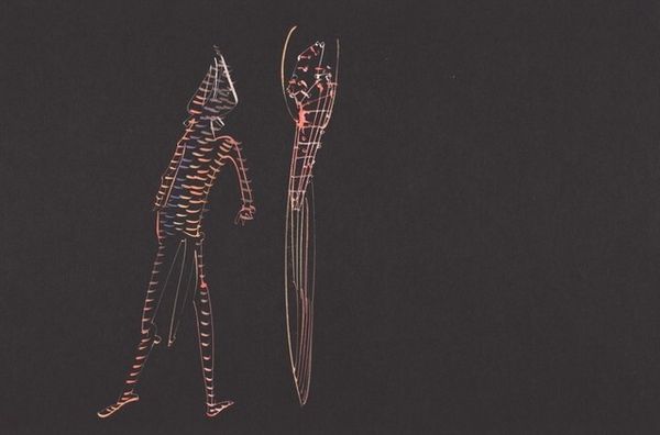
Editor: Erte's "Alphabet Z" transforms the letter into a symbol of stylized decadence. The flowing figure feels so characteristic of Art Deco design. What story do you think Erte is trying to tell with this image? Curator: To me, Erte's “Alphabet Z” encapsulates the cultural moment of its creation. It is not simply a letter, but a commentary on femininity, class, and performance. Can you see how the female figure becomes almost architectural, blending the female form with decorative motifs? This piece, typical of the Art Deco era, elevates the concept of the flapper—the "new woman"—and interrogates their place in a rapidly changing social landscape. Editor: I see what you mean! It is interesting how the letter seems to disappear and is replaced with an idealized form. Curator: Exactly! This speaks to how Art Deco wasn't merely about decoration; it also served to reconstruct identities through careful manipulations of image and design. Consider also the power dynamics at play. Who was this ideal designed for? And who did it exclude? Editor: That really makes me think about how the figure, draped in these luxurious fabrics, is also kind of confined by them. Almost like a gilded cage. Curator: Precisely. Erte invites us to question the seeming liberation of the Art Deco era and to recognize the constraints that existed, particularly for women navigating societal expectations around beauty, identity, and autonomy. Editor: This has really opened my eyes to the social commentary hidden within what I initially saw as simply a decorative piece. Curator: And hopefully that encourages everyone listening to think critically about the art they engage with!
Comments
No comments
Be the first to comment and join the conversation on the ultimate creative platform.
