graphic-art, print, typography, poster
#
word art style
#
pattern out of typography
#
colouring book
#
graphic-art
#
art-nouveau
#
hand-lettering
# print
#
lettering
#
hand drawn type
#
landscape
#
typography
#
hand lettering
#
figuration
#
word art
#
typography
#
fading type
#
symbolism
#
italian-renaissance
#
poster
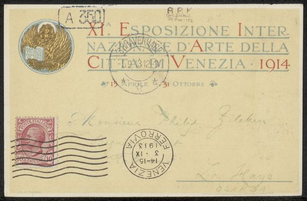
Copyright: Public domain
Editor: This is "Stamp Posta Di Fiume," created in 1919 by Leopoldo Metlicovitz, a graphic art poster. It has a very intricate typographic design, and the word art reminds me of something between Art Nouveau and Italian Renaissance. What do you see in this piece? Curator: I see a potent statement on identity and self-determination. Look closely. This stamp, produced during a turbulent period for the city of Fiume—now Rijeka, Croatia—represents more than just a postal artifact. It embodies a struggle for national belonging. Editor: Belonging? I thought it was just a pretty stamp. Curator: Consider the sociopolitical context. After World War I, Fiume was a contested territory between Italy and what would become Yugoslavia. This stamp visualizes the yearning of the Italian population in Fiume to be unified with Italy, it captures the cultural moment of that precise historical moment. Editor: So the typography… Curator: The typography becomes a visual argument. The words themselves declare the city’s identity and aspirations. Notice how 'Costituente Fiumana’ dominates the composition. Who gets to decide the city’s future? Who gets a voice? How does language shape that narrative? Editor: It's much more than just aesthetics then. It makes me wonder, are stamps always political statements, just waiting to be uncovered? Curator: Indeed! Art is rarely created in a vacuum, is it? What at first seems decorative can often reveal deeper truths about power, identity, and the human condition, which enriches our dialogue across time.
Comments
No comments
Be the first to comment and join the conversation on the ultimate creative platform.
More like this