drawing, graphic-art, print, engraving
#
drawing
#
graphic-art
# print
#
figuration
#
form
#
11_renaissance
#
line
#
engraving
Copyright: National Gallery of Art: CC0 1.0
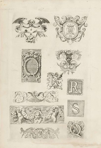
Editor: This engraving, titled "Pendant," is by Robert Nanteuil. What strikes me first is the level of detail achieved purely through line work. It’s a bit puzzling, almost like a page of ornamented initials. What can you tell me about it? Curator: Indeed. Let us first consider the rigorous deployment of line in Nanteuil’s composition. Observe how variations in thickness and density create the illusion of volume, particularly in rendering the textures of the cherubic figure, the eagle’s feathers, or the ornate crown. Note how lines are tools to delineate shapes but also construct tonal variations. Editor: I see. So, the variations aren't just decorative; they build up the forms themselves. Is there any specific framework we should use for interpretation? Curator: We should note that we might consider this a preparatory sheet for prints, demonstrating various letterform designs. What, then, does the combination of forms signify? Is there a hierarchy implied? Or does the even-handed presentation of each form suggest another design, for a printed page, or an emblem? Editor: The crown supported by an angel and an eagle seems significant. The letter "A" seems much less elaborated than, say, "F." The other letters fall somewhere in the middle in terms of embellishment. Curator: Precisely. We could ask: What system organizes the images in terms of forms? Is it merely alphabetical? Or do symbolic relationships emerge? Note, too, the isolated emblem of the radiant sun. Editor: This way of looking at forms, shapes and lines makes you think that all parts come together to form a symbolic pattern, as if all elements form a secret language. Curator: In short, to comprehend any design requires that one learn to understand its alphabet.
Comments
No comments
Be the first to comment and join the conversation on the ultimate creative platform.
More like this