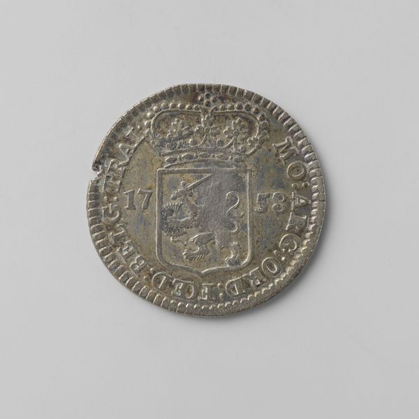
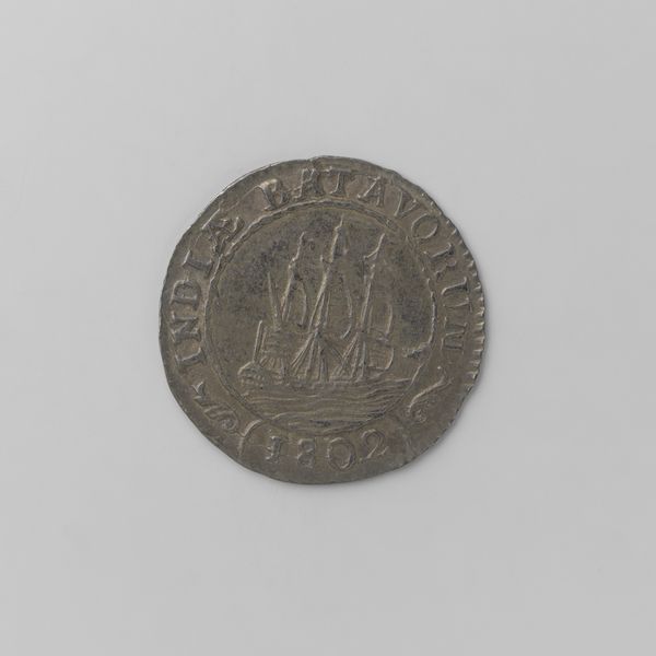
Dimensions: diameter 2.2 cm, weight 3.41 gr
Copyright: Rijks Museum: Open Domain
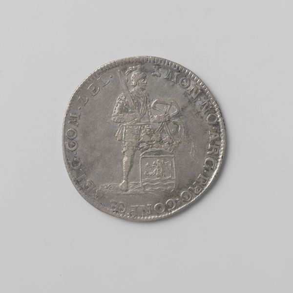
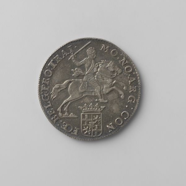
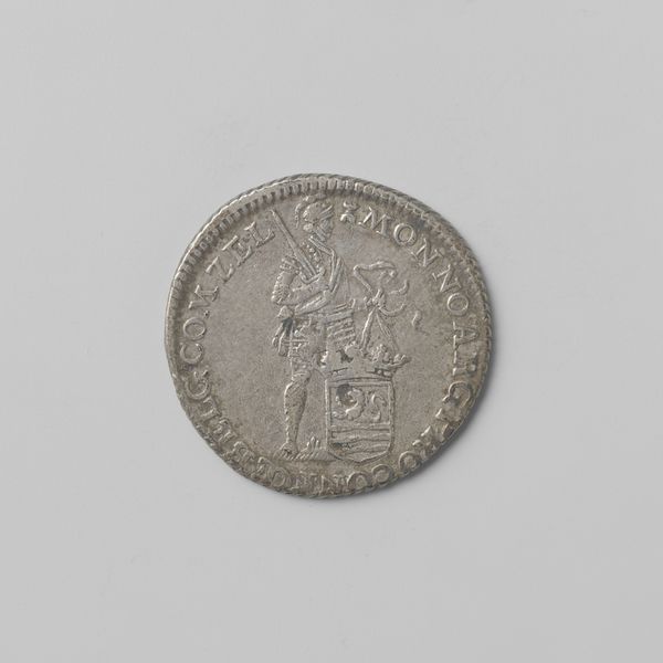
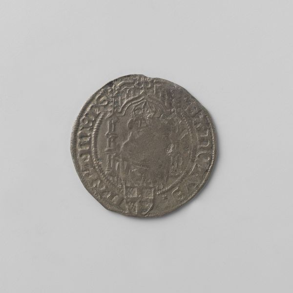
Editor: Here we have a Zeeuwse kwart silver ducat from 1788, from the Province of Zeeland. It's a diminutive piece, a coin, but I'm struck by the clarity of the engraving, and I notice there is text running around the circumference and what looks to be an allegorical figure in the center. What stands out to you? Curator: Formally, I'm drawn to the relationship between the figure and the inscription. Observe how the engraver uses the figure, which appears as if he's holding an arrow, along with the bordered seal underneath to interrupt the circular inscription. It creates visual tension, disrupting what would otherwise be a predictable symmetry. Editor: Tension? How so? Curator: The figure's stance, slightly off-center, pulls the eye away from a perfect circular flow. This intentional asymmetry introduces a dynamic quality to the coin. Furthermore, consider the texture—the smooth surface of the metal contrasting with the finely etched details of the figure and text. Do you perceive any sense of depth here despite it being a coin? Editor: Well, now that you mention it, yes. The engraver has created an illusion of depth through line weight, haven't they? The figure almost seems to emerge from the background. Curator: Precisely! The lines defining his body are finer than those composing the other figures and the surrounding text. What might happen if everything were uniformly inscribed? Editor: I suppose it would feel flatter, less dynamic. It’s really remarkable how the artist achieves so much depth and dimensionality with such a limited medium. I hadn't considered the engraving as more than just informational. Curator: Exactly, by observing formal aspects and design qualities closely we realize the artist created the piece beyond just recording an inscription. Close attention can be quite rewarding!
Comments
No comments
Be the first to comment and join the conversation on the ultimate creative platform.
More like this