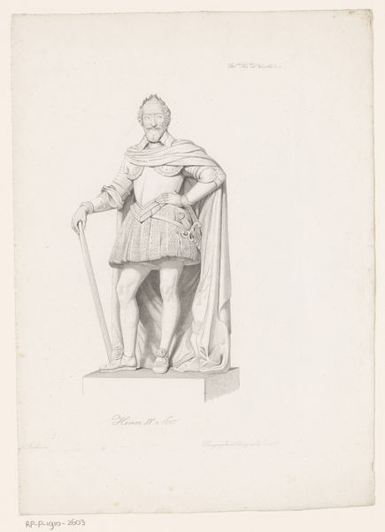
drawing, print, ink, sculpture, pen
#
portrait
#
drawing
#
statue
# print
#
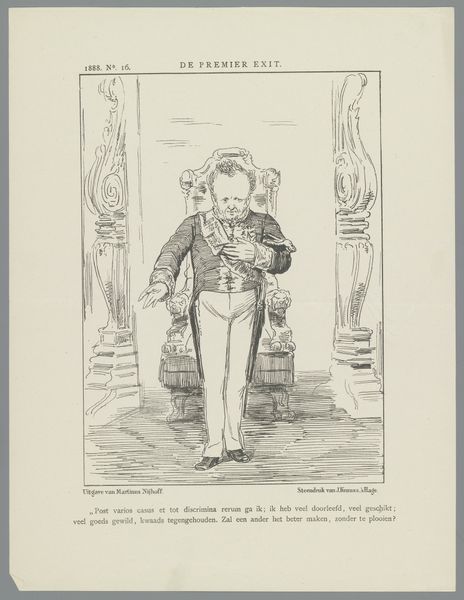
caricature
#
ink
#
sculpture
#
pen-ink sketch
#
pen
#
history-painting
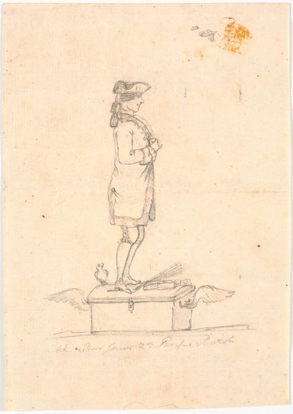
Dimensions: height 275 mm, width 215 mm
Copyright: Rijks Museum: Open Domain
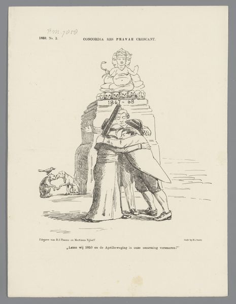
Editor: We're looking at "Spotprent op het standbeeld van Coen," from 1869, a pen and ink print. It's a caricature of a statue. The detail is incredible given the medium, but there's also something stark about its simplicity. How do you interpret this work? Curator: The effectiveness of this print lies in its formal contrasts. Note the stark linearity of the statue juxtaposed with the delicate, almost lace-like quality of the figure's collar and sleeves. The hatching and cross-hatching create a play of light and shadow, adding volume and depth, even within the limitations of ink on paper. Editor: So you see the beauty more in the technical elements than in the… subject? Curator: The subject serves the technical execution. Observe the carefully constructed composition. The figure dominates, yet the architectural base anchors it, providing a sense of stability, while his gaze extends outward to something beyond the page. Editor: Is there symbolism in that gaze, perhaps? Curator: Perhaps. Semiotics, while relevant, often relies on conjecture. Here, the statue itself is the signifier, Coen the signified. His attire and pose are signifiers, all communicating elements of wealth, power, and vision. Note the year "1619," etched in simple Roman letters, lending an aspect of both historicity and perhaps something of satire? The choice of line—its thickness, its direction, its density—each contribute to a coherent, expressive whole. Editor: I never really looked at a statue caricature like that before, seeing the formal structure and how it works in communicating through composition and materials instead of narrative. Curator: Exactly. And that, in essence, is the formalist project.
Comments
No comments
Be the first to comment and join the conversation on the ultimate creative platform.
More like this