drawing, print, paper, engraving
#
drawing
#
allegory
#
baroque
# print
#
paper
#
history-painting
#
engraving
Dimensions: 247 × 179 mm
Copyright: Public Domain
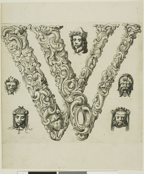
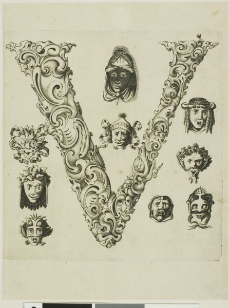
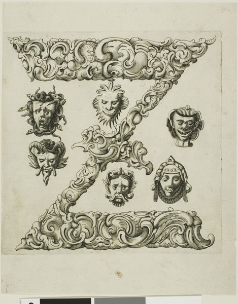
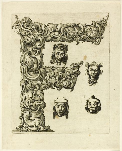
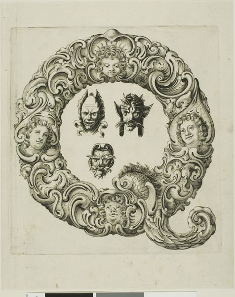
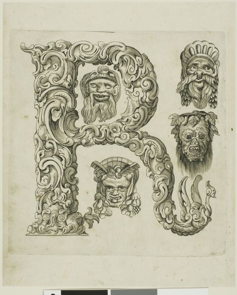
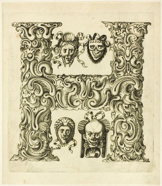
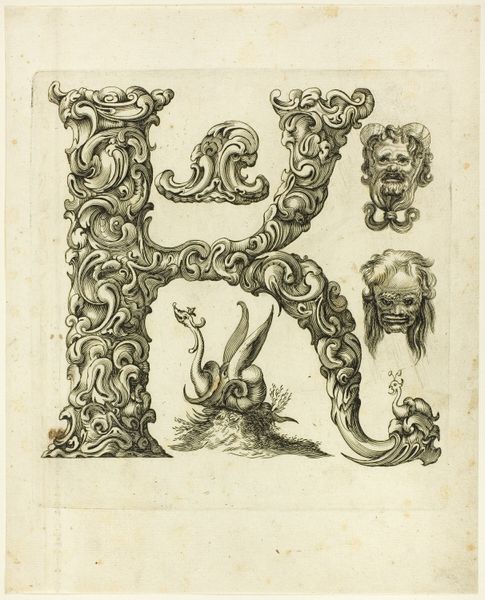
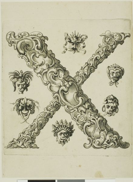
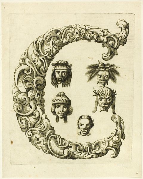
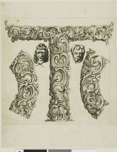
Editor: Here we have Peter Aubry’s “Letter Y,” an engraving from 1630. It’s amazing how the artist transformed a simple letter into such an ornate design! I’m really intrigued by the grotesque masks arranged around the Y itself. How do you interpret this work? Curator: Intriguing indeed! Disregarding iconographic or symbolic readings for a moment, focus on the structural elements. Note how the swirling lines of the letter 'Y' create a dynamic interplay with the relatively static forms of the mask. How does the stark contrast in texture contribute to the visual impact? Editor: The texture definitely stands out; the ‘Y’ feels alive, like it's made of twisting vines or something fluid, compared to the hard, carved look of the faces. I wonder if the artist intentionally disrupted our conventional understanding of letters? Curator: Precisely! Aubry exploits the graphic potential inherent in letterforms. Notice how the positive and negative space dictates the distribution of light, enhancing the interplay between form and void. This generates a palpable tension. Does that reading influence your perspective of the work? Editor: It does. By shifting my focus to the basic formal elements—lines, shapes, light, and space— I understand better how the engraving engages my eye, inviting continuous exploration within its self-contained visual system. Curator: Absolutely. Abstraction is key here; a deep formal analysis yields understanding beyond narrative possibilities. This piece reminds me that close attention to compositional mechanics opens avenues for visual experience. Editor: I agree. Analyzing this “Letter Y” through a Formalist lens reveals how its design sparks visual interest, going far beyond alphabetic representation. Thank you!
Comments
No comments
Be the first to comment and join the conversation on the ultimate creative platform.
More like this