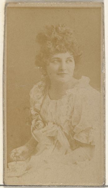
Rosabel Morrison, from the Actresses series (N245) issued by Kinney Brothers to promote Sweet Caporal Cigarettes 1890
print, photography
portrait
photography
Dimensions: Sheet: 2 1/2 × 1 7/16 in. (6.4 × 3.7 cm)
Copyright: Public Domain
Curator: This is a trade card from 1890, part of the "Actresses" series issued by Kinney Brothers to promote Sweet Caporal Cigarettes. It depicts Rosabel Morrison. Editor: It's striking. The sepia tones create this very intimate, almost dreamlike atmosphere. It's so soft and evocative; she looks directly at the viewer, but the style somehow blurs direct engagement, right? Curator: Well, Kinney Brothers weren't exactly aiming for high art with these. Think about the distribution. These cards were mass-produced, inserted into cigarette packs. So the focus was as much on commerce as art, right? Rosabel Morrison becomes a vehicle for advertising a product within the emergent market of actresses’s fan cards. Editor: Yes, but let's consider its composition. The light is diffused, softening the contours of her face, really bringing out her delicate features. The hat and the floral details provide a kind of frame, directing your gaze inward. The slight tilt of her head also contributes to its inherent asymmetrical aesthetic. Curator: I see your point, but let’s look closer at those materials and production methods. These cards would have been printed quickly and cheaply to maximize profits, the choice of actress wasn't merely aesthetic; she would need to be recognizable and glamorous enough to move the cigarettes. Editor: But within that context, there’s still artistry. It embraces principles that resemble the visual motifs evident throughout Japonisme and art nouveau. Curator: Well, her fame was leveraged. Her image associated with a consumable good. These cards helped shape a new kind of consumer culture, blending entertainment and tobacco use. It is a piece of evidence that displays an early version of modern marketing. Editor: I agree with this context, absolutely! I will maintain however, that even within those constraints, the anonymous artist composed this image to achieve balance and harmony within a portrait format, creating a quiet but firm statement. Curator: It is fascinating to see this trade card not only as product marketing but also a reflection of the social landscape of its time. Editor: Absolutely; examining art through both a lens focused on design, composition, and form and in the larger context of a consumable resource will give visitors greater insights into how this print card lives on today.
Comments
No comments
Be the first to comment and join the conversation on the ultimate creative platform.