drawing, paper, ink
#
drawing
#
ink drawing
#
paper
#
ink
#
pen-ink sketch
#
pen work
#
calligraphy
Copyright: Rijks Museum: Open Domain
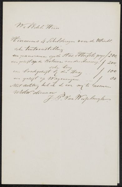
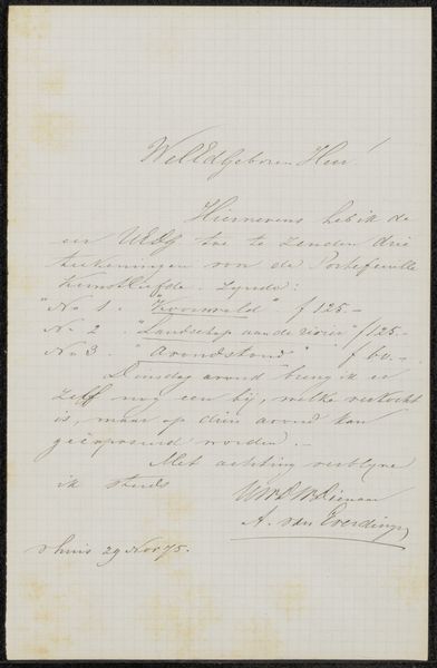
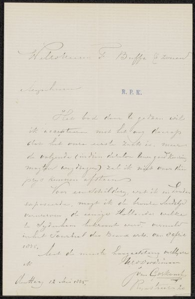
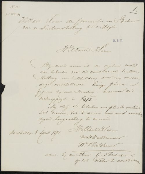
Curator: Here we have "Brief aan Frans Buffa en Zonen," or "Letter to Frans Buffa and Sons," a pen and ink drawing on paper, possibly created in 1875 by Karel Frans Philippeau. Editor: My initial impression is one of subdued elegance. The composition is stark, with the text occupying a small portion of the paper, but the script itself possesses a rhythmic quality. Curator: Precisely! Notice how the calligraphic hand isn’t merely functional; it’s expressive. The swelling and tapering lines of the ink create a dynamic visual texture, almost like a miniature abstract drawing contained within each word. We can see here the influence of Italic and perhaps some Carolingian minuscule scripts influencing the formal structure of Dutch handwriting at this period. Editor: But it’s more than just aesthetics, isn’t it? Consider who Frans Buffa and Sons were: prominent art dealers in Amsterdam. This letter isn’t just an artistic flourish; it’s a document situated within the art world’s power structures. What might Philippeau be requesting or offering? Is it an invitation, a complaint, or a negotiation of some kind? These details change the read entirely! Curator: A keen observation. The ambiguity is indeed thought-provoking. However, focusing solely on socio-economic factors risks obscuring the artistic intention behind the piece itself. Look at the balance created through the dual columns and use of negative space as critical formal choices. These compositional choices allow our eye to perceive the letter as a work of intentional art, with a specific form, rhythm, and balance that could only occur via deliberation and design, rather than mere communication of simple meaning. Editor: It is worth pondering what role language plays within this structure. The penmanship isn't as rigid as block lettering or font. Here, each looping line has personality! Consider the fact that penmanship carries gendered and classed meaning, marking Philippeau as someone cultured with very specialized and exclusive artisanal skills. This level of mastery creates the effect of wealth through access and technique. Curator: I see it both ways now. The very act of writing elevates language itself. Editor: Yes! Context and form combine to allow us a very textured sense of a slice of life.
Comments
No comments
Be the first to comment and join the conversation on the ultimate creative platform.
More like this