drawing, paper, ink
#
portrait
#
drawing
#
paper
#
ink
Copyright: Rijks Museum: Open Domain
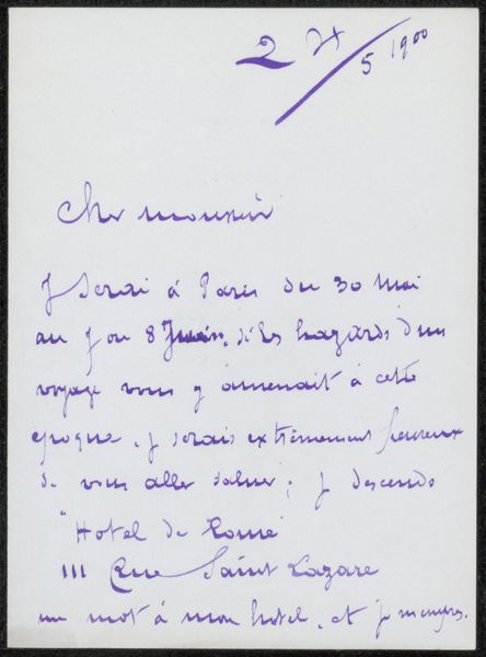
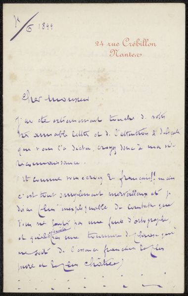
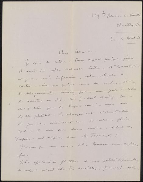
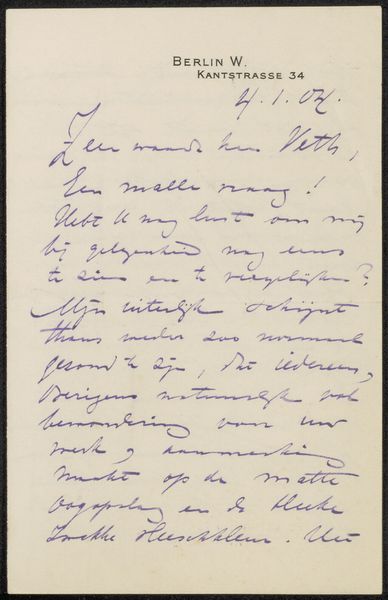
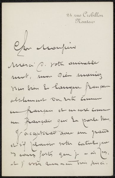
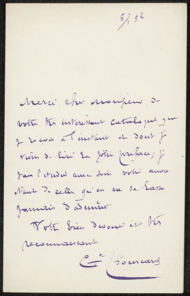
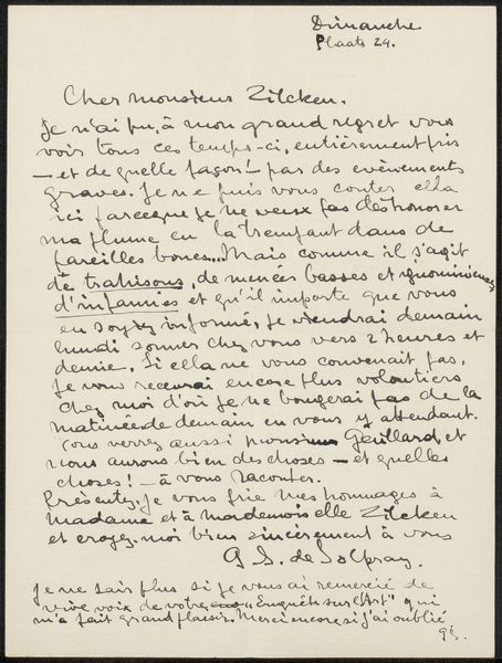
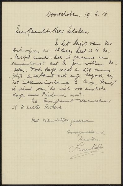
Editor: Here we have "Brief aan Philip Zilcken," possibly from sometime between 1900 and 1926, by Gustave Bourcard. It’s an ink drawing on paper. Looking at the handwriting, the neatness of the script and the elegant letterhead give it such a formal feeling. How do you read the visual components of the drawing itself? Curator: The initial visual impact arises from the contrast of the saturated ink against the blank paper. Note how the calligraphic forms are not merely communicative but possess an intrinsic aesthetic quality. Observe, for instance, the looping ascenders and descenders, the pressure and release of the pen, and the overall balance achieved on the page through the distribution of positive and negative space. How does the paper as a field contribute to the experience of the work? Editor: That’s interesting, I hadn’t thought about the negative space as contributing something to the work, I always think about it in painting! It does really highlight the texture and density of the script. What do you think of the date on the work itself? Curator: Indeed. As for the inscription indicating a potential date – the "26/1900," and place—"24 rue Crébillon Nante"—it acts less as fixed data and more as elements within the visual field, complicating our reading. These notations, by sharing similar materiality with the main body of text, encourage the reader to consider the letter as object, the date as formal gesture, before meaning. Do you follow? Editor: I think so, like considering it less as something intended to be read. As more of a set of carefully drawn forms making up the overall artwork, right? Curator: Precisely! Considering it this way we recognize that its significance goes beyond simple information transmittal, but it prompts an understanding of relationships of graphic signs within its carefully orchestrated space. The artwork resides then in a tension between writing as a sign system, and abstract line, shading, and form. Editor: Thanks! Looking at the drawing through that lens brings an entirely new appreciation for it. It's almost like a performance!
Comments
No comments
Be the first to comment and join the conversation on the ultimate creative platform.
