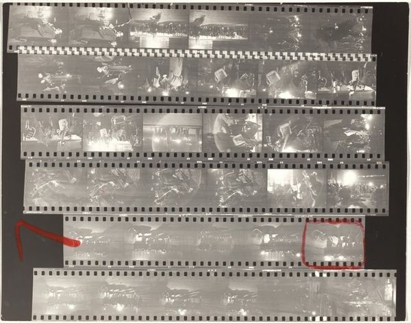
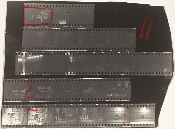
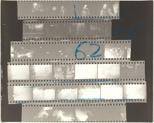
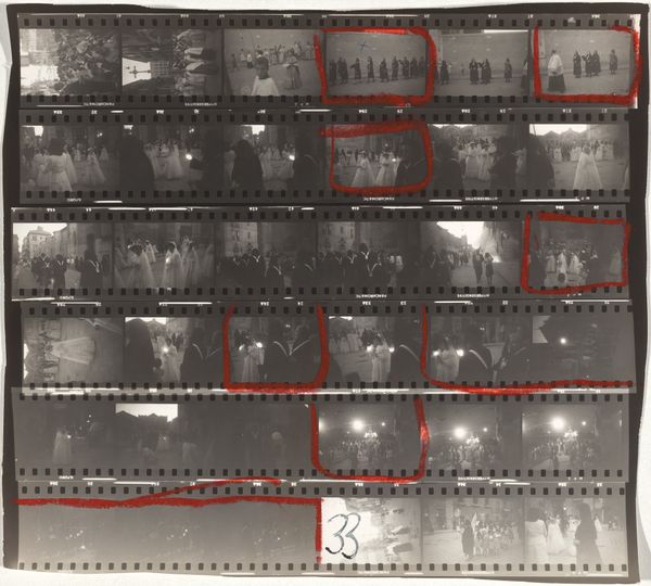
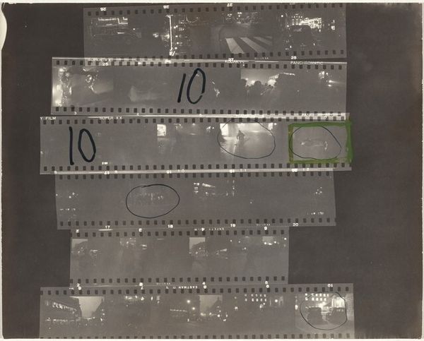
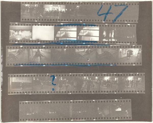
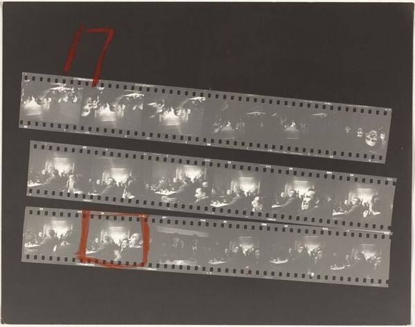
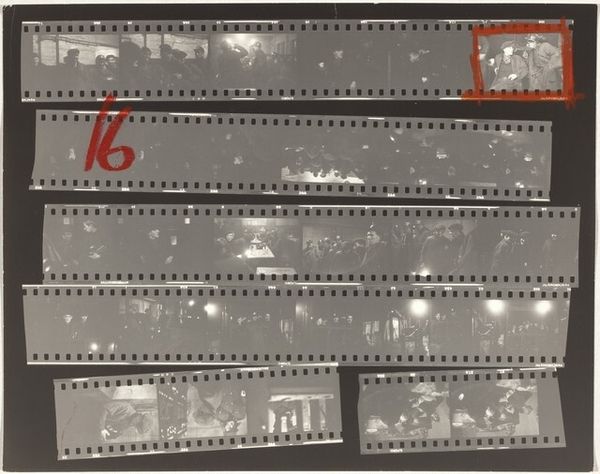
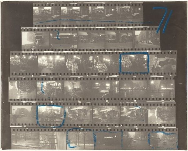
contact-print, photography
#
portrait
#
contact-print
#
street-photography
#
photography
#
realism
Dimensions: overall: 20.2 x 25.8 cm (7 15/16 x 10 3/16 in.)
Copyright: National Gallery of Art: CC0 1.0
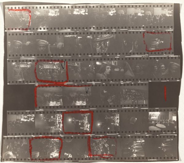
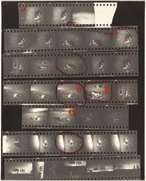
Curator: Today we’re looking at Robert Frank’s “Wales 32,” a contact print from 1953. It presents rows of developed film, revealing his editing process. What's your initial take on it? Editor: Well, it feels like peering into someone's memory – fragmented, layered, and slightly chaotic. The contact print medium is fascinating, since it’s so raw and immediate. The darkroom's decision making is so transparent. Curator: Precisely. The grid format imposed by the film strips creates a compositional tension. The eye bounces between images, searching for patterns or connections across frames. It’s more about process than singular captured image, right? Editor: Absolutely. But the images themselves do resonate. I see recurring motifs: crowds, possibly religious gatherings under these very prominent light sources. The figures seem almost dwarfed by the light, creating a sense of awe or perhaps submission. Curator: It strikes me that the images themselves show an interesting arrangement of dark and light masses within each frame and across the whole. Frank arranges for strong tonal balance. He clearly favored specific frames based on form, but I wonder why... Editor: I see those heavy edits. Those red markings circling specific frames force us to consider which moments caught his eye—and why. They highlight an individual standing alone, set against the crowd, perhaps representing a yearning or quiet dissent? Curator: You know, looking at it this way also draws my attention to the act of selection itself. Frank's marks transform the mundane into something meaningful. The hand of the artist, deciding what merits our attention. Editor: Right. Frank used such symbolism effectively. There's also an element of social commentary here; this tension between individual and crowd, power dynamics and moments of transcendence. What this Welsh community symbolized is still really engaging to think about. Curator: Indeed, and I now understand how these small tonal adjustments create balance that speaks to a deeper symbolic language here. It’s about how visual choices construct meaning. Editor: And about how our interpretation of those forms is always shifting as we grapple with cultural heritage. It truly highlights the layered potential inherent in images, whether as documentation or art.
Comments
No comments
Be the first to comment and join the conversation on the ultimate creative platform.
More like this