drawing, ink, pen
#
drawing
#
script typography
#
hand-lettering
#
old engraving style
#
hand drawn type
#
hand lettering
#
ink
#
hand-written
#
hand-drawn typeface
#
thick font
#
pen work
#
symbolism
#
pen
#
handwritten font
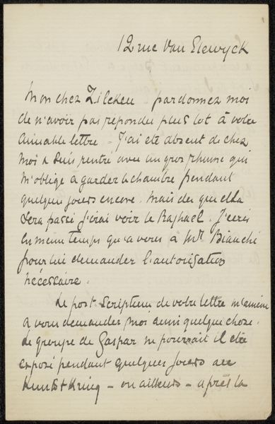
Copyright: Rijks Museum: Open Domain
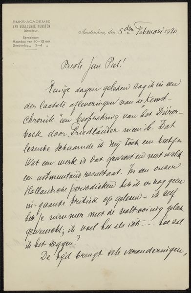
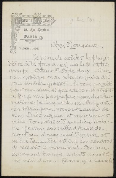
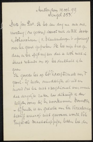
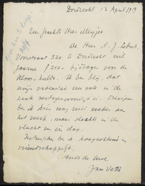
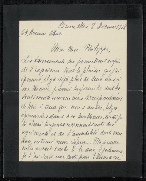
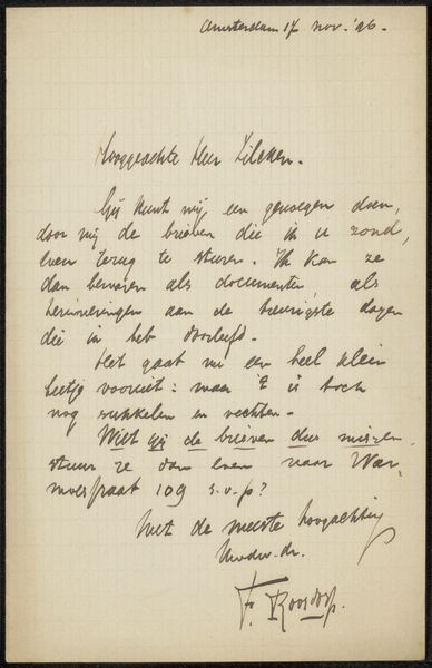
This letter to Philip Zilcken is an intriguing visual artifact, a small rectangle densely filled with cursive script. Note the interplay between the rigid structure of the letter’s form and the fluid, almost organic quality of the handwriting, which creates a dynamic tension. The letter can be understood through structuralism. The consistent stroke weight and uniform spacing create a sense of order, but the slight variations in letterforms introduce an element of the personal. The letterhead, with its stylized monogram, further emphasizes a semiotic function, acting as a signifier of identity and authority. It destabilizes the neat divide between personal expression and formal communication. This duality highlights how the very structure of communication – even in a personal letter – is embedded with cultural and aesthetic choices. This is not just a message, but a carefully constructed representation.
Comments
No comments
Be the first to comment and join the conversation on the ultimate creative platform.
More like this