drawing, paper, ink, pen
#
portrait
#
drawing
#
hand written
#
script typography
#
hand-lettering
#
old engraving style
#
hand drawn type
#
hand lettering
#
paper
#
ink
#
hand-written
#
hand-drawn typeface
#
pen work
#
pen
#
handwritten font
Copyright: Rijks Museum: Open Domain
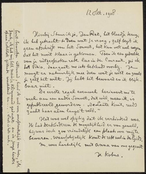
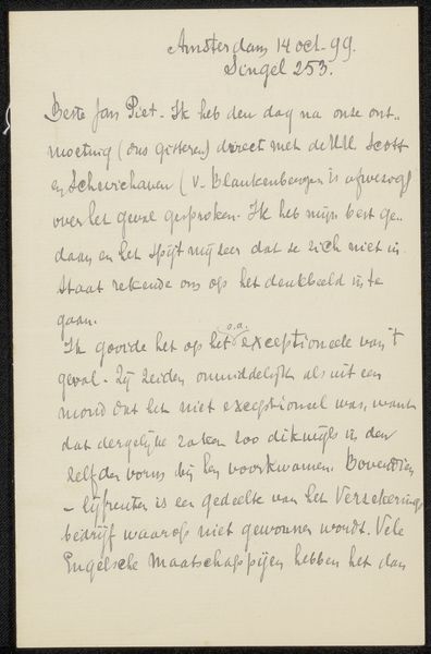
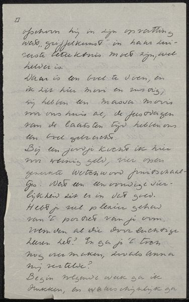
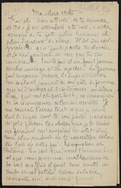
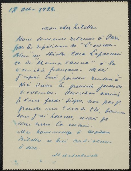
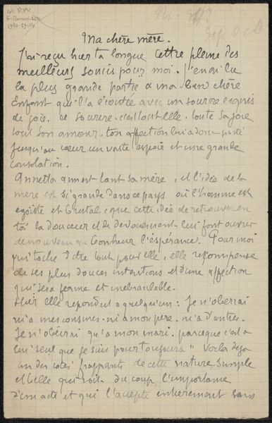
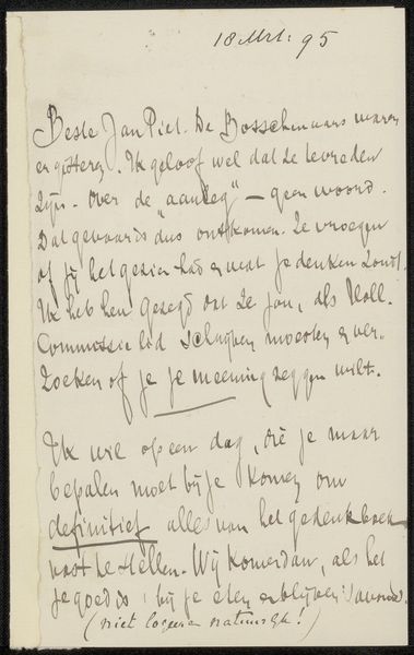
Editor: Here we have "Brief aan Philip Zilcken" – or "Letter to Philip Zilcken" - by Olivier Georges Destrée, created sometime between 1867 and 1930. It's ink on paper, so a drawing in a way, but what strikes me is the dynamism in the script itself. What do you make of it? Curator: Indeed. Let's begin with the fundamental elements: observe the contrasting densities of the ink, which create a textured visual field. Notice how the varying pressure applied by the pen results in a modulation of line thickness, imparting a rhythmic quality to the script. Do you see how this manipulation transcends the mere conveyance of textual information? Editor: So, it’s the artist’s hand itself – the pressure and flow – that really animates the work, not necessarily the content of the letter. Curator: Precisely. Disregard, for a moment, its function as correspondence. Instead, examine the abstract composition, the interplay of forms within the defined space. How does the artist negotiate the tension between legibility and pure calligraphic expression? Note, also, the strategic use of negative space to accentuate certain passages. It becomes a study in form, line, and the inherent qualities of the medium itself. Editor: So, the messiness and imperfections in a way, give it a really expressive feel. It's like the writing becomes an emotional portrait in itself. Curator: Your observations are insightful. By disassociating the letter from its intended communicative function, we can appreciate the pure aesthetic qualities inherent in the artist's manipulation of line and form, wouldn’t you agree? Editor: Absolutely, I’ll definitely be looking at handwriting differently now, seeing it as its own form of art, too.
Comments
No comments
Be the first to comment and join the conversation on the ultimate creative platform.
More like this