drawing, graphic-art, paper, ink
#
drawing
#
graphic-art
#
sculpture
#
paper
#
ink
#
geometric
#
abstraction
Copyright: Public Domain: Artvee
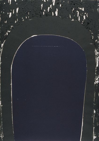
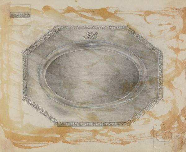
Editor: We're looking at a 1935 ink and paper drawing by Winold Reiss, a design study for an oval medallion intended for the Ruppert Beer logo, rendered in black. The abstraction and starkness gives it a sort of retro severity, like an emblem from a bygone era. What do you see in its geometric choices, Professor? Curator: Indeed, the severity is striking. Think about the oval as a pre-existing form, laden with associations of heraldry, perhaps even religious icons. Then consider Reiss’s additions: the stylized, zig-zag border – aggressive and defensive – almost a crown of thorns, disrupting the smooth curve of the oval. He frames it within stacked geometric forms to emphasize symmetry, a machine age ideal, suggesting control and strength. Editor: So it's playing with contrasts – tradition versus modernity? Curator: Precisely! This emblem seeks to contain something—a tradition, a beer, a brand—within the visual language of modernity. What happens when the familiar is reworked to serve a contemporary need? Is the historical meaning transformed, lost, or even amplified through contrast? The absence of any branding inside the oval emphasizes these contrasts. It is, perhaps, a tabula rasa. What do *you* imagine would exist within this void? Editor: That’s fascinating. I see what you mean, like a window framing nothing and everything. I hadn't thought about it in terms of historical context or as this conversation of different ideas until now. Curator: Symbolism often operates that way, doesn’t it? Layered, complex, hinting at histories buried within our collective memory. It's a visual palimpsest.
Comments
No comments
Be the first to comment and join the conversation on the ultimate creative platform.
More like this