drawing, mixed-media, print, paper
#
drawing
#
mixed-media
#
hand-lettering
# print
#
hand drawn type
#
hand lettering
#
paper
#
calligraphy
Copyright: Rijks Museum: Open Domain
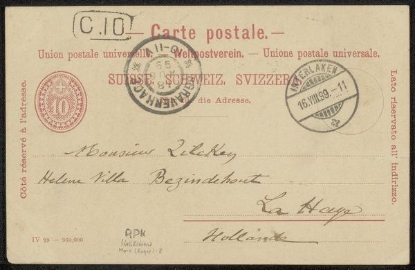
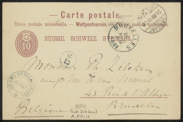
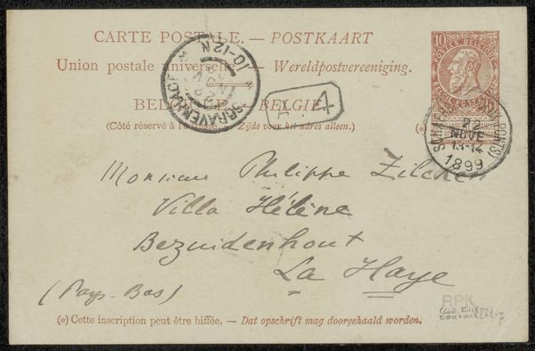
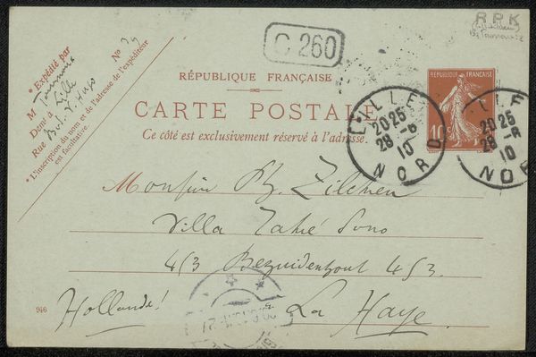
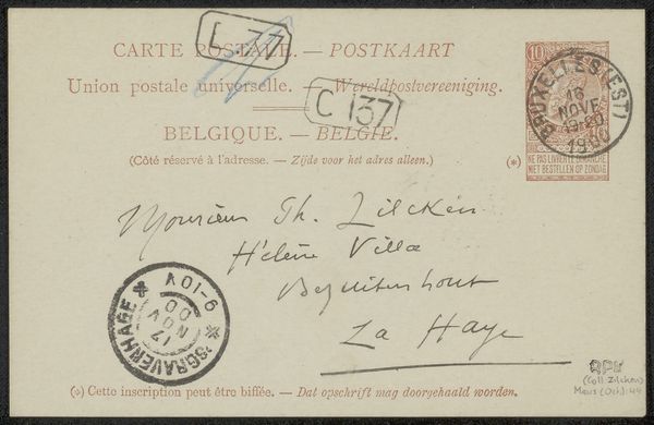
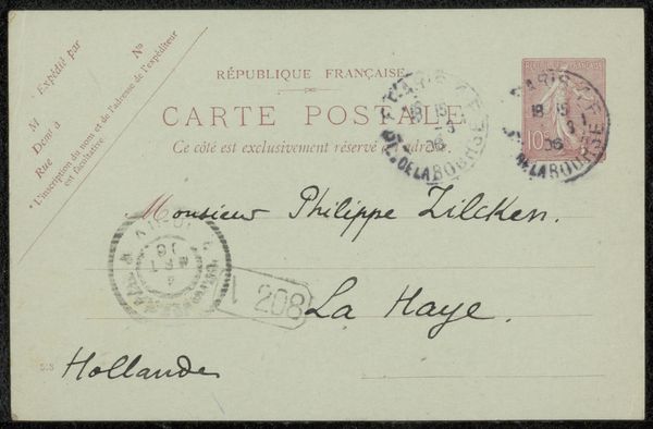
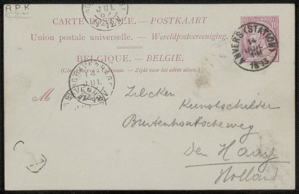
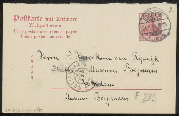
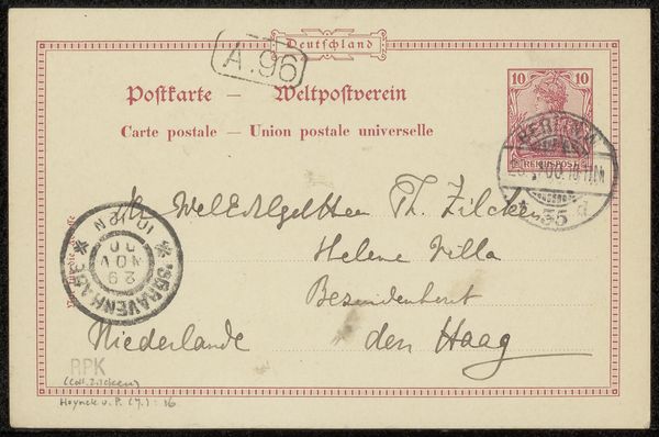
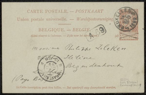
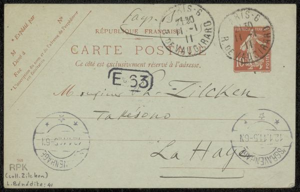
Editor: Here we have a mixed-media work on paper, a postcard really, titled "Briefkaart aan Philip Zilcken," created before 1915. It features printing, drawing and hand-lettering. There's a distinct balance between the printed text and the handwritten elements. What stands out to you, initially? Curator: I am immediately drawn to the interplay between the graphic precision of the printed text and the fluidity of the handwritten script. Notice how the artist utilizes the pre-existing structure of the postcard - the lines, the printed headings in different languages – as a framework within which to inscribe their personal message. How does the contrast in styles strike you? Editor: It gives the piece a very human, personal feel amidst all the standardized postal information. Almost like two different voices speaking on the same plane. Curator: Precisely. Consider also the deployment of the postal stamps, their circular forms acting as visual anchors, echoing and contrasting with the rectangular format of the card itself. The red ink of one stamp draws the eye, providing a chromatic counterpoint to the predominantly muted tones. Do you find that adds depth to the composition? Editor: Definitely, that stamp really pops. But are those the only colours, red and… sepia? Does this limited palette inform your reading? Curator: It's more about the visual structures the artwork has, not so much about colour; even without other colours we can see other visual tensions happening across the material and the text of the postcard. It allows for closer inspection into different levels of production that would be otherwise obfuscated by use of more vibrant tones. What overall effect is achieved here through the economy of visual resources? Editor: The contrast creates an intriguing dialogue between public communication and private expression. I appreciate how this closer analysis brings attention to visual decisions I might have initially overlooked. Curator: Indeed, analyzing these nuances gives us insight to Roger Marx's aesthetic sensibilities.
Comments
No comments
Be the first to comment and join the conversation on the ultimate creative platform.
More like this