Dimensions: support: 1155 x 2810 mm
Copyright: © Bridget Riley 2014. All rights reserved, courtesy Karsten Schubert, London | CC-BY-NC-ND 4.0 DEED, Photo: Tate
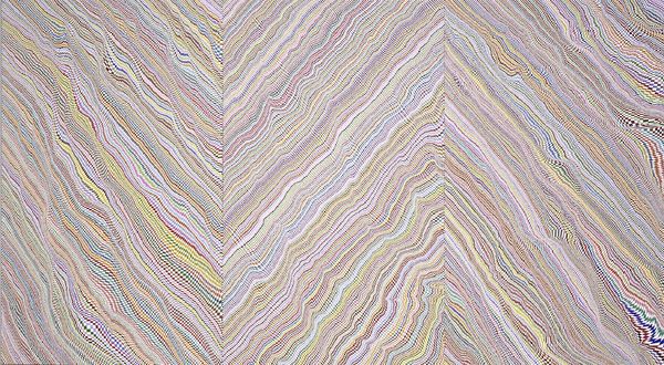
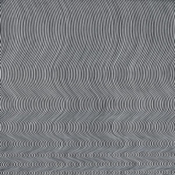
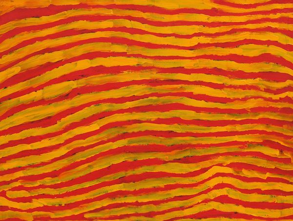
Editor: Bridget Riley’s "To a Summer's Day" at the Tate Modern is really striking. The wavy lines and muted colors create a serene, almost hypnotic effect. How would you interpret this piece in terms of its place in art history? Curator: It's fascinating how Riley uses abstraction to evoke subjective experience. Consider the social context: post-war optimism coupled with the rise of consumer culture. How might the gallery setting influence our understanding of this seemingly simple arrangement of lines and colours? Editor: That's a great point! I never thought about how much the gallery itself shapes our perception of the work. Curator: Indeed. The institution frames the artwork, adding layers of meaning beyond the artist's intention. It makes you wonder, how different would our experience be if we encountered this work in a different setting? Editor: I'll definitely be thinking about that next time I visit an exhibition. Thanks!
Comments
tatemodern 11 months ago
⋮
http://www.tate.org.uk/art/artworks/riley-to-a-summers-day-t03375
Join the conversation
Join millions of artists and users on Artera today and experience the ultimate creative platform.
tatemodern 11 months ago
⋮
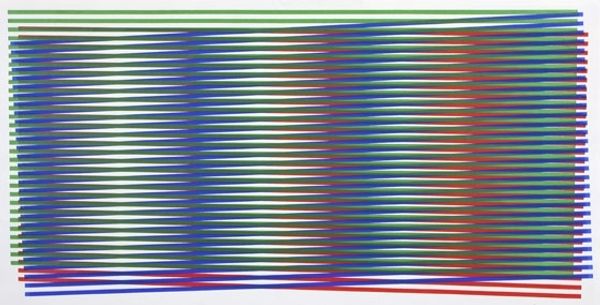
Coloured stripes cross along a common band, reminiscent of twisting ribbons, to create a wave pattern. The choice of colours was intended to provoke an optical mix in the eye, with as much interaction as possible between colours. Light blue and yellow ochre form the basic pair of colours into which occasional threads of rose and violet are introduced to accentuate the warm and cold accents across the canvas. The title refers to William Shakespeare’s sonnet ‘Shall I compare thee to a summer’s day?’ Gallery label, October 2016
More like this