Copyright: Public Domain: Artvee
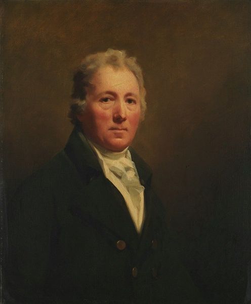
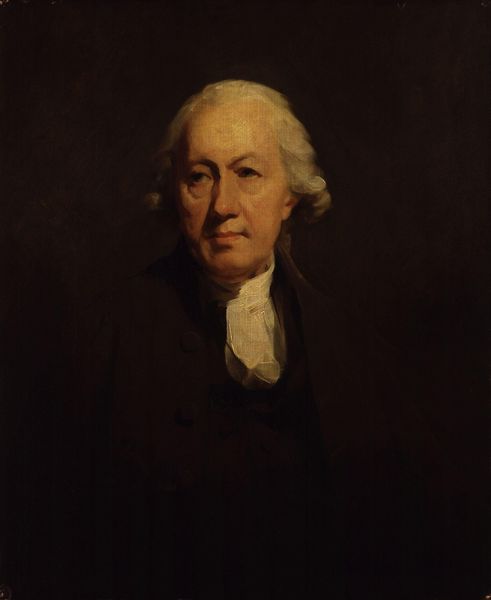
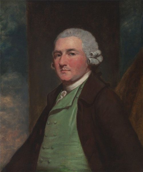
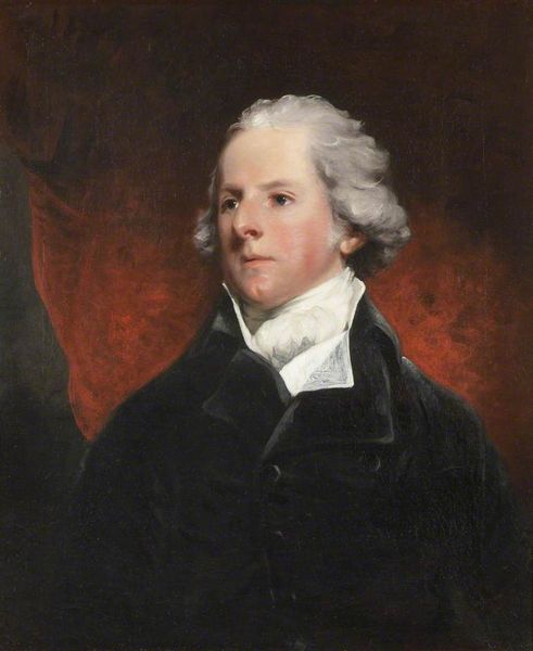
Editor: Here we have "Portrait Of The Reverend John Home" by Henry Raeburn, likely dating somewhere in the late 1700s given Home’s lifespan. It's an oil painting, and my initial impression is the artist dedicated attention to capturing the sitter’s expression and the soft texture of his garments. What elements stand out to you from a formal perspective? Curator: Focusing on its formal qualities, note the composition's reliance on subtle gradations of tone. Raeburn manipulates light and shadow to model the face, drawing attention to the Reverend's gaze. Do you see how the colour palette contributes to the mood? Editor: I do. It seems restricted; a lot of muted browns and creams. Is that intentional? Curator: Precisely. The limited colour palette—essentially a near-monochromatic study in browns, creams and greens—serves to unify the composition. It concentrates our attention on the brushwork itself, specifically how the artist models form. Notice the impasto in areas where the light hits; what effect does that create? Editor: I see how the texture helps to almost sculpt the planes of the face and his clothing, like those strokes along his cheekbone, or at the neck beneath the ruffled cravat. Curator: An astute observation. The painting surface then becomes a record of the artist's decisions. Raeburn also balances areas of sharp detail with blurred passages, directing the eye and preventing it from getting 'stuck' anywhere. How would you describe the effect of his compositional choices? Editor: I think that I now better appreciate the subtlety of how this painting works through careful composition. Instead of merely recording likeness, it appears to analyze and then amplify certain elements. Curator: Precisely. By examining its internal structure and organization, we gain insight into its power. Thank you for your observations!
Comments
No comments
Be the first to comment and join the conversation on the ultimate creative platform.