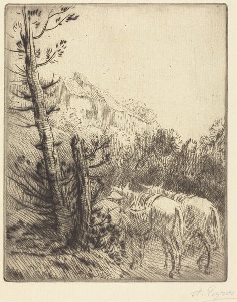
drawing, graphite
#
drawing
#
ink drawing
#
landscape
#
figuration
#
graphite
Copyright: National Gallery of Art: CC0 1.0
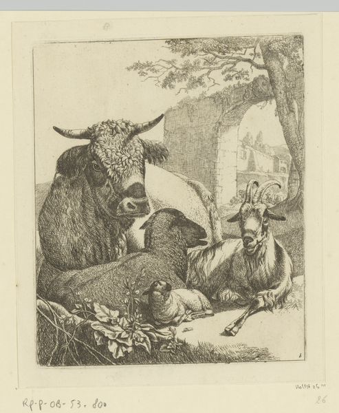
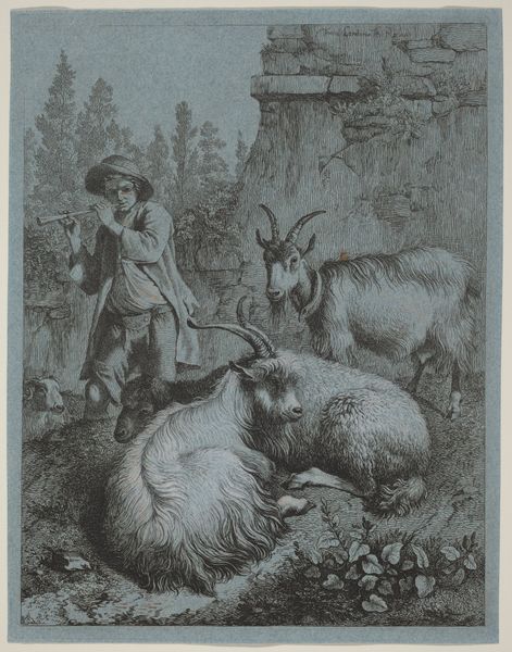
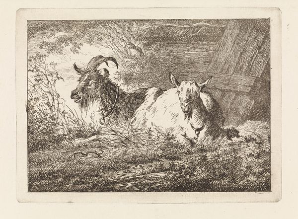
Curator: This is "Zeigen," a drawing in graphite and ink by August Gaul, likely from 1920. What strikes you first about this image? Editor: The stark contrast! The looming cliff edge is almost brutal, then these heavily rendered goats in the foreground, a dense mass of ink and graphite, almost confrontational in their direct gaze. Curator: Indeed. Gaul was known for his animal sculptures. This drawing might serve as a preliminary study, and there is certainly a compelling psychological dimension here. Look at the line of goats receding into the background. They’re much smaller, more hesitant, even obedient—contrasted sharply with this assertive foreground group. Editor: The composition reinforces that. The severe verticality of the cliff against the downward-sloping path emphasizes the goats' precarious position and defiant stance, and Gaul creates a strong pull for the viewers eye using their dark colouration.. The linear strokes create a dynamic contrast to the smoothness of the cliff face. Curator: What are they “showing,” as the title suggests? The German word ‘zeigen’ is active, meaning ‘to show,’ or even ‘to indicate’ or ‘point out.’ Perhaps Gaul intended to show an enduring strength amid a hostile environment. These mountain goats have survived this territory long before us and may well exist long after us. Editor: Or are they showing a way, indicating something beyond the visible horizon? There’s definitely an implication of looking toward some far off prospect. Maybe the cliff itself becomes symbolic—a barrier, perhaps, but one these goats traverse so easily. Curator: Or a division between the everyday and the sacred? They might be showing the threshold that exists on the edges of our understanding of the world. Editor: So while seemingly naturalistic, there is this implicit narrative—a semiotic richness despite its limited colour palette. Curator: Exactly. And I would add that, because it is so graphic, made of lines instead of colour fields, we read the landscape like a text as much as like a vista. It feels didactic in some way. Editor: An intriguing and dynamic piece that merges formal strengths with profound symbolism. Curator: An enduring piece from a master of animal forms, and, evidently, their deeper meanings.
Comments
No comments
Be the first to comment and join the conversation on the ultimate creative platform.
More like this