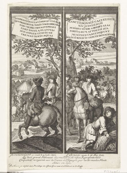
Paneel met de overwinningen te Hulst en Kijkuit en te Keizersweerd, 1702 1702
0:00
0:00
danielimarot
Rijksmuseum
print, engraving
#
baroque
# print
#
old engraving style
#
cityscape
#
history-painting
#
engraving
Dimensions: height 273 mm, width 185 mm
Copyright: Rijks Museum: Open Domain
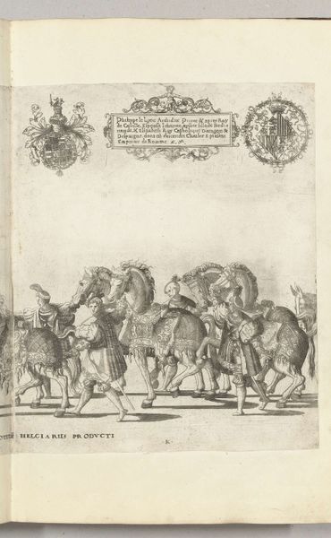
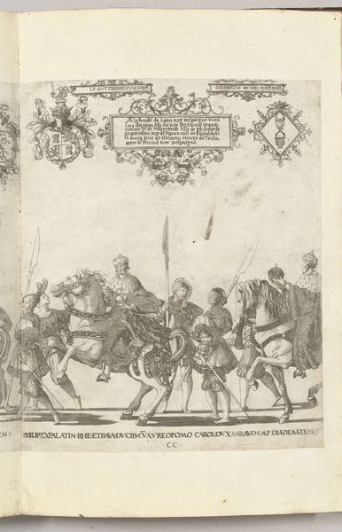
Editor: This engraving from 1702 by Daniël Marot depicts the victories at Hulst and Kijkuit, and at Keizersweerd. It's so detailed! My first impression is how balanced the composition seems despite the chaotic scenes. What draws your eye when you look at it? Curator: The print’s most striking feature is the bilateral symmetry, bisecting the composition into two distinct yet related halves. Note how Marot employs parallel lines, not merely to describe form, but also to create tonal variation and depth, enriching the textural contrasts between the figures, landscapes, and the banners containing the inscriptions. The contrast suggests the victories happened in different places and times. Do you agree? Editor: Yes, that's true. The density of line work definitely creates different atmospheres in each half. The left side feels more frantic and active compared to the right. How would this choice affect how the victories are received by the viewer? Curator: By emphasizing linear precision, Marot constructs a visual rhetoric that emphasizes clarity and control. Consider how this meticulous articulation elevates the victories from mere events to symbols of structured, rational power. Do you perceive an allegorical dimension beyond the straightforward depiction of these triumphs? Editor: I hadn't considered the allegory before, but seeing the victories represented in such a controlled way, makes the victories seem inevitable. I also wonder about the choice of including the Latin text above each image. I noticed they have matching decorative leaf elements around the perimeter, making me believe they must relate. Curator: Indeed. Semiotically, the Latin inscriptions, paired with the visual representations, would evoke erudition, transforming these Dutch victories into timeless, classical virtues. This union of text and image reinforces the notion of divinely ordained success, presenting a view of controlled power rather than barbaric triumph. It also may remind the viewer of the glories of the roman empire. Editor: I never would have gotten that depth of understanding by myself. The layers of intent packed into those lines are so incredible. Curator: Agreed. Reflecting upon these features, it's evident that the power of Baroque art lies in its intricate design and symbolic weight.
Comments
No comments
Be the first to comment and join the conversation on the ultimate creative platform.
More like this