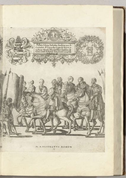
Filips, paltsgraaf en hertog van Beieren, met de rijksappel en Karel III, hertog van Savoye, met de keizerskroon, plaat CC 1530 - 1536
0:00
0:00
print, engraving
#
portrait
#
medieval
# print
#
history-painting
#
engraving
Dimensions: height 360 mm, width 295 mm
Copyright: Rijks Museum: Open Domain
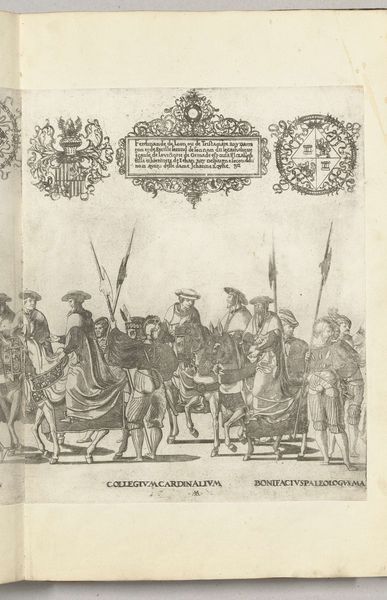
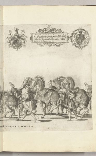
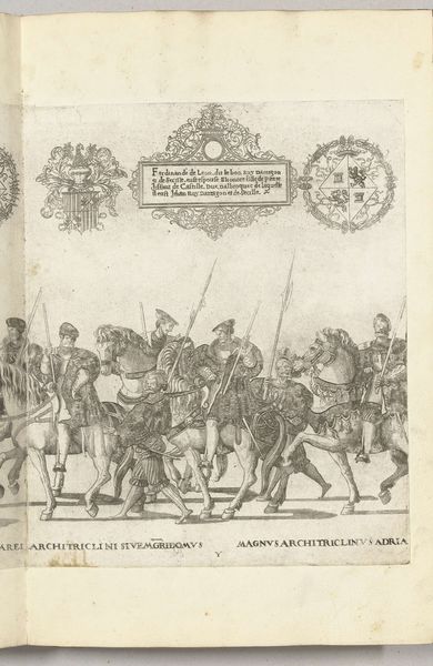
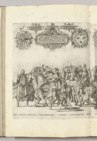
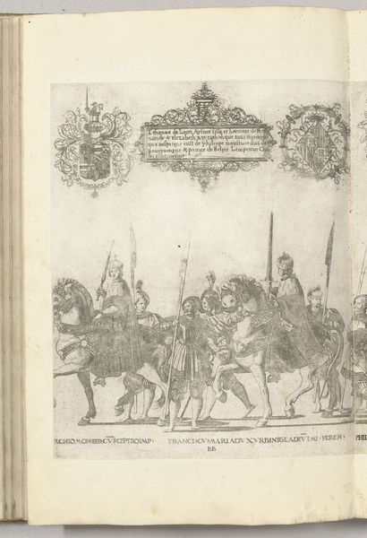
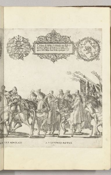
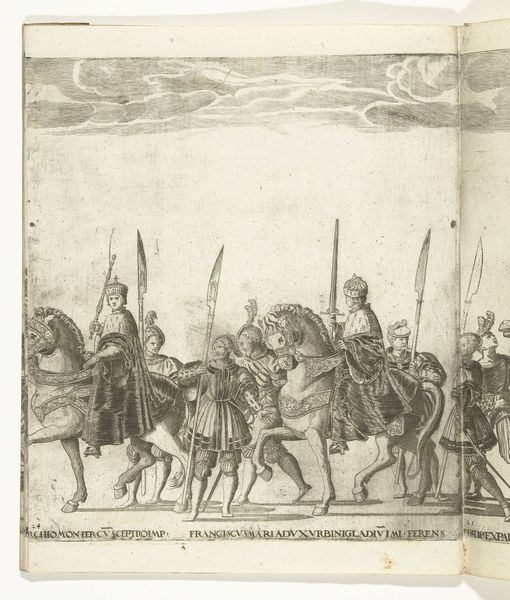
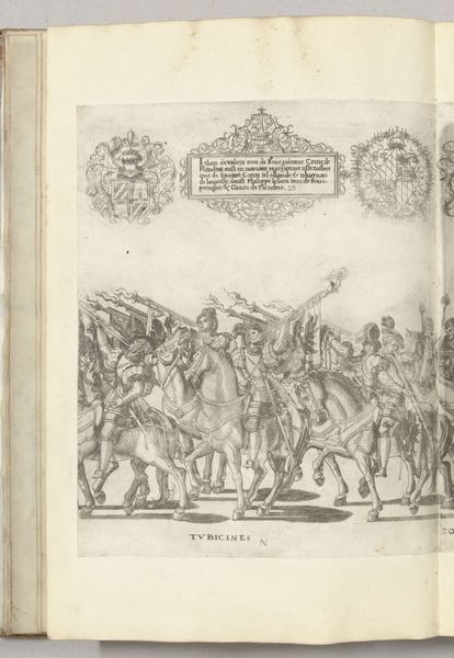
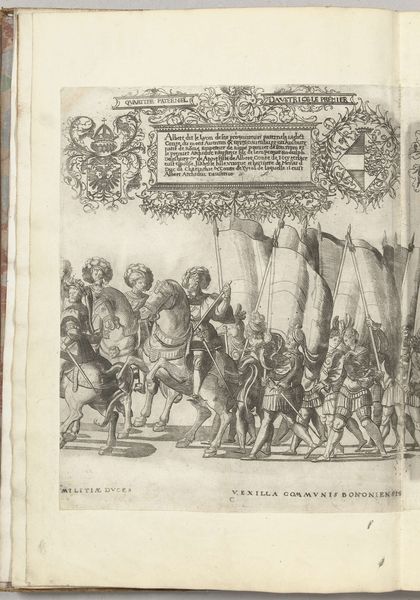
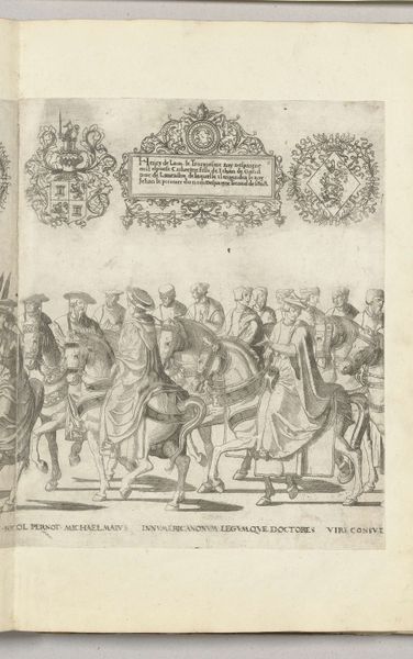
Curator: Welcome! We’re standing before Nicolaas Hogenberg’s engraving, "Filips, paltsgraaf en hertog van Beieren, met de rijksappel en Karel III, hertog van Savoye, met de keizerskroon, plaat CC," created sometime between 1530 and 1536. Editor: It strikes me immediately as intensely formal. Look at the procession—stiff figures, almost like chess pieces, precisely placed on the page. Curator: Yes, it’s designed to convey authority. Hogenberg created this during a period when imagery was a critical tool for establishing and maintaining power, especially among European nobility. The act of distributing images like this could shape public perception. Editor: The details in the engraving are incredible, especially given the medium. See the texture of the fabrics and the intricate harness on the horses; notice, also, the elaborate frames at the top, showcasing symbols like heraldic crests and foliage. It is far more ornamented than most medieval works, in my view. Curator: Absolutely. These details are meant to underscore the status of the figures depicted, Philips and Charles. Printmaking allowed for relatively wide dissemination of these carefully constructed images. Editor: The light is so evenly distributed. I also see each figure is outlined and very flat to the rest of the picture plane, and the lines define their clothes but little more. Look at the flatness of the faces! The technique gives them a rather emotionless cast. Curator: Perhaps that was intentional. Their likeness in service of dynasty and legacy are, perhaps, far more important than capturing their humanity. Editor: An interesting, plausible observation that makes the print seem less distant and frozen. Still, I cannot help noticing the flatness—how it pulls me out of complete immersion and brings the symbolic elements back to the forefront of my focus. Curator: Understanding this engraving requires a lens that considers how power was constructed and performed in the 16th century through visual media. Editor: While my eye keeps coming back to the lines, the textures, the technical virtuosity. This combination allows us to examine it, its purpose, and, finally, our reactions.
Comments
No comments
Be the first to comment and join the conversation on the ultimate creative platform.
More like this