Copyright: Clarence Holbrook Carter,Fair Use
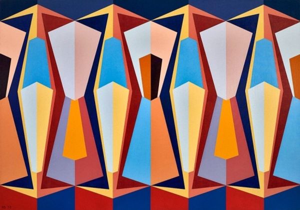
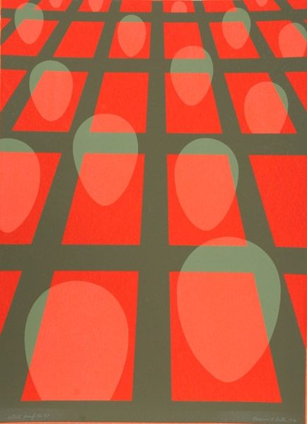
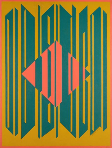
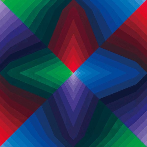
Curator: Standing before us is Clarence Holbrook Carter's "Untitled - Faces in a Grid (Red and Blue)" from 1973. It’s executed in acrylic paint, if I’m not mistaken. Editor: Oh, wow! Immediately, I’m struck by how dizzyingly vibrant it is. It has a rhythmic pulsation almost. All those overlapping shapes playing tricks on my eyes. Curator: Indeed. It’s got that distinctive op-art, hard-edge painting vibe, with its geometric abstraction. It feels like a face reflected through a kaleidoscope, repeating, distorting. A real hall of mirrors. Editor: The shapes are quite interesting. Almost like stylized teardrops pointing downwards, nestled in the embrace of crisscrossing diamonds, a symbol of clarity and truth in some cultures. But arranged in this relentless grid... does that somehow dilute their power? Or amplify it, by their sheer presence in multitude? Curator: Good question. I find that in some abstract works the meaning shifts like sand in the wind, it changes. In this instance I feel they’re almost glyphs from some unknown culture – each 'face' a character in a system we can’t quite decipher, hinting at order hidden within abstraction. Editor: So, this repetitive nature makes me think about conformity, about being one face in a crowd, while still maybe trying to show some individual character, with its placement within the bigger picture... Does it reflect anxieties of that time, or the cold detachment that would develop from abstract expressionism? Curator: The era definitely shaped its language, but artists play tricks on me sometimes. With abstraction, so often people try to put narrative into an otherwise silent structure. Maybe that’s a response, a desire to pull away, like, I will communicate, but not necessarily with words or representational shapes…but with angles. Editor: It’s certainly thought-provoking. In any case it’s still something one could enjoy in itself, even with it's cold palette. It draws you in. I didn't notice this earlier but there is also a warm underpainting below this icy blue. Curator: That’s Clarence Holbrook Carter’s little secret. What started as a surface remains with his message behind these planes. That he chose acrylic helps enhance these translucent, hard-edged patterns too. Editor: It’s a piece that continues to offer new perspectives with each viewing, then. A structured dance between precision and ambiguous identity. Curator: I completely agree; a fitting end to our journey with these fascinating geometric faces. Let's move on to the next work.
Comments
No comments
Be the first to comment and join the conversation on the ultimate creative platform.
More like this