About this artwork
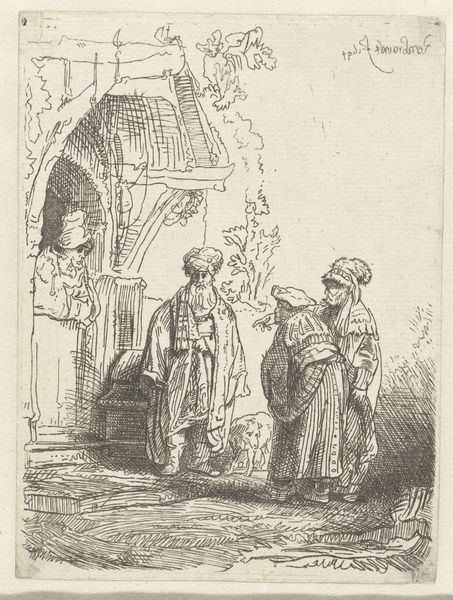
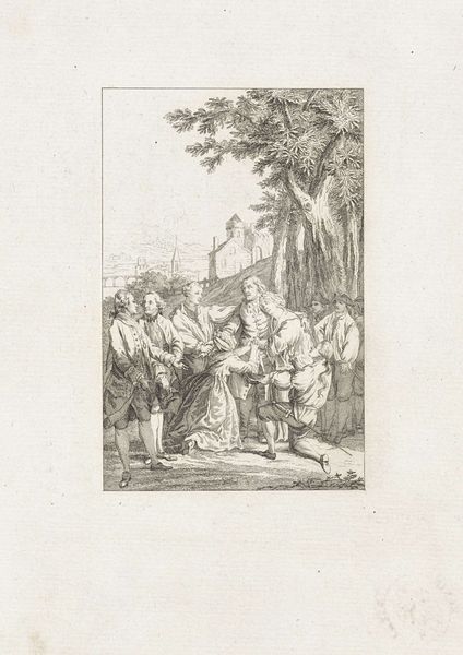
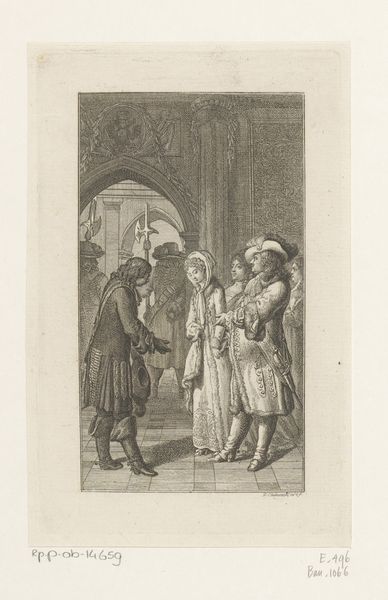
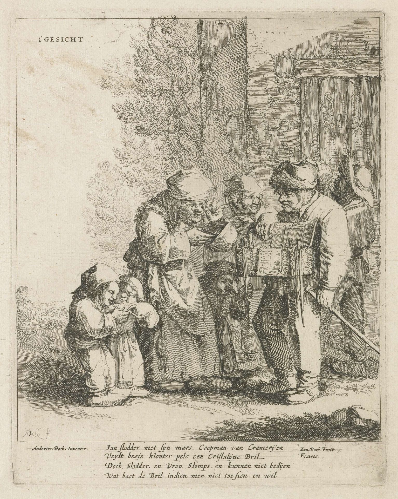
Editor: We're looking at Jan Both's "Het Gezicht," dating from sometime between 1620 and 1638. It's an etching, so a print, currently held at the Rijksmuseum. My initial impression is of organized chaos; a group of figures clustered together, and their expressions and poses seem almost theatrical. What catches your eye when you look at it? Curator: Formally speaking, I'm drawn to the intricate network of lines that comprise the image. Consider the varying densities and directions. See how they sculpt volume, define textures, and articulate spatial relationships within the composition. Ask yourself, how do the strong diagonals and verticals create tension and balance, directing the viewer's eye around the scene? Editor: So, not necessarily what's happening in the image but more about how the image itself is made? Curator: Precisely. For instance, observe the use of light and shadow. It isn't merely representational. Instead, light emphasizes certain aspects, such as the faces, while shadow conceals and adds depth. Notice the formal rhythm across the composition, that directs the audience towards particular subject matter. Do you think the texture created adds or detracts from the subject matter? Editor: I think it certainly adds! The etching seems very detailed, particularly for something so old, but also has depth from the way shadows were used, which adds a narrative aspect to it that could not have existed as strongly without the form. Thank you for showing me what to appreciate about the artistic elements of this image! Curator: It’s the visual language itself that conveys meaning. Close looking will show you that every detail is significant in baroque artworks like this one!
Artwork details
- Medium
- print, etching
- Dimensions
- height 222 mm, width 175 mm
- Location
- Rijksmuseum
- Copyright
- Rijks Museum: Open Domain
Tags
Comments
Share your thoughts
About this artwork
Editor: We're looking at Jan Both's "Het Gezicht," dating from sometime between 1620 and 1638. It's an etching, so a print, currently held at the Rijksmuseum. My initial impression is of organized chaos; a group of figures clustered together, and their expressions and poses seem almost theatrical. What catches your eye when you look at it? Curator: Formally speaking, I'm drawn to the intricate network of lines that comprise the image. Consider the varying densities and directions. See how they sculpt volume, define textures, and articulate spatial relationships within the composition. Ask yourself, how do the strong diagonals and verticals create tension and balance, directing the viewer's eye around the scene? Editor: So, not necessarily what's happening in the image but more about how the image itself is made? Curator: Precisely. For instance, observe the use of light and shadow. It isn't merely representational. Instead, light emphasizes certain aspects, such as the faces, while shadow conceals and adds depth. Notice the formal rhythm across the composition, that directs the audience towards particular subject matter. Do you think the texture created adds or detracts from the subject matter? Editor: I think it certainly adds! The etching seems very detailed, particularly for something so old, but also has depth from the way shadows were used, which adds a narrative aspect to it that could not have existed as strongly without the form. Thank you for showing me what to appreciate about the artistic elements of this image! Curator: It’s the visual language itself that conveys meaning. Close looking will show you that every detail is significant in baroque artworks like this one!
Comments
Share your thoughts