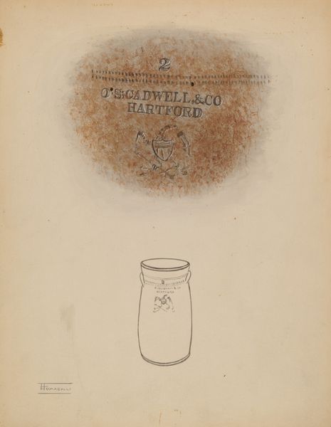
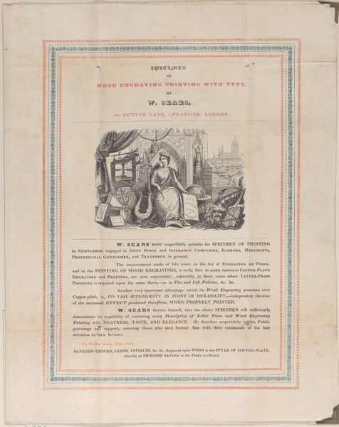
drawing, print
#
drawing
#
toned paper
#
light pencil work
# print
#
old engraving style
#
hand drawn type
#
personal sketchbook
#
ink drawing experimentation
#
pen-ink sketch
#
ink colored
#
sketchbook drawing
#
sketchbook art
Dimensions: Sheet: 7 7/16 × 6 3/4 in. (18.9 × 17.1 cm)
Copyright: Public Domain
This trade card for the Surrey Lithographic Company presents a fascinating array of symbols, all meticulously designed for the discerning customer. Framed within a decorative oval, the text promises “Lithography - A Series of Views in the County of Sussex." Notice the laurel leaves crowning the composition. The laurel, historically, has signified triumph and immortality, dating back to ancient Greece where victors were crowned with laurel wreaths. It’s a classical motif, meant to imbue the Surrey Lithographic Company with an aura of artistic and commercial success. We find this motif recurring across centuries, from Roman statuary to Renaissance paintings, always denoting excellence and enduring legacy. The company cleverly uses it to imply their craft will stand the test of time. Yet, how ironic that this very laurel, meant to symbolize eternity, now adorns a humble trade card. This cyclical progression of symbols—their adaptation and reappearance in new contexts—reveals the profound, often subconscious, ways in which history shapes our present.
Comments
No comments
Be the first to comment and join the conversation on the ultimate creative platform.
More like this